I installed a plug-in that I hope makes the blog easier to read on mobile devices.
So far I’ve heard it works well on the iPhone. As far as I can tell the plug-in doesn’t interfere with any desktop browsers. If you have any feedback, please let me know.
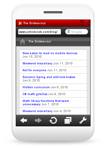
Here’s a screen shot of the home page from the Opera Mini Simulator:
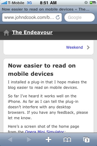
Update: Here’s a screen shot of this post on an iPhone 3G thanks to Mpdreamz:
Related post: Styling HTML for mobile devices
Looks fine on my X10 – but then, I don’t remember your blog to be a problem before the plug-in either.
Is this a WordPress plugin?
Which one?
Thanks!
Looks great on my Blackberry. Unfortunately I have to go through a few layers on the Google Mobile App to see it this way.
Commenting from my BB seems to work nicely too.
apologies for the spam – Since I usually view through Google Mobile, I pulled up some other sites directly in my BB as a test. Your blog now displays in a larger than usual font – large enough for me to read without reading glasses. Nice.
Looks great on my android (evo)
Unfortunately, my mobile plug-in conflicts with my caching plug-in. Caching effectively negates the mobile theme. I may have to turn off mobile support until I can resolve the conflict.