I recently ran across a paper on typesetting rare Chinese characters. From the abstract:
Written Chinese has tens of thousands of characters. But most available fonts contain only around 6 to 12 thousand common characters that can meet the needs of everyday users. However, in publications and information exchange in many professional fields, a number of rare characters that are not in common fonts are needed in each document.
There’s sort of a paradox here: the author is saying it’s common to need rare words. Aren’t rare words, you know, rare? Of course they are, but the chances of needing some rare word, not just a particular rare word, can be large, particularly in lengthy documents.
This post gives a sort of back-of-the-envelope calculation to justify the preceding paragraph.
Word frequencies often approximately follow Zipf’s law, where the frequency of the nth most common word is proportional to n raised to some negative power s. I’ve seen estimates that there are around N = 50,000 characters in Chinese, but that 1,000 characters make up about 90% of usage. This would correspond to a value of s around 1.25.
In practice, Zipf’s law, like all power laws, fits better over some parts of its range than others. We’re making a simplifying assumption by applying Zipf’s law to the entire vocabulary of Chinese, but this post isn’t trying to precisely model Chinese character frequency, only to show that the statement quoted above is plausible.
With our Zipf’s law model, the 10,000th most common character in Chinese would appear about 2 times in a million characters. But the frequency of all the words from the 10,000th most common to the 50,000th most common would be about 0.03.
So if we list all characters in order of frequency and call everything after the 10,000th position on the list rare, the combined frequency of all rare words is quite high, about 3%. To put it another way, a document of 1,000 words would likely contain around 30 rare words, according to the simplified model presented here.
Related posts
- Chinese character frequency and entropy
- Estimating vocabulary size with Heaps law
- Passwords and power laws
- Twitter follower distribution
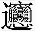
[1] The Chinese character at the top of the post comes from here. According to the source, “The Chinese character ‘biáng’ used to represent Biang Biang noodles, is one of the most complex and rare Chinese characters. It has 56 strokes and cannot be found in modern dictionaries or entered into computers.”


![\sigma = \frac{1}{\sqrt{n\left[ \frac{\zeta''(\hat{\alpha}, x_{min})}{\zeta(\hat{\alpha}, x_{min})} - \left(\frac{\zeta'(\hat{\alpha}, x_{min})}{\zeta(\hat{\alpha}, x_{min})}\right)^2\right]}}](http://www.johndcook.com/discrete_power_law_sigma.svg)