Every time I get into a hotel shower I think “Oh great. How does this one work?” No two are the same, and yet I’ve never seen a shower that had the simplicity and convenience of the typical residential shower with two knobs, one for hot water and one for cold. (At least that’s what’s most common in the US.)
Here’s how the shower was labeled in my hotel in Denver this week:
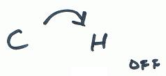
I assumed that the off position was at 4 o’clock, the hottest water at 3 o’clock, and the coldest at 9 o’clock. So I turned the handle to the 2 o’clock position and waited for the water to warm up. Eventually I realized the shower should have been labeled something like this:
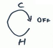
The original label was misleading in two ways. First, it implied that you get warmer water by turning the handle clockwise. Second, it implied that the range of motion of the handle was between 9 o’clock and 4 o’clock. But to get a warm shower you have to turn the knob counterclockwise to between 5 and 6 o’clock.
Why do hotel shower designers go to great lengths to frustrate users? What’s wrong with simply having hot and a cold water knobs? Would this add a few dollars to the construction cost of a room? If so, I could think of a long list of ways I’d rather they cut costs. Are they concerned about guests who don’t know English? If so, then why assume that guests know what the letters “C” and “H” stand for? How about pictures of penguins and ice cubes drawn in blue above the cold water knob, and pictures of boiling water and fire drawn in red above the hot water knob?
Well, I have the same feelings about your US-style knobs. Why do I have to manually mix hot and cold water? (The same is true for faucets, by the way.)
One knob for hot/cold and one for water pressure is much better design, IMHO. Actually, I prefer the handle variant, where you turn the handle to change the temperature and push/pull it to change the water pressure (from off to full pressure).
But I wonder why knobs are used at all. One is never sure which way to turn it, and the labeling is often confusing (especially if the labeling is on the knob instead of surrounding the knob). Surely a clearly marked horizontal slider would be better.
Funny you should mention this — I’ve just returned from a camping holiday where the showers had a single button operation. You push the button to get a hot shower lasting arond half a minute. (If you’ve ever been in the sea in Cornwall, you’ll know that a hot shower is always what’s wanted.) For an extended shower, push the button again, or hold it down.
Karl is right. Unfortunately, in the US I am seeing more and more single handle controls which allow for temperature regulation, but which have no facility at all to adjust the flow rate! They are either on full-force or off. Terrible!
My favorite hotel shower control was at a nice hotel in downtown Tokyo. There was a knob labeled in degrees Celsius, with blue-thru red underneath (cool thru hot) the numbers, and a tick mark at the top to let you know what you set it to. I forget if the knob pulled in an out to increase/decrease flow, or if there was another knob for that. It seemed to work perfectly – I wish I had one at home.