You can associate a matrix with a graph and find the eigenvalues of that matrix. This gives you a spectrum associated with the graph. This spectrum tells you something about the graph analogous to the way the spectrum of a star’s light tells you something about the chemical composition of the star.
So maybe it would be useful to visualize graph spectra the way you visualize chemical spectra. How could you do this?
First, scale the spectrum of the graph to the visual spectrum. There are different kinds of matrices you can associate with a graph, and these have different natural ranges. But if we look at the spectrum of the Laplacian matrix, the eigenvalues are between 0 and n for a graph with n nodes.
Eigenvalues typically correspond to frequencies, not wavelengths, but chemical spectra are often displayed in terms of wavelength. We can’t be consistent with both, so we’ll think of our eigenvalues as wavelengths. We could easily redo everything in terms of frequency.
This means we map 0 to violet (400 nm) and n to red (700 nm). So an eigenvalue of λ will be mapped to 400 + 300 λ/n. That tells us where to graph a spectral line, but what color should it be? StackOverflow gives an algorithm for converting wavelength to RGB values. Here’s a little online calculator based on the same code.
Here are some examples. First we start with a random graph.
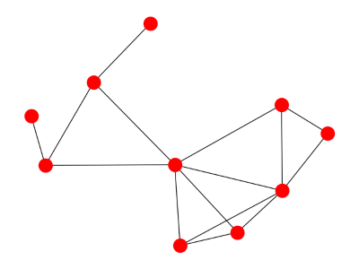
Here’s what the spectrum looks like:

Here’s a cyclic graph:
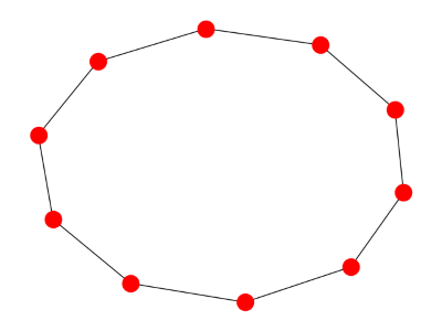
And here’s its spectrum:

Finally, here’s a star graph:
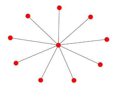
And its spectrum:

Related: Ten spectral graph theory posts
Have you been able to use this visualization to gain any kind of insights? Perhaps the spectrum can give some indication of how strongly connected the graph is, or how cyclical. Or maybe it’s just a picture that isn’t terribly useful.
The size of the 2nd eigenvalue tells you how strongly connected the graph is, so just visualizing that one line tells you something.
Visualizing the rest of the spectrum could tell you, for example, how much a graph acts like a typical random graph.
Graph spectrum is a sort of lossy compression. You can’t reconstruct a graph from its spectrum, except in special cases, but you can tell a lot. And if two graphs have noticeably different spectra, they differ in some significant way.
Would it be interesting to make the width of a line depend on the multiplicity of its eigenvalue?
Sjoerd: Yes, that would be a good idea. That would help with the last graph where the 2nd eigenvalue has multiplicity 8. An easy way to do this would be to jitter the eigenvalues a little.