Topological sort

When I left academia [1] my first job was working as a programmer. I was very impressed by a new programmer we hired who hit the ground running. His first week he looked at some problem we were working on and said “Oh, you need a topological sort.” I’d never heard of a topological sort and it sounded exotic. What could this have to do with topology?!

A topological sort of a directed graph lists source nodes before target nodes. For example, if there is a directed edge from A to B and from C to A, then the nodes would be list C, A, B. It’s just a way of listing items in a directed graph so that no item in the list points to an item earlier in the list. All arrows point forward.

This is not exotic at all. It’s something you’ve likely done, maybe by hand. As pointed out in the comments, the make utility does this, compiling source files in the order that they’re needed [2].

Where does topology come in? Imagine your directed graph made of beads and strings. You want to pick up the graph by some bead so that all beads are higher than the beads they point to. It’s topological in the sense that you don’t need to preserve the geometry of the graph, only its connectivity.

tsort

The Unix utility tsort will do a topological sort. The input to the utility is a text file with two items per line, separated by white space, indicating a directed edge from the first item to the second.

Example

Here is a thumbnail image of a graph of relationships between special functions. See this page for a full-sized image and an explanation of what the arrows represent.

special function relationships

I took the GraphViz file used to create the graph and formatted it for tsort. Then I randomly shuffled the file with shuf.

    Gegenbauer_polynomials Legendre_polynomials
    Gegenbauer_polynomials Chebyshev_polynomials_Second_kind
    Hypergeometric_2F1 Jacobi_polynomials
    Error_function Fresnel_S
    ...
    Hypergeometric_1F1 Error_function

The lines are not sorted topologically because, for example, the Gegenbauer polynomials are special cases of the Hypergeometric 2F1 functions, so Hypergeometric 2F1 should be listed before Gegenbauer polynomials.

When I ran the shuffled file through tsort I got

    Elliptic_F
    Hypergeometric_2F1
    Elliptic_E
    Hypergeometric_1F1
    ....
    Beta

and now in this list more general functions always come before special cases.

Related posts

[1] After a postdoc at Vanderbilt, I took a job as a programmer. I got the job because they needed a programmer who knew some DSP. A few years later I got a job at MD Anderson Cancer Center managing a group of programmers. It’s fuzzy whether my time at MDACC should be considered time in Academia. My responsibilities there were sometimes academic—writing journal articles, teaching classes—and sometimes not—developing software and managing software developers.

[2] The make software can be used to run any directed acyclic graph of tasks, but is most often used to compile software.

The NBA and MLB trees are isomorphic

NBA MLB games

An isomorphism is a structure-preserving function from one object to another. In the context of graphs, an isomorphism is a function that maps the vertices of one graph onto the vertices of another, preserving all the edges.

So if G and H are graphs, and f is an isomorphism between G and H, nodes x and y are connected in G if and only if nodes f(x) and f(y) are connected in H.

There are 30 basketball teams in the National Basketball Association (NBA) and 30 baseball teams in Major League Baseball (MLB). That means the NBA and MLB are isomorphic as sets, but it doesn’t necessarily mean that the hierarchical structure of the two organizations are the same. But in fact the hierarchies are the same.

Both the NBA and MLB have two top-level divisions, each divided into three subdivisions, each containing five teams.

Basketball has an Eastern Conference and a Western Conference, whereas baseball has an American League and a National League. Each basketball conference is divided into three divisions, just like baseball leagues, and each division has five teams, just as in baseball. So the tree structures of the two organizations are the same.

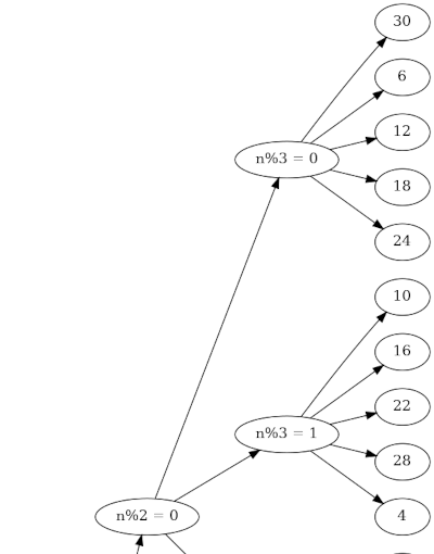
In the earlier post about the MLB tree structure, I showed how you could number baseball teams so that the team number n could tell you the league, division, and order within a division by taking the remainders when n is divided by 2, 3, and 5. Because the NBA tree structure is isomorphic, the same applies to the NBA.

Here’s a portion of the graph with numbering. The full version is available here as a PDF.

Here’s the ordering.

  1. Los Angeles Clippers
  2. Miami Heat
  3. Portland Trail Blazers
  4. Milwaukee Bucks
  5. Dallas Mavericks
  6. Brooklyn Nets
  7. Los Angeles Lakers
  8. Orlando Magic
  9. Utah Jazz
  10. Chicago Bulls
  11. Houston Rockets
  12. New York Knicks
  13. Phoenix Suns
  14. Washington Wizards
  15. Denver Nuggets
  16. Cleveland Cavaliers
  17. Memphis Grizzlies
  18. Philadelphia 76ers
  19. Sacramento Kings
  20. Atlanta Hawks
  21. Minnesota Timberwolves
  22. Detroit Pistons
  23. New Orleans Pelicans
  24. Toronto Raptors
  25. Golden State Warriors
  26. Charlotte Hornets
  27. Oklahoma City Thunder
  28. Indiana Pacers
  29. San Antonio Spurs
  30. Boston Celtics

Incidentally, the images at the top of the post were created with DALL-E. They look nice overall, but you’ll see bizarre details if you look too closely.

A mathematical look at the NFL

This post will look at the National Football League through the lens of graph theory, topology, and binary numbers.

The NFL has a very nice tree structure, which isn’t too surprising in light of the need to make tournament brackets. The NFL is divided into two conferences, the American Football Conference and the National Football Conference.

Tree structure

Each conference is divided into four divisions named after geographical regions. Since this is a mathematical post, I’ve listed the regions counterclockwise starting in the east because that’s how mathematicians do things.

NFL -> AFC<br /> NFL -> NFC<br /> AFC -> AFCE<br /> AFC -> AFCN<br /> AFC -> AFCW<br /> AFC -> AFCS<br /> NFC -> NFCE<br /> NFC -> NFCN<br /> NFC -> NFCW<br /> NFC -> NFCS

Each division has four teams. Adding each team under its division would make an awkwardly wide graph. I made a graph of the entire tree, rotated so that image is long rather than wide. Here’s a little piece of it.

The full image is available here.

Geography

Now you may wonder how well the geographic division names correspond to geography. For example, the Dallas Cowboys are in the NFC East, and it’s a little jarring to hear Texas called “east.”

But within each conference, all the “East” teams are indeed east of all the West teams. And with one exception, all the North teams are indeed north of the South teams. The Indianapolis Colts are the exception. The Colts are in the AFC South, but are located to the north of the Cincinnati Bengals and the Baltimore Ravens in the AFC North.

This geographical sorting only applies within a conference. The Dallas Cowboys, for example are east of all the West teams within their conference, but they are west of the Kansas City Chiefs in the AFC West.

Here’s where topology comes in: you can make the division names match their geography if you morph the map of the United States pulling Indianapolis south of its geometric location.

Binary numbers

The graph structure of the NFL is essentially a full binary tree; you could make it into a binary tree by introducing a sub-conference layer and grouping the teams into pairs.

You could number the NFL teams with five bits: one for the conference, two for the division, and two more for the team. We could make the leading bit 0 for the AFC and 1 for the NFC. Then within each division, we could use 00 for East, 01 for North, 10 for West, and 11 for South. As mentioned above, this follows the mathematical convention of angles increasing counterclockwise starting at the positive x-axis.

The table above is an SVG image; here is the same data in plain text.

Related posts

Visualizing correlations with graphs

Yesterday I found a statistics textbook for geologists [1] for $1 at a library book sale. When I thumbed through the book an image similar to the one below caught my eye.

This image approximates Figure 15.2 in [1],

The nodes represent six factors of the thickness of rock formations and the edges are labeled with the correlations between factors. Only large correlations are shown. For example, in theory everything is correlated with “total” but carbonates are not significantly correlated with the total. Nonclastics divide into evaporates and carbonates; apparently nearly all the nonclastics in this data set were evaporites.

Notice that this example illustrates that correlation is not transitive. That is, if A is correlated with B and B is correlated with C, it does not follow that A is necessarily correlated with C.

Making the graph

I made the graph above with GraphViz using the following code.

    graph G {
    
    layout=neato
    
    T [label="Total"      , pos="2.50, 5.00!"]
    S [label="Sand"       , pos="4.66, 3.75!"]
    C [label="Carbonates" , pos="4.66, 1.25!"]
    E [label="Evaporites" , pos="2.50, 0.00!"]
    N [label="Nonclastics", pos="0.39, 1.25!"]
    H [label="Shale"      , pos="0.39, 3.75!"]
    
    T -- S [label=" 0.24 "]
    T -- H [label=" 0.89 "]
    T -- N [label=" 0.84 "]
    T -- E [label=" 0.82 "]
    H -- N [label=" 0.69 "]
    H -- E [label=" 0.70 "]
    S -- C [label=" 0.45 "]
    N -- E [label=" 0.99 "]

    }

I’ve mostly used GraphViz to make graphs when I didn’t care much about the layout. I’ve experimented with a few layout engines, but I hadn’t tried specifying the node positions before.

The nodes in the original graph were arranged in a circle, so I tried the circo layout engine. This did not position the nodes in a circle. I also tried specifying the positions without the bang on the end, giving the positions as layout hints. GraphViz did not appreciate my suggestions and was certain that it knew better how to layout the graph. But when I added the exclamation marks GraphViz acquiesced to my wishes.

GraphViz will create output in a variety of formats. I tried PNG and SVG. The SVG image above was 11 times smaller than the PNG output. One reason I starting using SVG images more often is that they often result in smaller files. They also look very nice at multiple resolutions, i.e. on a desktop and on a mobile device.

Related posts

[1] Krumbein and Graybill. An Introduction to Statistical Models in Geology. McGraw-Hill, 1965.

Graphing Japanese Prefectures

The two previous posts looked at adjacency networks. The first used examples of US states and Texas counties. The second post made suggestions for using these networks in a classroom. This post is a continuation of the previous post using examples from Japan.

Japan is divided into 8 regions and 47 prefectures. Here is a network diagram of the prefectures in the Kanto region showing which regions border each other. (In this post, “border” will be regions share a large enough border that I was able to see the border region on the map I was using. Some regions may share a very small border that I left out.)

This is a good example of why it is convenient in GraphViz to use variable names that are different from labels. I created my graphs using English versions of prefecture names, and checked my work using the English names. Then after debugging my work I changed the label names (but not the connectivity data) to use Japanese names.

To show what this looks like, my GraphViz started out like this

    graph G {
    layout=sfdp
    AI [label="Aichi"]
    AK [label="Akita"]
    AO [label="Aomori"]
    ...
    AO -- AK
    AO -- IW
    AK -- IW
    ...

and ended up like this

    graph G {
    layout=sfdp
    AI [label="愛知県"]
    AK [label="秋田県"]
    AO [label="青森県"]
    ...
    AO -- AK
    AO -- IW
    AK -- IW
    ...

Here’s a graph only showing which prefectures border each other within a region.

This image is an SVG, so you can rescale it without losing any resolution. Here’s the same image as a PDF.

Because this network is effectively several small networks, it would be easy to look at a map and figure out which nodes correspond to which prefectures. (It would be even easier if you could read the labels!)

Note that there are two islands—literal islands, as well as figurative islands in the image above—Hokkaido, which is its own region, and Okinawa, which a prefecture in the Kyushu region.

Here’s the graph with all bordering relations, including across regions.

The image above is also an SVG. And here’s the same image as a PDF.

Classroom exercise with networks

In the previous post I looked at graphs created from representing geographic regions with nodes and connecting nodes with edges if the corresponding regions share a border.

It’s an interesting exercise to recover the geographic regions from the network. For example, take a look at the graph for the continental United States.

It’s easy to identify Alaska in the graph. The node on the left represents Maine because Maine is the only state to border exactly one other state. From there you can bootstrap your way to identifying the rest of the states.

Math class

This could make a fun classroom exercise in a math class. Students will naturally come up with the idea of the degree of a node, the number of edges that meet that node, because that’s a handy way to solve the puzzle: the only possibilities for a node of degree n are states that border n other states.

This also illustrates that networks preserve topology, not geometry. That is, the connectivity information is retained, but the shape is dramatically different.

Geography class

Someone asked me on Twitter to make a corresponding graph for Brazil. Mathematica, or at least my version of Mathematica, doesn’t have data on Brazilian states, so I made an adjacency graph using GraphViz.

adjacency graph of Brazilian states

Labeling the blank nodes is much easier for Brazil than for the US because Brazil has about half as many states, and the topology of the graph gives you more to work with. Three nodes connect to only one other node, for example.

Here the exercise doesn’t involve as much logic, but the geography is less familiar, unless of course you’re more familiar with Brazil than the US. Labeling the graph will require staring at a map of Brazil and you might accidentally learn a little about Brazil.

GraphViz

The labeled version of the graph above is available here. And here are the GraphViz source files that make the labeled and unlabeled versions.

The layout of a GraphViz file is very simple. The file looks like this:

    graph G {

        layout=sfdp

        AC [label="Acre"]
        AL [label="Alagoas"]
        ...
        AC -- AM
        AC -- RO
        ...
    }

There are three parts: a layout, node labels, and connections.

GraphViz has several layout engines, and the sfdp one matched what I was looking for in this case. Other layout options lead to overlapping edges that were confusing.

The node names AC, AL, etc. do not appear in the output. They’re just variable names for your convenience. The text inside the label is what appears in the final output. I’ll give an example in the next post in which it’s very convenient for the variables to be different from the labels. The order of the labels doesn’t matter, only which variables are associated with which labels.

Finally, the lines with variables separated by dashes are the connection data. Here we’re telling GraphViz to connect node AC to nodes AM and RO. The order of these lines doesn’t matter.

Related posts

Adjacency networks

Suppose you want to color a map with no two bordering regions having the same color. If this is a map on a plane, you can do this using only four colors, but maybe you’d like to use more.

You can reduce the problem to coloring the nodes in a graph. Each node corresponds to a region, and there is an edge between two nodes if and only if their corresponding regions share a border.

Here is a sort of topologists’s or graph theorist’s view of the continental United States.

This was created using the following sample code from the Mathematica documentation.

    RelationGraph[MemberQ[#2["BorderingStates"], #1] &, 
        EntityList[
            EntityClass["AdministrativeDivision", "ContinentalUSStates"]]]

You can recognize Maine in the graph because it’s the only state that only borders one other state. Alaska is also easy to locate. Exercise for the reader: mentally add Hawaii to the graph.

The analogous graph for Texas counties took much longer to draw: there are 49 continental US states but 254 Texas counties.

This was created with the following code.

    RelationGraph[MemberQ[#2["BorderingCounties"], #1] &, 
        EntityList[EntityClass["AdministrativeDivision", "USCountiesTexas"]]]

You can find El Paso county in the top left; it only borders one county just as Maine only borders one state.

Related posts

Shortest tours of Eurasia and Oceania

This is the final post in a series of three posts about shortest tours, solutions to the so-called traveling salesmen problem.

The first was a tour of Africa. Actually two tours, one for the continent and one for islands. See this post for the Mathematica code used to create the tours.

The second was about the Americas: one tour for the North American continent, one for islands, and one for South America.

This post will look at Eurasia and Oceania. As before, I limit the tours to sovereign states, though there are disputes over which regions are independent nations. I first tried to do separate tours of Europe and Asia, but this would require arbitrarily categorizing some countries as European or Asian. The distinction between Asia and Oceania is a little fuzzy too, but not as complicated.

Oceania

Here’s a map of the tour of Oceania.

Here’s the order of the tour:

  1. Australia
  2. East Timor
  3. Indonesia
  4. Palau
  5. Papua New Guinea
  6. Micronesia
  7. Marshall Islands
  8. Nauru
  9. Solomon Islands
  10. Vanuatu
  11. Fiji
  12. Tuvalu
  13. Kiribati
  14. Samoa
  15. Tonga
  16. New Zealand

The total length of the tour is 28,528 kilometers or 17,727 miles.

Eurasia

Here’s a map of the the Eurasian tour.

Here’s the order of the tour:

  1. Iceland
  2. Norway
  3. Sweden
  4. Finland
  5. Estonia
  6. Latvia
  7. Lithuania
  8. Belarus
  9. Poland
  10. Czech Republic
  11. Slovakia
  12. Hungary
  13. Romania
  14. Moldova
  15. Ukraine
  16. Georgia
  17. Armenia
  18. Azerbaijan
  19. Turkmenistan
  20. Uzbekistan
  21. Afghanistan
  22. Pakistan
  23. Tajikistan
  24. Kyrgyzstan
  25. Kazakhstan
  26. Russia
  27. Mongolia
  28. China
  29. North Korea
  30. South Korea
  31. Japan
  32. Taiwan
  33. Philippines
  34. East Timor
  35. Indonesia
  36. Brunei
  37. Malaysia
  38. Singapore
  39. Cambodia
  40. Vietnam
  41. Laos
  42. Thailand
  43. Myanmar
  44. Bangladesh
  45. Bhutan
  46. Nepal
  47. India
  48. Sri Lanka
  49. Maldives
  50. Yemen
  51. Oman
  52. United Arab Emirates
  53. Qatar
  54. Bahrain
  55. Saudi Arabia
  56. Kuwait
  57. Iran
  58. Iraq
  59. Syria
  60. Lebanon
  61. Jordan
  62. Israel
  63. Cyprus
  64. Turkey
  65. Bulgaria
  66. North Macedonia
  67. Serbia
  68. Bosnia and Herzegovina
  69. Montenegro
  70. Albania
  71. Greece
  72. Malta
  73. Italy
  74. San Marino
  75. Croatia
  76. Slovenia
  77. Austria
  78. Liechtenstein
  79. Switzerland
  80. Monaco
  81. Andorra
  82. Spain
  83. Portugal
  84. France
  85. Belgium
  86. Luxembourg
  87. Germany
  88. Netherlands
  89. Denmark
  90. United Kingdom
  91. Algeria

The total length of the tour is 61,783 kilometers or 38,390 miles.

Three tours of the Americas

The previous post looked at an optimal tour of continental Africa. This post will give analogous tours of continental North America, North American Islands, and South America. The next post looks at Eurasia and Oceania.

North American Continent

Here’s the North American continental tour.

The order of the tour is as follows.

  1. Canada
  2. United States
  3. Mexico
  4. Guatemala
  5. El Salvador
  6. Costa Rica
  7. Panama
  8. Nicaragua
  9. Honduras
  10. Belize

North American Islands

Here’s a tour of the North American islands.

Trinidad and Tabago is about ten miles from the South American continent, but the country is classified as being part of North America, at least for some purposes.

Here is the order of the tour.

  1. Cuba
  2. Jamaica
  3. Haiti
  4. Dominican Republic
  5. Grenada
  6. Trinidad and Tobago
  7. Barbados
  8. Saint Vincent and the Grenadines
  9. Saint Lucia
  10. Dominica
  11. Antigua and Barbuda
  12. Saint Kitts and Nevis
  13. Bahamas

South American tour

Here’s the tour of South America.

Here’s the order of the tour:

  1. Venezuela
  2. Guyana
  3. Suriname
  4. French Guiana
  5. Brazil
  6. Paraguay
  7. Uruguay
  8. Falkland Islands
  9. Argentina
  10. Chile
  11. Bolivia
  12. Peru
  13. Ecuador
  14. Colombia

A traveling salesman tour of Africa

Suppose you’d like to tour Africa, visiting each country once, then returning to your starting point, minimizing the distance traveled.

Here’s my first attempt at a solution using Mathematica, based on an example in the documentation for FindShortestTour.

    africa = CountryData["Africa"]
    FindShortestTour[africa]
    GeoGraphics[{Thick, Red, GeoPath[africa[[%[[2]]]]]}]


This produced the following map:

Hmm. Maybe I should have been more specific about what I mean by “Africa.” My intention was to find a tour of continental Africa, i.e. not including islands. This means I needed to remove several items from Mathematica’s list of African countries. Also, I had in mind sovereign states, not territories of overseas states and not disputed territories.

After doing this, the map is more like what I’d expect.

The tour is then

  1. Algeria
  2. Tunisia
  3. Libya
  4. Egypt
  5. Chad
  6. Central African Republic
  7. Democratic Republic of the Congo
  8. Burundi
  9. Rwanda
  10. Uganda
  11. South Sudan
  12. Sudan
  13. Eritrea
  14. Djibouti
  15. Somalia
  16. Ethiopia
  17. Kenya
  18. Tanzania
  19. Malawi
  20. Zambia
  21. Mozambique
  22. Zimbabwe
  23. Eswatini
  24. Lesotho
  25. South Africa
  26. Botswana
  27. Namibia
  28. Angola
  29. Republic of the Congo
  30. Gabon
  31. Equatorial Guinea
  32. Cameroon
  33. Nigeria
  34. Niger
  35. Mali
  36. Burkina Faso
  37. Benin
  38. Togo
  39. Ghana
  40. Ivory Coast
  41. Liberia
  42. Sierra Leone
  43. Guinea
  44. Guinea-Bissau
  45. Gambia
  46. Senegal
  47. Mauritania
  48. Morocco

The initial tour, including islands, foreign territories, and Western Sahara, was 23,744 miles or 38,213 kilometers. The second tour was 21,074 miles or 33915 kilometers.

Here’s a tour of just the islands, excluding foreign territories.

The order of the tour is

  1. Cape Verde
  2. Seychelles
  3. Mauritius
  4. Madagascar
  5. Comoros
  6. São Tomé and Príncipe

This tour is 13,034 miles or 20,976 kilometers.

Update: See the next two posts for tours of the Americas and Eurasia and Oceania.

Related posts