The Readability bookmarklet lets you reformat any web to make it easier to read. It strips out flashing ads and other distractions. It uses black text on a white background, wide margins, a moderate-sized font, etc. I use Readability fairly often. (Instapaper is a similar service. I discuss it at the end of this post.)
Yesterday I used it to reformat an article on literate programming. For some inexplicable reason, the author chose to use a lemon yellow background. It’s ironic that the article is about making source code easier to read. The content of the article is easy to read, but the format is not.
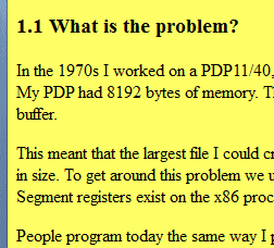
Readability to the rescue! Here are before and after screen shots.
Before:
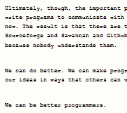
After:
I recommend the article, Example of Literate Programming in HTML [Update: link went away], and I also recommend using reformatting the page unless you enjoy reading black text on a yellow background.
Readability did a good job until about half way through the article. The article has C and HTML code examples, and perhaps these confused Readability. (Readability usually handles code samples well. It correctly formats the first few code samples in this article.) The last half of the article renders like source code, and the font gets smaller and smaller.
I ran the page through an HTML validator to see whether some malformed HTML could be the source of the problem. The validator found numerous problems, so perhaps that was the issue.
I haven’t seen Readability fail like this before. I’ve been surprised how well it has handled some pages I thought might trip it up.
I ended up saving the article and editing its source, changing the bgcolor value to white. It’s a nice article on literate programming once you get past the formatting. The best part of the article is the first section, and that much Readability formats correctly.
Instapaper
Instapaper reformats web pages similarly. It produces a narrower column of text, but otherwise the output looks quite similar.
Instapaper did not discover the title of the literate programming article. (The title of the article was not in an <h1> tag as software might expect but was only in a <title> tag in the page header.) However, it did format the entire body of the article correctly.
I find it slightly more convenient to use the Readability bookmarklet than to submit a link to Instapaper. I imagine there are browser plug-ins that make Instapaper just as easy to use, though I haven’t looked into this because I’m usually satisfied with Readability.
I find that dark gray on white has much better readability on LCD screens than black on white. Probably the anti-aliasing works better.
You could try reporting the bug to the Readability developers. A bug I once reported was fixed it in just a few days (and they even sent me an email to confirm that it was fixed).
Another thing, I love Chrome’s “Inspect Element” feature. It lets you modify the markup of the page on the fly without saving and editing it in a text editor.
I submit basically every article to Instapaper for reading on my Kindle (on the bus or in bed or at the gym).
You can get a bookmarklet like Readability’s “Read Now” on Instapaper’s Extras page. Look for “Instapaper Text bookmarklet”.
Once upon a time some slide rules were yellow… See
“HOW PICKETT EYE-SAVER SLIDE RULES SAVE EYESTRAIN — AID ACCURACY”
http://www.sphere.bc.ca/test/pickett.html
Here’s a great colour scheme that really does help to reduce eye strain when working with terminals and text editors: http://ethanschoonover.com/solarized. It works well for Web pages too.
Simpler, but less sophisticated, ways to get rid of the yellow background:
Firefox: Main Menu -> View -> Page Style -> No Style
Many browsers: The “zap colors” bookmarklet from https://www.squarefree.com/bookmarklets/zap.html — there’s lots of other really neat tweaks on that site too. What I like about the squarefree bookmarklets is that they’re simple and don’t bounce the whole page through a 3rd party server.
Ibrahim: Thanks for the link. I sent Readability a bug report.
You can also check the iReader extension for firefox and chrome
While the iReader extension is pretty nice, it doesn’t recognize the article John refers to as an article, so iReader won’t reformat it.
Hi, here is a working version of reader extension for chrome browser: https://chrome.google.com/webstore/detail/gnadbfndefpicpmbogbcemhagplbmfkh
Cause the latest version of ireader is not working with 18 chrome