Sometimes a good diagram is a godsend, reducing the entropy in your head at a glance.
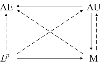
When I was studying integration theory, I ran across a diagram something like the following in the out-of-print book Elements of Integration by Robert G. Bartle.

Each arrow summarizes a theorem. The four corners stand for modes of convergence: almost everywhere, almost uniform, Lp, and convergence in measure. A solid line from one mode to another means that if a sequence of function converges in the first mode then it also converges in the other. A dashed line means that a subsequence converges in the second mode. For example, if a sequence of functions fn converge to a function f, then the sequence also converges in measure to f, and a subsequence converges to f almost everywhere.
Note that this isn’t the typical mathematical diagram where the corners represent spaces and the arrows represent functions. I don’t recall seeing anything like this outside of Bartle’s book.
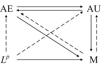
For a finite measure space, additional relationships hold as summarized in the diagram below.

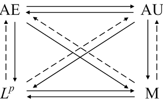
If the sequence fn is uniformly dominated by an Lp function g, then even more relationships hold.

For more details, see modes of convergence. These notes also contain counterexamples that show no other relationships exist. Three simple counterexamples suffice to show no arrows are missing.

This is a fantastic summary on the primary modes of convergence. I’m currently studying for a qualifying exam in real analysis, and your synopsis is greatly appreciated. Many thanks.
“Sometimes a good diagram is a godsend, reducing the entropy in your head at a glace.” – I SO AGREE! What tool did you use, John? I’d have used http://www.creately.com
I don’t remember what tool I used. Maybe Visio. These days I’d use Inkscape, but I don’t think I’d starting using Inkscape when this was written.