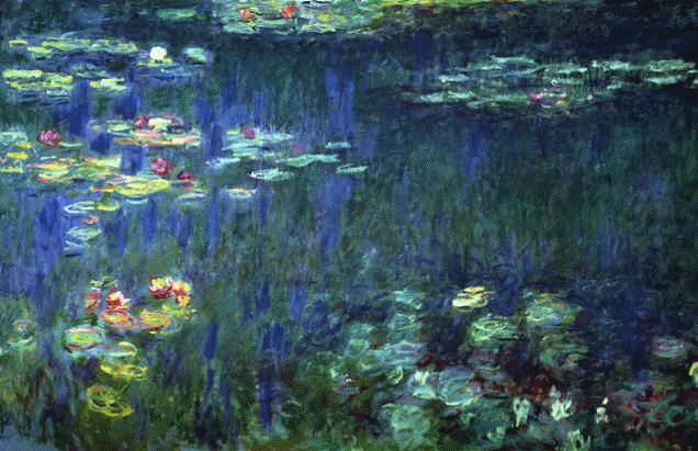
The other day Nils gave an interesting answer to a question on StackOverflow regarding color theory.
NEVER ever use pure colors. … If you have no idea what color to start with, get a classic masterpiece of painting from the net. Blur it a bit and then pick some nice colors from it. If you use some common sense it’s hard not to end with pleasant colors this way.
He gave the example of extracting this color scheme

from this painting.


That’s a very clever idea!
I’m not sure what this color scheme is intended for (if anything) but I suspect this is a good way to pick colors for graphs and charts. I usually start with black, red, blue, green, and so forth but one problem is that before long I wind up with colors which will be difficult for color blind people to distinguish. One solution to that is to take for example the red and green and tint them differently, but of course the resulting collection of colors looks haphazard. My guess is that by choosing ‘impure’ colors which are pleasing together one will generally also have a palette with colors which are distinct to color blind people as well.
For selecting colours for charts and diagrams, ColorBrewer is great: http://www.colorbrewer.org/
It provides a number of colour palettes for different purposes (sequential data, e.g., 1, 2, 3, 4, 5, diverging data, e.g., –2, 1, 0, 1, 2, or qualitative data, e.g., A, B, C, D, E) and in different sizes.
For each colour palette, it has information on whether the colours are suitable for colour blind people, for black and white printing, for use with projectors, etc. And the colours all look ‘nice’ (e.g., no bright cyan to hurt your eyes!).
There’s even an R implementation.
Karl, that is simply awesome!
Thank you so much for that link!