Sometimes a graph looks wiggly because it’s actually quite flat.
This isn’t much of a paradox; the resolution is quite simple. A graph may look wiggly because the scale is wrong. If the graph is flat, graphing software may automatically choose narrow vertical range, accentuating noise in the graph. I haven’t heard a name for this, though I imagine someone has given it a name.
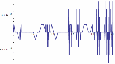
Here’s an extreme example. The following graph was produced by the Mathematica command Plot[Gamma[x+1] - x Gamma[x], {x, 0, 1}].

This is unsettling the first time you run into it, until you notice the vertical scale. In theory, Γ(x + 1) and x Γ(x) are exactly equal. In practice, a computer returns slightly different values for the two functions for some arguments. The differences are on the order of 10−15, the limit of floating point precision. Mathematica looks at the range of the function being plotted and picks the default vertical scaling accordingly.
In the example above, the vertical scale is 15 orders of magnitude smaller than the horizontal scale. The line is smooth as glass. Actually, it’s much smoother than glass. An angstrom is only 10 orders of magnitude smaller than a meter, so you wouldn’t have to look at glass under nearly as much magnification before you see individual atoms. At a much grosser scale you’d see imperfections in the glass.
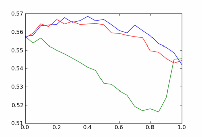
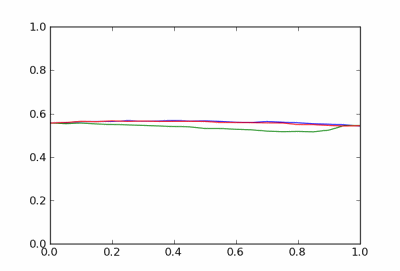
The graph above is so jagged that it demands our attention. When the horizontal axis is closer to the proper scale, say off by a factor of 5 or 10, the problem can be more subtle. Here’s an example that I ran across yesterday.

The curves look awfully jagged, but this is just simulation noise. The function values are probabilities, and when viewed on a scale of probabilities the curves look unremarkable.


My work involves radar-based detection of particular object classes in a noisy environment, and it is interesting to have watched the evolution of the scientists who develop the detection and classification algorithms over time.
At first there was enormous debate over marginal performance improvements — but those measurements suffered from wiggle noise very similar to this, mostly because the differences in performance were only a few targets, and small changes in the environmental noise could change those in either direction.
To address that, they then often drew receiver operating curves with over/under ranges of the performance line based on Bayesian statistics — and found that the confidence bounds overlapped for almost all of the algorithms, even though they could measure the differences between the algorithms in quasi-real-world situations.
Now they prefer subset analysis using ANOVA, which seems to give more accurate measures of the relative performance levels, and allows them to choose algorithms that are better at detecting the items that they are worried the most about for a particular system.
Selecting the appropriate scale for a graph is a really important part of communicating with graphs. Inappropriate scales chosen intentionally can mislead. Even good intentions won’t save us from a fetish for greater precision. Is there any science to guide us in selecting the scales?
Another thing I see *all the time* is when graphs are truncated.
For (fictional) example, let’s say that Romney has a 93% disapproval rating, and Gingrich has a 96% disapproval rating. I’ll often see graphs in the media where the “y=0” point will be at 90%, thus the full height of the graph represents the last 10% of the measure. When graphed, it will look like 2x as many people hate Gingrich , even though it’s only a few percent. Without the common 90% shown, the difference looks much bigger.
P.S. The numbers are fictional & I’m not political, I’ve just seen so many graphs like this recently, it’s in the forefront of my mind.
This is also appears in gene-expression studies where it is common to plot log-expression ratios against log-intensities. If not fixing the scale, a sample without differentially expressed (DE) genes will, to the eye, appear nosier compared with a sample with a few DE genes.
PS. An alternative name to this could be “the wiggle illusion” since it is mostly a visual “artifact”.
Interestingly, Maxima and Gnuplot don’t have any of that nonsense when plotting that graph. Maybe it’s less about the hardware and more about the software.
I think it’s actually a rather large problem in data graphics. Often the numbers on the left-hand scale are the most important data in a graphic, but they’re not what my eye is drawn to.
Sort of like in regressoin analysis, the most important number (β for a significant variable) is hidden in the middle of the output table (not bolded unless I’m writing the report).
When I worked at Bain and Company*, they called them “New York Times graphs”, IIRC
*At the dawn of time ☺
Lesson: check the scales always..