Several people responded to my previous post asserting that screen readers would not be able to read text formatted via Unicode variants. Maybe some screen readers can’t handle this, but there’s no reason they couldn’t.
Before I go any further, I’d like to repeat my disclaimer from the previous post:
It’s a dirty hack, and I’d recommend not overdoing it. But it could come in handy occasionally. On the other hand, some people may not see what you intend them to see.
This formatting is gimmicky and there are reasons to only use it sparingly or not at all. But I don’t see why screen readers need to be stumped by it.
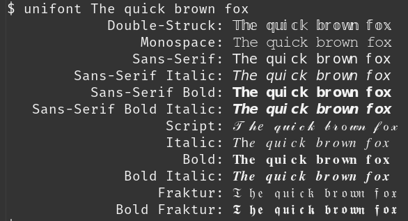
In the example below, I format the text “The quick brown fox” by running it through unifont as in the previous post.
If we pipe the output through unidecode then we mostly recover the original text. (I wrote about unidecode here.)
    $ unifont The quick brown fox | unidecode

            Double-Struck: The quick brown fox
                Monospace: The quick brown fox
               Sans-Serif: The quick brown fox
        Sans-Serif Italic: The quick brown fox
          Sans-Serif Bold: The quick brown fox
   Sans-Serif Bold Italic: The quick brown fox
                   Script: T he quick brown fox
                   Italic: The quick brown fox
                     Bold: The quick brown fox
              Bold Italic: The quick brown fox
                  Fraktur: T he quick brown fox
             Bold Fraktur: T he quick brown fox
The only problem is that sometimes there’s an extra space after capital letters. I don’t know whether this is a quirk of unifont or unidecode.
This isn’t perfect, but it’s a quick proof of concept that suggests this shouldn’t be a hard thing for a screen reader to do.
Maybe you don’t want to normalize Unicode characters this way all the time, but you could have some configuration option to only do this for Twitter, or to only do it for characters outside a certain character range.
The extra space between T and h might be related to the Th ligature.
As one of the people who complained on the previous post, I appreciate this :-)