Stefan Steinerberger defines “an amusing sequence of functions” in [1] by
![]()
Here’s a plot of f30(x):
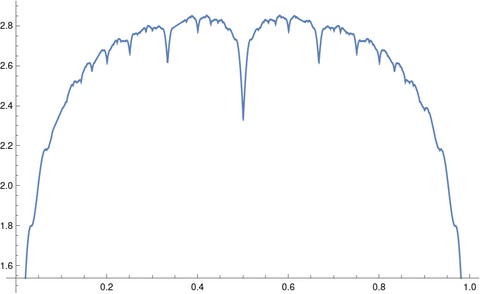
As you can see, fn(x) has a lot of local minima, and the number of local minima increases rapidly with n.
Here’s a naive attempt to produce the plot above using Python.
    from numpy import sin, pi, linspace
    import matplotlib.pyplot as plt

    def f(x, n):
        return sum( abs(sin(k*pi*x))/k  for k in range(1, n+1) )

    x = linspace(0, 1)
    plt.show()
This produces the following.
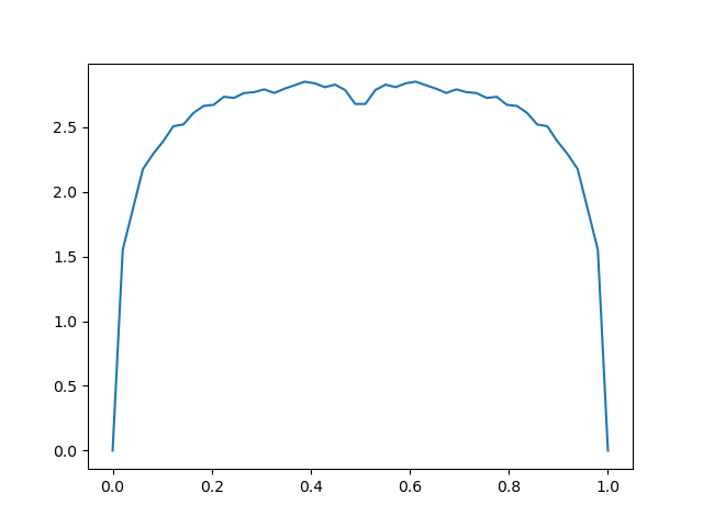
The code above doesn’t specify how finely to divide the interval [0, 1], and by default linspace will produce 50 evenly spaced points. In the example above we need a lot more points. But how many? This is not a simple question.
You could try more points, adding a third argument to linspace, say 1000. That will produce something that looks more like the first plot, but is the first plot right?
The first plot was produced by the Mathematica statements
    f[x_, n_] := Sum[Abs[Sin[Pi k x]/k], {k, 1, n}]
    Plot[f[x, 30], {x, 0, 1}]
Mathematica adaptively determines how many plotting points to use. It tries to detect when a function is changing rapidly in some region and allocate more points there. The function that is the subject of this post makes a good test case for such automated refinement.
Often Mathematica does a good enough job automatically, but sometimes it needs help. The Plot function takes additional parameters like PlotPoints and MaxRecursion that you can use to tell Mathematica to work harder.
It would be an interesting exercise to make a high quality plot of fn for some moderately large n, making sure you’ve captured all the local minima.
[1] Stefan Steinerberger. An Amusing Sequence of Functions. Mathematics Magazine, Vol. 91, No. 4 (October 2018), pp. 262–266
Turns out I’ve been working on this problem recently, and I thought you might enjoy some of what I have learned. It appears the “correct” way to plot functions is with interval arithmetic, assuming the interval dependency problem is not too bad. This is what Maple does; I believe they used this paper by Tupper.
My context in working on this problem was a bit different; I assumed the user was able to compute a function f in double precision, but I couldn’t induce the user the to recompile the code with an interval type. In this case, you can’t guarantee that you recover all maxima, and indeed plotting sin(1/x) looks horrible:
In this case, I figured the following was a reasonable default: Find the pixel resolution of the screen. Evaluate the function at the edge of each pixel, and traverse a line connecting all vertical pixels. Fill in a circle around each marked pixel to construct the parallel curve.
It appears that when you do this, the maxima of your function are recovered. However, they seem to be “washed out”, not because of insufficient resolution, but by the parallel curve: