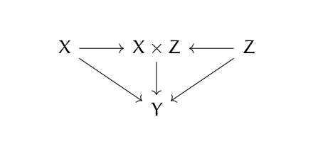
I was thumbing through a new book on causal inference, The Effect by Nick Huntington-Klein, and the following diagram caught my eye.

Then it made my head hurt. It looks like a category theory diagram. What’s that doing in a book on causal inference? And if it is a category theory diagram, something’s wrong. Either there’s a typo or the arrows are backward.
The diagram above is a valid commutative diagram, but for a coproduct rather than a product. That is, X × Z should be labeled X ⨿ Z. (For more on that, see my post on categorical products, and reverse all the arrows in your mind.)
But there’s no category theory going on here. This is an influence diagram. It says that X and Z influence Y directly (indicated by the diagonal arrows), but they also determine the product X × Z (the ordinary product of two numbers, no fancy category stuff) and this product in turn also influences Y.

After several unsuccessful attempts to get anywhere with Category Theory, I came across the introductory book by Harold Simmons, which I recommend very highly. He keeps the pace quite modest and the chapters short. This is certainly the friendliest introduction I have found.