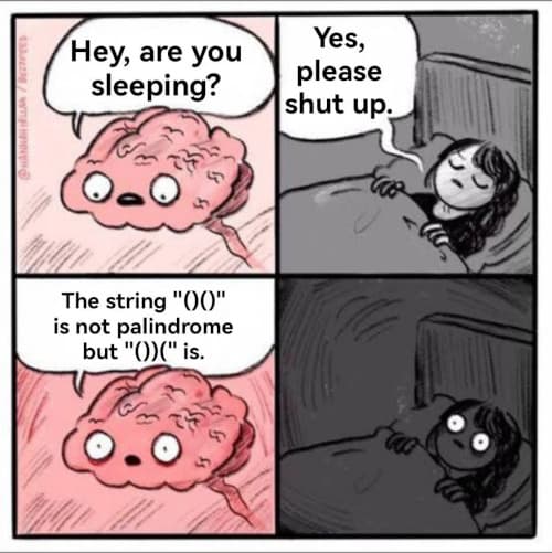
I recently ran into the following comic strip online:
[Update: Thanks to Bryan Cantanzaro for letting me know via the comments that the image above was created by Hannah Hillam. The version I found had had her copyright information edited out. I will replace the image above with a legitimate version shortly.]
[Update 2: I’m not sure this is a Hannah Hillam cartoon per se; I haven’t found the exact source. Hannah Hillam makes a template available to let people put their own words in the format above, and the template does not contain a copyright notice. Maybe someone besides her make the cartoon above. The fact that the words are not hand drawn suggests this is the case. If you know who created the image please let me know and I will gladly credit them. ]
The comic is unsettling because it points out that a palindrome is a symmetric sequence of characters, which is not the same as a visually symmetric sequence.
What words are symmetric in the sense that “()()” is symmetric, i.e. visually symmetric rather than a symmetric sequence of characters?
The question isn’t well defined without some assumptions. Visual symmetry depends on whether characters are written in lower case or upper case, and it depends on the choice of font.
Let’s look at upper case first. I will assume the following letters are symmetric: A, H, I, M, O, T, U, V, W, X, and Y. Then the following words are symmetric: A, AHA, HAH, HUH, I, MAAM, MUM, TAT, TIT, TOOT, TOT, TUT, WOW.
For lower case, I will assume the following letters are symmetric: i, l, m, o, u, v, w, x, y. And I will assume b and d are mirror images, as well as p and q.
With these assumptions, the following words are symmetric: bid, bud, dib, doob, dub, ulu, wow.
An ulu, according to dictionary.com, is “a knife with a broad, nearly semicircular blade joined to a short haft at a right angle to the unsharpened side: a traditional tool of Inuit or Yupik women.”
I heard on Futility Closet that in a video game — possibly Mortal Kombat — one of the characters had the word “MAXIMUM” written vertically on his clothes so that when he faced the other way, it would look the same.
“bod” is also visually symmetric (short for “body”, among other things; listed on merriam-webster.com and in fairly common usage, e.g., in the phrase “dad bod”)
Please note that this comic was taken (with the attribution REMOVED) from Hannah Hillam. https://www.instagram.com/p/CgyShBxusuM/
Thanks, Bryan. I didn’t know where the image came from and didn’t realize it had been tampered with.
[Update: Maybe the cartoon is a legitimate use of a template the author of the comic provides. See the updates in the post.]
TOYOTA is almost there, throw in an article and it sort of works
Regarding the origin of the comic, knowyourmeme’s article (“Are You Going To Sleep?”) credits the BuzzFeed article “15 Conversations You Have With Your Own Brain”, which looks to be accurate.
The comic there is by Hannah Hillam, but it’s an earlier version than the one you linked, with the attribution information in a different part of the image. That information _is_ preserved in the image you posted, but it’s hard to read because of the image quality.
Following up on my other comment about the orientation of parentheses versus the orientation of text – it’s worth observing that in writing systems that actually could be written from right to left or left to right, asymmetric letters were oriented according to the direction of reading, rather than absolutely. ( https://en.wikipedia.org/wiki/Boustrophedon )
This contrasts with the modern approach where letters have an absolute form, and there’s only one possible direction of reading.
“pod” is symmetric, but only rotationally.
As mentioned by Malcom in an earlier comment, the comic is drawn by Hannah Hillam but it was an image she drew for Buzzfeed. This is discussed with links in the Know Your Meme entry ‘Are You Going to Sleep?’ (https://knowyourmeme.com/memes/are-you-going-to-sleep).