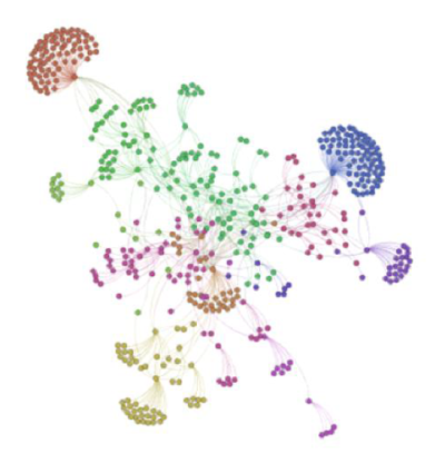
John Johnson did an analysis of the statistics blogosphere for the Coursera Social Networking Analysis class. His blog post about the analysis lists some of the lessons he learned from the project. It also includes a link to his paper and to the Python code used to do the analysis.

Image from Figure 6 of John’s paper.
Related: Help understanding complex networks

Thanks John. By the way, the Gephi files (Gephi, http://www.gephi.org, is the graph analysis program I used to make the images) are available on the Github site, so you can find yourself in there, lay the graph out a different way, and simply have fun with it. I’ll probably try something other than a poor man’s natural language processing on this data pretty soon, as well.