Posterior variance

A few days ago I wrote a post entitled Does additional data always reduce posterior variance?. In a nutshell, the answer is no, not always.

That led the previous post which looked at posterior means for three Bayesian models, showing how the posterior mean is a weighted average of the prior mean and the mean of the new data. The weights are precisions, which means something different for each model.

For the beta-binomial model, variance may increase when seeing unexpected data (details here), but precision always increases.

For the normal-normal model precision is the reciprocal of variance. Every new data point makes precision go up and posterior variance go down.

The Poisson-gamma model may be the most interesting. As stated in the previous post, if data has a Poisson distribution with parameter λ, and λ has a gamma(α0, β0) prior distribution, then the posterior distribution on λ after observing k events over time t has a gamma(α0 + k, β0 + t) posterior distribution. Therefore the posterior variance is

0 + k) / (β0 + t)².

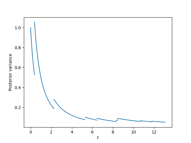
Note the posterior variance is an increasing function of k and a decreasing function of t. This means that the posterior variance increases every time an event is observed, and it decreases quadratically between observations.

Here’s an illustration. I simulated data from a Poisson process with λ and used a gamma(1, 1) prior on λ. Here’s a plot of the posterior variance.

Posterior mean

Common sense says that what you believe after seeing new data should be some sort of compromise between what you believed before and what the new data says. You don’t want to ignore previous information or new information.

How much should new data change your prior beliefs? When prior judgment and new information are in conflict, which one should be given the benefit of the doubt?

Bayesian data models provide a framework for making such decisions quantitative and objective. The choice of a data model is somewhat subjective—whether it’s a Bayesian model or not—but given a Bayesian model, the rules for updating the representation of your beliefs are objective. As some put it, you “turn the Bayesian crank.” A likelihood model and a prior on parameters together specify how new data changes the prior distribution into a posterior distribution.

We will make this more concrete with three examples.

Normal-normal model

Suppose that data X has a normal distribution with unknown mean μ and known variance σ², and we assume that a priori μ has a normal distribution with mean μ0 and variance σ0².

After observing x, the posterior distribution on μ also has a normal distribution, but with a different mean and variance. Its mean is somewhere between the prior mean and x. We will ignore the change in the variance for this post.

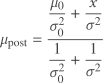
The posterior mean of μ is

\mu_{\text{post}} = \frac{\dfrac{\mu_0}{\sigma_0^2} + \dfrac{x}{\sigma^2}}{\dfrac{1}{\sigma_0^2} + \dfrac{1}{\sigma^2}}

This equation becomes more understandable when we introduce precisons τ = 1/σ² and τ0 = 1/σ0².

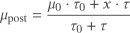
Then we have

\mu_{\text{post}} = \frac{\mu_0 \cdot \tau_0 + x \cdot \tau}{\tau_0 + \tau}

which you can read as saying the posterior mean is the weighted average of the prior mean and x, with the weights given by the precision. Intuitively, you take the weighted mean of your conclusions from previous data and new data, weighting the mean according to how much confidence you have in each.

Beta-binomial model

Now let’s switch over to a different data model. Now assume X is a binary random variable, with probability of success p and probability of failure 1 − p, and we assume p has a beta(a, b) distribution.

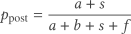
After observing s successes and f failures, the posterior mean of the distribution on p becomes

p_{\text{post}} = \frac{a + s}{a + b + s + f}

We can rewrite this as

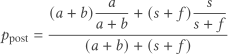
p_{\text{post}} = \frac{(a + b) \dfrac{a}{a+b} + (s + f) \dfrac{s}{s+f}}{(a + b) + (s +f)}

This says that the posterior mean is the weighted average of the prior mean a/(a + b) and the mean of the data s/n. The weights are the prior effective sample size a + b and the sample size of the new data n. In this example (effective) sample size is playing the role that precision played in the normal-normal model above.

Gamma-Poisson model

Suppose data have a Poisson distribution with parameter λ, and λ has a gamma(α0, β0) prior distribution [1]. And suppose you observe k events over time t. Then the posterior distribution of λ given the data has a gamma(α0 + k, β0 + t) prior distribution and the mean of the posterior distribution is given by

\lambda_{\text{post}} = \frac{\alpha_0 + k}{\beta_0 + t} = \frac{\beta_0 (\alpha_0 / \beta_0) + t (k / t)}{\beta_0 + t}

As before, the posterior mean is a weighted average of the prior mean and new data, and the weights are interpretable as some sort of measure of confidence, namely time. The variable t is directly time and the parameter β0 is sort of an effective time, just as a + b is an effective sample size for the beta distribution.

Common thread

In each example the posterior mean is the weighted average of the prior mean and the mean of the data, with the weights given by a precision. However, precision means something different in each example. In the normal-normal model, precision is the reciprocal of variance, but in the beta-binomial model precision is sample size and in the Poisson-gamma model precision is time.

What all three examples have in common is that they are conjugate models using distributions from the “exponential family” of probability distributions. In technical terms, precision is the multiplicative factor on the sufficient statistic in the exponent of the posterior kernel.

Related posts

[1] There are multiple conventions for parameterizing the gamma distribution. Here we’re using the shape-rate parameterization, where the mean is α/β.

Copy and paste law

I was doing some research today and ran into a couple instances where part of one law was copied and pasted verbatim into another law. I suppose this is not uncommon, but I’m not a lawyer, so I don’t have that much experience comparing laws. I do, however, consult for lawyers and have to look up laws from time to time.

Here’s an example from California Health and Safety Code § 1385.10 and the California Insurance Code § 10181.10.

The former says

The health care service plan shall obtain a formal determination from a qualified statistician that the data provided pursuant to this subdivision have been deidentified so that the data do not identify or do not provide a reasonable basis from which to identify an individual. If the statistician is unable to determine that the data has been deidentified, the health care service plan shall not provide the data that cannot be deidentified to the large group purchaser. The statistician shall document the formal determination in writing and shall, upon request, provide the protocol used for deidentification to the department.

The latter says the same thing, replacing “health care service plan” with “health insurer.”

The health insurer shall obtain a formal determination … health insurer shall not provide the data … for deidentification to the department.

I saved the former in a file cal1.txt and the latter in cal2.txt and verified that the files were the same, with a search and replace, using the following shell one-liner:

diff <(sed 's/care service plan/insurer/g' cal1.txt) cal2.txt

I ran into this because I often provide statistical determination of deidentification, though usually in the context of HIPAA rather than California safety or insurance codes.

Related posts

Sigmas and Student

I saw something yesterday saying that the Japanese bond market had experienced a six standard deviation move. This brought to mind a post I’d written eight years ago.

All probability statements depend on a model. And if you’re probability model says an event had a probability six standard deviations from the mean, it’s more likely that your model is wrong than that you’ve actually seen something that rare. I expand on this idea here.

How likely is it that a sample from a random variable will be six standard deviations from its mean? If you have in mind a normal (Gaussian) distribution, as most people do, then the probability is on the order of 1 chance in 10,000,000. Six sigma events are not common for any distribution, but they’re not unheard of for distributions with heavy tails.

Let X be a random variable with a Student t distribution and ν degrees of freedom. When ν is small, i.e. no more than 2, the tails of X are so fat that the standard deviation doesn’t exist. As ν → ∞ the Student t distribution approaches the normal distribution. So in some sense this distribution interpolates between fat tails and thin tails.

What is the probability that X takes on a value more than six standard deviations from its mean at 0, i.e. what does the function

f(ν) = Prob(X > 6σ)

look like as a function of ν where σ² = ν/(ν − 2) is the variance of X?

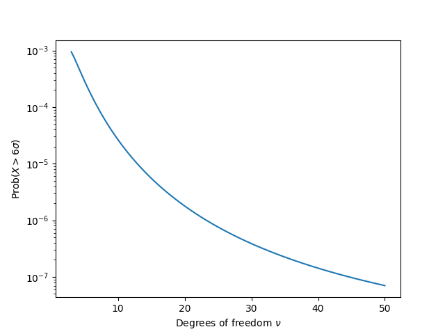
As you’d expect, the limit of f(ν) as ν → ∞ is the probability of a six-sigma event for a normal distribution, around 10−7 as mentioned above. Here’s a plot of f(ν) for ν > 3. Notice that the vertical axis is on a log scale, i.e. the probability decreases exponentially.

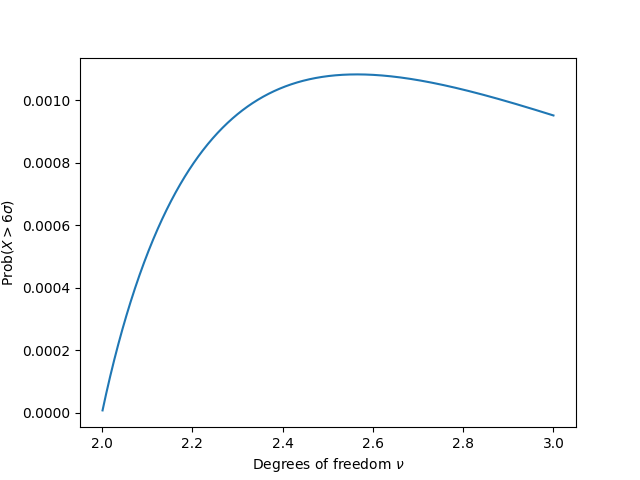
What you might not expect is that f(ν) isn’t monotone. It rises to a maximum value before it decays exponentially. In hindsight this makes sense. As ν → 2+ the variance becomes infinite, and the probability of being infinitely far from the mean is 0. Here’s a plot of f(ν) between 2 and 3.

So six sigma probabilities for a Student t distribution rise from 0 up to a maximum of around 10−3 then decrease exponentially, then asymptotically approach a value around 10−7.

Related posts

Stylometry

I was reading an article this morning that mentioned a stylometric analysis of a controversial paragraph written by Roman historian Flavius Josephus. I’ve written several posts that could be called stylometry or adjacent, but I haven’t used that word. Here are some posts that touch on the statistical analysis of a text or of an author.

Trying to fit exponential data

The first difficulty in trying to fit an exponential distribution to data is that the data may not follow an exponential distribution. Nothing grows exponentially forever. Eventually growth slows down. The simplest way growth can slow down is to follow a logistic curve, but fitting a logistic curve has its own problems, as detailed in the previous post.

Suppose you are convinced that whatever you’re wanting to model follows an exponential curve, at least over the time scale that you’re interested in. This is easier to fit than a logistic curve. If you take the logarithm of the data, you now have a linear regression problem. Linear regression is numerically well-behaved and has been thoroughly explored.

There is a catch, however. When you extrapolate a linear regression, your uncertainly region flares out as you go from observed data to linear predictions based on the observed data. Your uncertainty grows linearly. But remember that we’re not working with the data per se; we’re working with the logarithm of the data. So on the original scale, the uncertainty flares out exponentially.

Weighting an average to minimize variance

Suppose you have $100 to invest in two independent assets, A and B, and you want to minimize volatility. Suppose A is more volatile than B. Then putting all your money on A would be the worst thing to do, but putting all your money on B would not be the best thing to do.

The optimal allocation would be some mix of A and B, with more (but not all) going to B. We will formalize this problem and determine the optimal allocation, then generalize the problem to more assets.

Two variables

Let X and Y be two independent random variables with finite variance and assume at least one of X and Y is not constant. We want to find t that minimizes

\text{Var}[tX + (1-t)Y]

subject to the constraint 0 ≤ t ≤ 1. Because X and Y are independent,

\text{Var}[tX + (1-t)Y] = t^2 \text{Var}[X] + (1-t)^2 \text{Var}[Y]

Taking the derivative with respect to t and setting it to zero shows that

t = \frac{\text{Var}[Y]}{\text{Var}[X] + \text{Var}[Y]}

So the smaller the variance on Y, the less we allocate to X. If Y is constant, we allocate nothing to X and go all in on Y.  If X and Y have equal variance, we allocate an equal amount to each. If X has twice the variance of Y, we allocate 1/3 to X and 2/3 to Y.

Multiple variables

Now suppose we have n independent random variables Xi for i running from 1 to n, and at least one of the variables is not constant. Then we want to minimize

\text{Var}\left[ \sum_{i=1}^n t_i X_i \right] = \sum_{i=1}^n t_i^2 \text{Var}[X_i]

subject to the constraint

\sum_{i=1}^n t_i = 1

and all ti non-negative. We can solve this optimization problem with Lagrange multipliers and find that

t_i \text{Var}[X_i] = t_j \text{Var}[X_j]

for all 1 ≤ i, jn. These (n − 1) equations along with the constraint that all the ti sum to 1 give us a system of equations whose solution is

t_i = \frac{\prod_{j \ne i} \text{Var}[X_j]}{\sum_{i = 1}^n \prod_{j \ne i} \text{Var}[X_j]}

Incidentally, the denominator has a name: the (n − 1)st elementary symmetric polynomial in n variables. More on this in the next post.

Related posts

Distribution of correlation

One of the more subtle ideas to convey in an introductory statistics class is that statistics have distributions.

Students implicitly think that when you calculate a statistic on a data set, say the mean, that then you have THE mean. But if your data are (modeled as) samples from a random variable, then anything you compute from those samples, such as the mean, is also a random variable. When you compute a useful statistic, it’s not as random as the data, i.e. it has smaller variance, but it’s still random.

A couple days ago I wrote about Fisher’s transform to make the distribution sample correlations closer to normal. This post will make that more concrete.

Preliminaries

We’ll need to bring in a few Python libraries. While we’re at it, let’s set the random number generator seed so the results will be reproducible.

import numpy as np
import matplotlib.pyplot as plt
from scipy.stats import skew

np.random.seed(20251020)

Correlated RNG

Next, we’ll need a way to generate correlated random samples, specifying the correlation ρ and the sample size N.

def gen_correlated_samples(rho, N):
    mean = [0, 0]
    cov = [
        [1, rho],
        [rho, 1]
    ]
    return np.random.multivariate_normal(mean, cov, size=N)

Calculating correlation

Once we generate correlated pairs, we need to calculate their correlation. To be more precise, their linear (Pearson) correlation. To do this we’ll find the empirical covariance matrix, the sample counterpart to the covariance matrix specified in the generator code above. The correlation coefficient is then the off-diagonal element of the covariance matrix.

def pearsonr(X):
    correlation_matrix = np.corrcoef(X[:,0], X[:,1])
    return correlation_matrix[0, 1]

Simulation

Now we’re ready to do our simulation.

M = 10000
rs = np.zeros(M)
for i in range(M):
    X = gen_correlated_samples(0.9, 100)
    rs[i] = pearsonr(X)

Notice that there are two levels of sampling. We’re generating random samples of size 100 and computing their correlation; that’s sampling our underlying data. And we’re repeating the process of computing the correlation 10,000 times; that’s sampling the correlation.

Untransformed distribution

Next we view the distribution of the correlation values.

plt.hist(rs, bins=int(np.sqrt(M)))
plt.show()
plt.close()

This gives the following plot.

It’s strongly skewed to the left, which we can quantify by calculating the skewness.

print(skew(rs))

This tells us the skewness is −0.616. A normal distribution has skewness 0. The negative sign tells us the direction of the skew.

Transformed distribution

Now let’s apply the Fisher transformation and see how it makes the distribution much closer to normal.

xformed = np.arctanh(rs)
plt.hist(xformed, bins=int(np.sqrt(M)))
plt.show()
plt.close()
print(skew(xformed))

This produces the plot below and prints a skewness value of −0.0415.

Small correlation example

We said before that when the correlation ρ is near zero, the Fisher transformation is less necessary. Here’s an example where ρ = 0.1. It’s not visibly different from a normal distribution, and the skewness is −0.1044.

Observation and conjecture

In our two examples, the skewness was approximately −ρ. Was that a coincidence, or does that hold more generally? We can test this with the following code.

def skewness(rho):
    rs = np.zeros(M)
    for i in range(M):
        X = gen_correlated_samples(rho, 100)
        rs[i] = pearsonr(X)
    return skew(rs)
    
rhos = np.linspace(-1, 1, 100)
ks = [skewness(rho) for rho in rhos]
plt.plot(rhos, ks)
plt.plot(rhos, -rhos, "--", color="gray")
plt.show()

Here’s the resulting plot.

It looks like the skewness is not exactly −ρ, but −cρ for some c < 1. Maybe c depends on the inner sample size, in our case 100. But it sure looks like skewness is at least approximately proportional to ρ. Maybe this is a well-known result, but I haven’t seen it before.

Distribution of coordinates on a sphere

Almost Sure posted an interesting fact on X:

If a point (x, y, z) is chosen at random uniformly on the unit sphere, then x, y, and z each have the uniform distribution on [−1, 1] and zero correlations (but not independent!) This follows from Archimedes’ “On the Sphere and Cylinder” published in 225BC.

Archimedes effectively showed that projecting a sphere to a cylinder wrapping round its equator preserves area, so projection of (x,y,z) is uniform on the cylinder. Used in Lambert cylindrical equal area projection.

In this post I want to empirically demonstrate the distribution of the coordinates, their lack of linear correlation, and their dependence.

The usual way to generate random points on a sphere is to generate three samples from a standard normal distribution and normalize by dividing by the Euclidean norm of the three points. So to generate a list of N points on a sphere, I generate an N × 3 matrix of normal samples and divide each row by its norm.

import numpy as np

N = 10000
# Generate N points on a sphere
M = norm.rvs(size=(N, 3))
M /= np.linalg.norm(M, axis=1)[:, np.newaxis]

Next, I find the correlation of each column with the others.

x = M[:, 0]
y = M[:, 1]
z = M[:, 2]
cxy, _ = pearsonr(x, y)
cyz, _ = pearsonr(y, z)
cxz, _ = pearsonr(x, z)
print(cxy, cyz, cxz)

When I ran this I got correlations of -0.0023, 0.0047, and -0.0177. For reasons explained in the previous post, I’d expect values in the interval [−0.02, 0.02] if the columns were independent, so the correlations are consistent with that hypothesis.

To demonstrate that each column is uniformly distributed on [−1, 1] you could look at histograms.

import matplotlib.pyplot as plt

plt.hist(x, bins=int(N**0.5))
plt.show()
plt.hist(y, bins=int(N**0.5))
plt.show()
plt.hist(z, bins=int(N**0.5))
plt.show()

I’ll spare you the plots, but they look like what you’d expect. If you wanted to do something more analytical than visual, you could compute something like the Kolmogorov-Smirnov statistic.

The coordinates are not independent, though they have zero linear correlation. Maybe a test for nonlinear dependence will work. I tried Spearman’s rank correlation and Kendall’s tau, and neither detected the dependence. But distance correlation did.

from dcor import distance_correlation

cxy = distance_correlation(x, y)
cyz = distance_correlation(y, z)
cxz = distance_correlation(x, z)
print(cxy, cyz, cxz)

Each of the distance correlations was approximately 0.11, substantially greater than zero, implying dependence between the coordinates.

Related posts

Inferring sample size from confidence interval

The previous post reported that a study found a 95% confidence interval for the the area of the Mandelbrot set to be 1.506484 ± 0.000004. What was the sample size that was used to come to that conclusion?

A 95% confidence interval for a proportion is given by

\hat{p} \pm 1.96 \sqrt{\frac{\hat{p} \,(1 - \hat{p})}{n}}

and so if a confidence interval of width w is centered at the proportion estimate p hat, then we can solve

\frac{w}{2} = 1.96 \sqrt{\frac{\hat{p} (1 - \hat{p})}{n}}

to find

n = 15.37 \frac{\hat{p}(1 - \hat{p})}{w^2}

Now in the example at the top of the post, we’re randomly sampling points from the square [−2, 2] × [−2, 2] and counting how many land inside the Mandelbrot set. The square has area 16, so p hat equals 1.506484 / 16. The width of the confidence interval for the area is 8 × 10⁻⁶. This means the width of the confidence interval for the proportion is 5 × 10⁻⁷, and so n = 5.244 × 10¹².

Doubts regarding Mandelbrot area

The reasoning above is correct for inferring sample size from a confidence interval, but the specific application to the Mandelbrot set is suspect. Did someone really do over a trillion iterations? Apparently not.

As far as I can tell, this was the source of the estimate above. It’s not based on random samples but rather on regular grids of samples, treated as if they were random samples, and then extrapolated to get the estimate above. The result may be correct, but it’s not a simple Monte Carlo estimate. I haven’t looked at the page carefully, but I suspect the reported confidence interval is too small; error bars tend to flare out under extrapolation.