Here are four of the most common typesetting errors I see in books and articles created with LaTeX.
1) Quotes
Quotation marks in LaTeX files begin with two back ticks, ``, and end with two single quotes, ''.

The first “Yes” was written as
``Yes.''
in LaTeX while the one with the backward opening quote was written as
"Yes."
2) Differentials
Differentials, most commonly the dx at the end of an integer, should have a little space separating them from other elements. The “dx” is a unit and so it needs a little space to keep from looking like the product of “d” and “x.” You can do this in LaTeX by inserting \, before and between differentials.
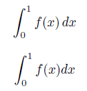
The first integral was written as
\int_0^1 f(x) \, dx
while the second forgot the , and was written as
\int_0^1 f(x) dx
The need for a little extra space around differentials becomes more obvious in multiple integrals.
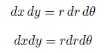
The first was written as
dx \, dy = r \, dr \, d\theta
while the second was written as
dx dy = r dr d\theta
3) Multi-letter function names
The LaTeX commands for typesetting functions like sin, cos, log, max, etc. begin with a backslash. The command log keeps “log,” for example, from looking like the product of variables “l”, “o”, and “g.”
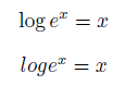
The first example above was written as
\log e^x = x
and the second as
log e^x = x
The double angle identity for sine is readable when properly typeset and a jumbled mess when the necessary backslashes are left out.
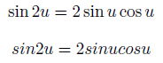
The first example was written
\sin 2u = 2 \sin u \cos u
and the second as
sin 2u = 2 sin u cos u
4) Failure to use math mode
LaTeX uses math mode to distinguish variables from ordinary letters. Variables are typeset in math italic, a special style that is not the same as ordinary italic prose.
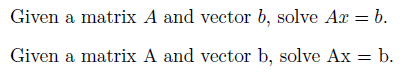
The first sentence was written as
Given a matrix $A$ and vector $b$, solve $Ax = b$.
and the second as
Given a matrix A and vector b, solve Ax = b.
Related posts
- Microsoft equation editor
- Converting Excel tables to LaTeX
- Typesetting music in LaTeX
- Contrasting Word and LaTeX
- Things that work best when you don’t notice them
I’d have to say the #1 LaTeX mistake is none of the above, but simply mismatching delimiters — whether it’s failing to match a parenthesis or other delimiter altogether, or matching it with the wrong kind. Example: frac{1}{x).
I also am repeatedly guilty of forgetting to close off an environment properly, such as when I have nested enumerate environments (happens a lot to teachers who do this sort of thing for creating tests).
I recommend typing closing delimiters immediately after opening delimiters, then backing up to fill in the content in between. I almost always work this way, unless there is very little content between the delimiters.
I also recommend aligning LaTeX delimiters vertically, the way one would when writing C code, especially for delimiters like
left(andright)that might have a lot of content inside.The “double-backtick-double-apostrophe solution” to (1) has always bothered me. It looks just as irritating and amateurish as the problem it ”solves”. It was fine for a time when curly quotes were exotic, but today it feels like a hack.
A better way is to use real curly quotes. On the mac US keyboard layout, they’re option-[ and option-shift=[ (single quotes are under ]). I haven’t used windows in a while but the US-International keyboard layout used to be almost as usable as the mac layout.
If you use Emacs, AUCTeX lets you use the inch-mark ” just as you would in word-processing software and contextually switches it to “ before text and ” after (” with a second press if you are talking about inches). The config group tex-quote lets you configure this behavior and more. The csquotes package is helpful if you use different languages with different quoting habits – your source can contain “” and the result in French for example be typeset using «».
Is there any other TeX-authoring software that does this?
mjm: Certainly some TeX-authoring software will fix the quotes for you. My impression is that nearly all TeX software will do this for you. That doesn’t mean the mistake isn’t still common. Maybe people using a general-purpose text editor rather than software (or context-sensitive mode) specialized for TeX.
I’m guilty of #2, but I wasn’t writing a book or article either. Can you point me to a place to see this error “in the wild”?
My own pet peeve is the incorrect use of the non-breaking space (the ~ character). I have seen countless times users putting a space before ~. For example, ‘in Section ~ref{sec:blah}, we see…’ instead of ‘in Section~ref{sec:blah}, we see…’. Or ‘John Smith ~cite{smith}’ instead of the correct ‘John Smith~cite{smith}’.
A number of mistakes come to my mind—some common and some subtle—too many to mention in the comments. I’ve put together some of them in a “LaTeX niceties” document here: http://matlabician.wordpress.com/latex-niceties.
The problem with putting “the real” curly quotes in a .tex source would be portability. Not all editors use UTF-8, you see?
About differentials, aside the , spacing, I prefer to write the d uptight, so I usually define a newcoomand{ud}{mathrm{d}} and use it whenever I need a differential.
The quotes problem can be solved by using the excellent package “csquotes” (see http://www.ctan.org/tex-archive/macros/latex/contrib/csquotes/ ). The basic command enquote{text} typesets the correct quotation marks for the selected language automagically.
Great list.
I have my students write in Latex all the time. If I had to come up with my own list of mistakes my students make all the time I would definitely have included (3) and (4).
Two others that I would add are to use the letter x instead of times, and the dual to your (4)—writing text in math mode. For example, {xin S: x>2 and x<4} (the "and" should be plain text).
One of my latex pet peeves: colon vs. : (e.g. $f:X to Y$ vs. $fcolon X to Y$; the second moves the colon slightly to the left).
In my country we write quotes as ,,text” (here I used double comma and double apostrofe).
Integrals should be written as “int_0^1f(x),mathrm{d}x” for the d to be not italics.
Mario: One advantage of HTML over LaTeX in this context is that I assume browsers would render the HTML markup
My biggest peeve is when people use math mode for italics. I’m currently reading Robert and Casella’s book’ Monte Carlo Methods in R, so I have to add using bit-mapped graphics (the graphics in that book are the worst I’ve ever seen in a book I’ve paid for).
When I wrote my first book in LaTeX (The Logic of Typed Feature Structures), the good folks at Cambridge University Press gave me a clinic on typesetting, with everything from kerning to laying out bottoms of spreads to be even. Once you learn more about typesetting, almost everything out there looks terrible. Especially egregious is all the wasted white space in most docs, especially vertically; CUP’s LaTeX cleanup crew actually reduced the length of my book substantially by tightening everything up.
Number 4 just saved my day!
Actually, the differential d should technically not be italics. I usually actually make a macro so that I can use mathrm{d} as dif or something. I have to say though, that sometimes I find it looks funny when it’s not italics though.
Thanks for the overview. I was tempted once to write a similar article as nearly all of the above are glaring (at least to one who has a little interestin in typography). And many professors at our university, even those who wrote books, make at least a few of those errors. But I think asking a math professor to review her book for proper typography as an humble CS student is probably a bit … misplaced :-)
Ian: That depends a little on regional typographic styles. I think in European countries it is commonly not italicized, in American typography it is, however.
From item 4 I can conclude that differentials should be written as mathrm{d}, as long d is not a variable.
Thanks for this post. I found it very useful.
When should I use math mode for isolated numerals? Ever?
here?: “There are 27 objects”
here?: “one of the objects has value 27”
Andrew: In the latter case, I guess. It gets noticable when you use text figures instead of lining figures (which should be reserved for headings and tables).
I hate the need to use “ . I use a plain editor to write my latex, and it looks ugly and unbalanced when you have “quote is here” on the page. Writing “quote is here’ ‘ has doubled the number of keystrokes. And if I’m cutting and pasting, often I have “quote is here” and I have to go through and manually change all the left quotes.
Please, someone, write a package to fix this. Csquotes is not the solution, because it adds a huge number of necessary keystrokes and hurts readability of the raw latex code and doesn’t solve the cut-and-paste problem. All that is needed is something that goes through the latex document and whenever it finds the symbol ” (except if it’s being used in HTML) change it in the first instance to “ and in the second instance to ‘ ‘ as one step in the process of turning the input code into ps or pdf. I’d do it myself but I don’t know any programming languages.
Strictly speaking indeed,
There is an ISO standard relating to mathematics (although widely ignored?). The isomath package (http://tug.ctan.org/tex-archive/macros/latex/contrib/isomath) helps dramatically.
The differential operator should be roman, and care should be taken with spacing.
The constant ‘e’ should be in roman, as should all constants (excluding those whose values are experimentally determined, and therefore subject to change).
Also a symbol for a matrix should be bold italic.
Another common issue: after something shortened with a dot, the space gets too large. Like: Smith et al. show that ….
looking like:
Smith et al. show that ….
The solution is:
Smith et al. show that …..
I’ve often wondered whether the differential lower-case ‘d’ should be written in Roman (like functions) rather than italic (like variables). Any ideas?
Jeremy: I believe that is the European convention. My American eyes are accustomed to ‘d’ set in math italic.
Jeremy: I think you’re right (but that may be because I’m Canadian). I was taught that the differential “d” should be written in Roman font type, not italicized. To each their own I guess.
Brackets. Tiny little brackets on massive functions involving huge continued fractions.
Don’t do this to yourselves. Your students will judge you for it.
At #26 the way to get the straight ‘d’ is apparently operatorname{d}!y/operatorname{d}!x to give dy/dx in the form you ask.
Thank you so much! You’ve just saved me looking really silly in my masters dissertation. My problem was with quotation marks. I’ve never known how to do that. Thank you for making it clear.
Officialy, by far, my top LaTeX mistake is textt{}. So many ‘t’s that I get afraid of putting too much and end up putting too few. =P
Elton: See banana problem.
Yeah, just like that! =)
Hi,
Thank you very much for the useful information.
I was looking for information how to write quotes.
You have safe my day.
I’ve just accessed this page for the first time (in Firefox 19.0, on Windows 7), and the backslashes in the LaTeX code for the examples aren’t appearing, so both log examples appear as:
log e^x = x
instead of the first one appearing as:
\log e^x = x
Thanks for letting me know! I’ve updated the post.
I recently exported my content from one version of the blogging software and imported it into a new installation. Apparently the backslashes were lost in the export/import process and so I added them back in.
Just a small correction, as you produced a very frequent mathematical typesetting mistake yourself. Typesetting
or
\frac{d}{dx} f(x)is not considered to by typographically correct — the `d` should be upright, as it is not a variable, but rather an operator. Hence, in using AMS
\text{}
\int f(x) \, \text{d}xor
\frac{\text{d}}{\text{d}x} f(x)Another one that I see quite often is writing
instead of
\text{e}^x.Here, `e` is the exponential function, so mathematical typographers tend to use the same font as for sin and cos — so, maybe one should use
\operatrorname{e}to indicate that part.There is a very nice text by Claudio Beccari in TUGboat 1(18) 1997 “Typesetting mathematics for science and technology according to ISO 31/XI” on this topic.
— jan
As I mentioned above, there are differing conventions on typesetting differentials. Regardless of which convention one uses for ‘d’, the important thing is to put a slight space between the differential and the integrand.
There are also differing conventions on how to typeset the ‘e’ of ex, but these are moot if one uses
\exp(x)<\code>. I think exp(x) is preferable, especially if the argument of the exponential function is complicated. Some journals require this.As a computer scientist, the Latex error I most commonly see is incorrect type-setting of multiple-character variable names in mathmode. I see a lot of things like
$set = \emptyset$. LaTeX will typeset this as if it’s s times e times t. I believe that the proper remedy is to use\mathit{set}instead.Don’t forget that the differential d should be roman, not italic. Just mark it as text.
Americans italicize the d. The British do not.
Thanks for the blog ;)
About the italicize or not of the symbol for differential. I think it should be in roman regardless british or americans. At least as I remember by the ISO standard (ISO 80000-2:2009), but I am not sure and don’t have it around.
Anyway more important is the space mentioned in the article and in the forum.
Following your argumentation in 3) and applied to example 2), I would say the *fifth* most commonly made mistake in Latex is to write “dx” as a product of two variables “d” and “x”. However, the differential “d” is no variable. It should therefore read $\mathrm{\,d}x$ instead of $\,dx$.
Do you mean
dx \, dy = r , dr \, d\theta
instead of
dx , dy = r , dr \, d\theta
Thanks
Julian
?
Thanks. I had an issue with my blog almost four years ago now that caused all my backslashes to disappear. I found most of the problems, but not all. Hopefully you found the last one!
As a followup to Martin’s comment on 08/12/16, the same is true when typesetting e in example 3. As this is not a variable, it should not be italicized.
The above example would be written as
\log \mathrm{e}^x = x
“dx \, dy = r \, dr \, d\theta”, instead of “dx \, dy = r , dr \, d\theta”.
Thanks, Paul. I had a technical problem years ago where a lot of backslashes went missing from my site. I thought I may have replaced all the missing backslashes by now, but you just found another one.