It’s easy to visualize function from two real variables to one real variable: Use the function value as the height of a surface over its input value. But what if you have one more dimension in the output? A complex function of a complex variable is equivalent to a function from two real variables to two real variables. You can use one of the output variables as height, but what do you do about the other one?
Annotating phase on 3D plots
You can start by expressing the function output f(z) in polar form
f(z) = reiθ
Then you could plot the magnitude r as height and write the phase angle θ on the graph. Here’s a famous example of that approach from the cover of Abramowitz and Stegun.
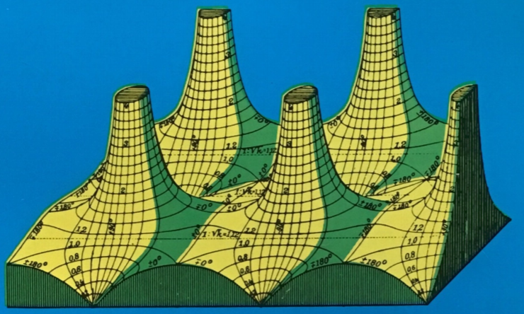
You can find more on that book and the function it plots here.
This approach makes it easy to visualize the magnitude, but the phase is textual rather than visual. A more visual approach is to use color to represent the phase, such as hue in HSV scale.
Hue-only phase plots
You can combine color with height, but sometimes you’ll just use color alone. That is the approach taken in the book Visual Complex Functions. This is more useful than it may seem at first because the magnitude and phase are tightly coupled for an analytic function. The phase alone uniquely determines the function, up to a constant multiple. The image I posted the other day, the one I thought looked like Paul Klee meets Perry the Platypus, is an example of a phase-only plot.
If I’d added more contour lines the plot would be more informative, but it would look less like a Paul Klee painting and less like a cartoon platypus, so I stuck with the defaults. Mathematica has dozens of color schemes for phase plots. I stumbled on “StarryNightColors” and liked it. I imagine I wouldn’t have seen the connection to Perry the Platypus in a different color scheme.
Using hue and brightness
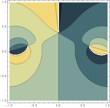
You can visualize magnitude as well as phase if you add another dimension to color. That’s what Daniel Velleman did in a paper that I read recently [1]. He uses hue to represent angle and brightness to represent magnitude. I liked his approach partly on aesthetic grounds. Phase plots using hue only tend to look psychedelic and garish. The varying brightness makes the plots more attractive. I’ll give some examples then include Velleman’s code.
First, here’s a plot of Jacobi’s sn function [2], an elliptic function analogous to sine. I picked it because it has a zero and a pole. Zeros show up as black and poles as white. (The function is elliptic, so it’s periodic horizontally and vertically. Functions like sine are periodic horizontally but not vertically.)
![f[z_] := JacobiSN[z I, 1.5]; ComplexPlot[-2, -1, 2, 1, 200, 200]](https://www.johndcook.com/complex_jacobi_10sn.jpg)
You can see the poles on the left and right and the zero in the middle. Note that the hues swirl in opposite directions around zeros and poles: ROYGBIV counterclockwise around a zero and clockwise around a pole.
Next, here’s a plot of the 5th Chebyshev polynomial. I chose this because I’ve been thinking about Chebyshev polynomials lately, and because polynomials make plots that fade to white in every direction. (That is, |p(z)| → ∞ as |z| → ∞ for all polynomials.)
![f[z_] := ChebyshevT[5, z]; ComplexPlot[-2, -2, 2, 2, 400, 400]](https://www.johndcook.com/complex_chebyshev_T5.jpg)
Finally, here’s a plot of the gamma function. I included this example because you can see the poles as little white dots on the left, and the plot has a nice dark-to-light overall pattern.
![f[x_] := Gamma[x]; ComplexPlot[-3.5, -3, 7, 3, 200, 200]](https://www.johndcook.com/complex_gamma.jpg)
Mathematica code
Here’s the Mathematica code from Velleman’s paper. Note that in the HSV scale, he uses brightness to change both the saturation (S) and value (V). Unfortunately the function f being plotted is a global rather than being passed in as an argument to the plotting function.
brightness[x_] := If[x <= 1,
    Sqrt[x]/2,
    1 - 8/((x + 3)^2)]

ComplexColor[z_] := If[z == 0,
    Hue[0, 1, 0],
    Hue[Arg[z]/(2 Pi),
        (1 - (b = brightness[Abs[z]])^4)^0.25,
        b]]

ComplexPlot[xmin_, ymin_, xmax_, ymax_, xsteps_, ysteps_] := Block[
    {deltax = N[(xmax - xmin)/xsteps],
     deltay = N[(ymax - ymin)/ysteps]},
    Graphics[
        Raster[
            Table[
                f[x + I y],
                {y, ymin + deltay/2, ymax, deltay},
                {x, xmin + deltax/2, xmax, deltax}],
                {{xmin, ymin}, {xmax, ymax}},
                ColorFunction -> ComplexColor
            ]
        ]
    ]
Related posts
Footnotes
[1] Daniel J. Velleman. The Fundamental Theorem of Algebra: A Visual Approach. Mathematical Intelligencer, Volume 37, Number 4, 2015.
[2] I used f[z] = 10 JacobiSN[I z, 1.5]. I multiplied the argument by i because I wanted to rotate the picture 90 degrees. And I multiplied the output by 10 to get a less saturated image.
Tip: Use a perceptually uniform colormap for displaying phase rather than HSL: http://www.hsluv.org/comparison/
To follow up on Stephan’s comment, here’s an excellent paper on colormap design, with a section dedicated to cyclic colormaps:
https://arxiv.org/pdf/1509.03700.pdf
See p20/p21 and Figure 13 in particular for the kind of anomalies induced by HSL/HSV. There’s another good example here:
https://github.com/BIDS/colormap/issues/6#issuecomment-222361809
Note the blue bands that appear in the right-hand HSV image which are absent from the others.
Here’s a modification of the code fragment above to pass in a function.
brightness[x_] := If[x ComplexColor]]]
ComplexPlot[-5, -5, 5, 5, 200, 200, Gamma]
the code fragment above got mangled. Here’s a notebook link instead: https://github.com/peeterjoot/mathematica/blob/master/complex/ComplexVisualization.nb