Typesetting music with LilyPond

I tried typesetting music in LaTeX some time ago and gave up. The packages I found were hard to install, the examples didn’t work, etc. This weekend I decided to try again. I tried plowing through the MusiXTeX documentation and got no further than I did last time.

I posted a note on StackOverflow and got some good responses. Nikhil Chelliah suggested I look at LilyPond. I had looked at LilyPond before, and @jleedev explained how to integrate LaTeX and LilyPond.

Here’s some sheet music I included in my previous post, March in 7/4 time.

sheet music example

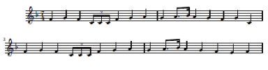
Here’s a full-sized PDF file version of the music above. And here’s the LilyPond source code used to create the music.

\relative c' {
\time 7/4
\key f \major
\clef treble
f g f \times 2/3{ c8 c c} f4 g a
g a8. bes16 a4 g f g c,
f g f \times 2/3{ c8 c c} f4 g a
g a8. bes16 a4 g f e f
}

The notation looks cryptic at first, but it makes sense after a few minutes. The command relative c' means that the following pitches will be relative to middle C. For example, the first note, F, is the F closest to middle C. Each note is the same length as the previous note by default, and the first note is a quarter note by default. The notation c8 means that the C is an eighth note, except it’s in the context of a triplet (times 2/3) and so it’s an eighth note triplet. The next F is denoted f4 to indicate that we’re back to quarter notes.

The notation a8. says that the A is a dotted eighth note. For the next note, bes16 means a B-flat sixteenth note. The suffix “es” stands for “flat” and “is” stands for “sharp.” (The documentation says it’s Dutch. I’ve never seen it before.) I don’t understand why I had to tell it that the B was flat. The code specified earlier that the key was F major, which implies B’s are flat. I suppose the code for individual notes is decoupled from the code to draw the key signature. That would make entering music painful in keys that have lots of sharps or flats. Maybe there’s a way to specify default sharps or flats.

The comma in c, gives the absolute pitch of the C. In relative mode, LilyPond assumes by default that each pitch name refers to the pitch closest to its predecessor. The C closest to the previous note, F, would have been the C up one fourth rather than down one fifth, so the comma was necessary to tell LilyPond to go down.

If I were to do a lot of music processing, I’d probably look at a commercial package such as Sibelius. But for now I’m just interested in producing small excerpts like that above, and it looks like LilyPond may be fine.

Update: I double checked the rules about flats etc. Yes, I do have to specify explicitly that the B in this example is B-flat. If I just say b rather than bes, LilyPond will add a natural sign in front of the B! It’s strange. It is aware of the key signature: when I tell it the B is flat, it says “OK, then I don’t have to mark that specially since it’s implicit in the key signature.” And if I don’t tell it the B is flat, it says “Oh, that’s an exception to the key signature. Better mark it with a natural sign.”

How to display side-by-side figures in LaTeX

The other day I tried putting two graphs side-by-side by setting R’s mfrow parameter. That made the graphs look odd because not everything was scaled proportionately. Then someone told me I could use a LaTeX command to place my original graphs side-by-side rather than creating a new image.

The trick is to use the subfigure package. Include the directive usepackage{subfigure} at the top of your file, then use code something like the following.

\begin{figure}
\centering
\mbox{\subfigure{\includegraphics[width=3in]{fig1.pdf}}\quad
\subfigure{\includegraphics[width=3in]{fig2.pdf} }}
\caption{Text pertaining to both graphs ...} \label{fig12}
end{figure}

If you put text in square brackets immediately after the \subfigure command, that text will be a caption for the corresponding sub-figure. For example, the LaTeX code above might be changed to include the following.

...\subfigure[Description of left graph]{\includegraphics...

Why is TeX so popular in Germany?

A lot of good (La)TeX resources come from Germany. I assume from the amount of development and support activity, there are probably a lot of users as well. Does anyone know why TeX is apparently so strong in Germany? Is there something about the German language that TeX supports particularly well?

Things that work best when you don't notice them

Fonts, translations, and programming languages have one thing in common: they work best when you don’t notice them.

If someone says “Hey, look at this cool font I just found!” you probably wouldn’t want to read a book set in that font. At least to an untrained eye, a great font will not stand out in a list of small samples. You have to see large blocks of text set in a font to appreciate it. Even then, most people will not consciously appreciate a very readable font.

Translations are similar. If you find yourself saying “What an interesting translation!” then the translator has probably fallen down on the job. A good translation is neither archaic nor trendy. It does not draw attention to itself but allows you to focus on the original content. I believe the English Standard Version achieves that with Bible translation.

Python is like a good font or a good translation. For years I’d look into Python briefly when someone would recommend it. I’d thumb through a Python book, but it all looked rather plain. Only later did I come to appreciate that the beauty of Python is that it is rather plain. It doesn’t call attention to itself. It just gets out of your way and lets you write programs. It seems to me that compared to other programming language communities, the Python community brags less about their language per se and more about what they’re able to do with it.

Better R console fonts

The default installation of R on Windows uses Courier New for the console font. Unfortunately, this font offers low contrast between the letter ‘l’ and the number ‘1.’ There is also poor contrast between the letter ‘O’ and the number ‘0.’ The contrast between period and commas is OK.

Lucida Console is an improvement. It has high contrast between ‘l’ and ‘1’, though ‘O’ and ‘0’ are still hard to distinguish. But my favorite console font is Consolas. It offers strong contrast between ‘l’ and ‘1’, commas and periods, and especially between lower case ‘o’, upper case ‘O’, and the number ‘0.’

Consolas is more legible while also fitting more characters into the same horizontal space. It can do this because it uses ClearType anti-aliasing while the other two fonts do not. Here is a sample of the three fonts magnified 4x to show the anti-aliasing.

I found setting the default console font in R a little tricky. Clicking on the Edit -> GUI preferences menu brings up the Rgui Configuration Editor. From there it’s obvious how to change the font. However, what I found surprising is that clicking the “OK” button only changes the font for the current session. I can’t think of another application that behaves analogously. To set your choice of font for all future sessions, click “Save” rather than “OK.”

* * *

Help integrating R into your environment

The Holy Grail of CSS

Basic tasks are simple in CSS, but even slightly harder tasks can be incredibly difficult. Controlling fonts, margins, and so forth is a piece of cake. But controlling page layout is another matter. In his book Refactoring HTML, Elliotte Rusty Harold describes a technique as

so tricky that it took any smart people quite a few years of experimentation to develop the technique show here.  In fact, so many people searched for this while believing that it didn’t actually exist that this technique goes under the name “The Holy Grail.”

What is the incredibly difficult task that took so many years to discover? Teaching a web browser to play chess using only style sheets? No, three column layout. I kid you not. He goes on to say

The goal is simple: two fixed-width columns on the left and the right and a liquid center for the content in the middle.  (That something so frequently needed was so hard to invent doesn’t speak well of CSS as a language, but it s the language we have to work with.)

You can read more about the Holy Grail of CSS in an article by Matthew Levine.

I appreciate the advantages of CSS, though I do wish it didn’t have such a hockey stick learning curve. I’ve heard people say not to bother learning overly difficult technologies because if you find it too difficult, so will everyone else and it will die off. But CSS seems to be firmly established with no competitor.

LaTeX and PowerPoint presentations

I use LaTeX for math documents and PowerPoint for presentations. When I need to make a math presentation, I can’t have everything I want in one environment. I usually go with PowerPoint.

Yesterday I tried the LaTeX Beamer package based on a friend’s recommendation. I believe I’ll switch to using this package as my default for math presentations. Here are my notes on my experience with Beamer.

Installation

Beamer is available from SourceForge. The installation instructions begin by saying “Put all files somewhere where TeX can find them.” This made me think Beamer would be another undocumented software package, but just a few words later the instructions point to a 224-page PDF manual with plenty of detail. However, I would recommend a couple minor corrections to the documentation.

  1. The manual says that if you want to install Beamer under MiKTeX, use the update wizard. But the update wizard will only update packages already installed. To install new packages with MiKTeX, use the Package Manager. (Command line mpm.exe or GUI mpm_mfc.exe.)
  2. The manual says to install latex-beamer, pgf, and xcolor. The Package Manager shows no latex-beamer package, but does show a beamer package.

The installation went smoothly overall. However, the MiKTeX Package Manager doesn’t let you know when packages have finished installing. You just have to assume when it quits giving new messages that it must be finished. At least that was my experience using the graphical version.

Using Beamer

I found Bruce Byfield’s introduction to Beamer helpful. The Beamer package is simple to use and well documented.

It’s nice to use real math typography rather than using PowerPoint hacks or pasting in LaTeX output as images. I also like animating bullet points simply by adding pause to the end of an enumerated item.

Inserting images

The biggest advantage that PowerPoint has over LaTeX is working with images. With PowerPoint you can:

  1. Paste images directly into your presentations.
  2. Edit files in place.
  3. Carry around your entire presentation as a single file.
  4. Include multiple image formats in a consistent way.

The last point may not seem like much until you’ve tried to figure out how to include images in LaTeX.

Accented letters in HTML, TeX, and MS Word

I frequently need to look up how to add diacritical marks to letters in HTML, TeX, and Microsoft Word, though not quite frequently enough to commit the information to my long-term memory. So today I wrote up a set of notes on adding accents for future reference. Here’s a chart summarizing the notes.

Accent HTML TeX Word
grave grave \` CTRL + `
acute acute \' CTRL + '
circumflex circ \^ CTRL + ^
tilde tidle \~ CTRL + SHIFT + ~
umlaut uml \" CTRL + SHIFT + :
cedilla cedil \c CTRL + ,
æ, Æ æ, Æ \ae, \AE CTRL + SHIFT + & + a or A
ø, Ø ø, Ø \o, \O CTRL + / + o or O
å, Å å, Å \aa, \AA CTRL + SHIFT + @ + a or A

The notes go into more details about how accents function in each environment and what limitations each has. For example, LaTeX will let you combine any accent with any letter, but MS Word and HTML only support letter/accent combinations that are common in spoken languages.