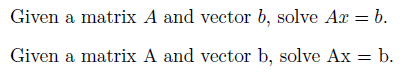
Typesetting chemistry in LaTeX

Yesterday I gave the following tip on TeXtip:

Set chemical formulas with math Roman. Example: sulfate is $mathrm{SO_4^{2-}}$

TorbjoernT and scmbradley let me know there’s a better way: use Martin Hansel’s package mhchem. The package is simpler to use and it correctly handles subtle typographical details.

Using the mhchem package, sulfate would be written ce{SO4^2-}. In addition to chemical compounds, mhchem has support for bonds, arrows, and related chemical notation.

Example:

Source:

\documentclass{article}
\usepackage[version=3]{mhchem}
\parskip=0.1in
\begin{document}

\ce{SO4^2-}

\ce{^{227}_{90}Th+}

\ce{A\bond{-}B\bond{=}C\bond{#}D}

\ce{CO2 + C -> 2CO}

\ce{SO4^2- + Ba^2+ -> BaSO4 v}

\end{document}


For more information, see the mhchem package documentation.

Related posts

Complexity of HTML and LaTeX

Sometime around 1994, my office mate introduced me to HTML by saying it was 10 times simpler than LaTeX. At the time I thought he was right. Now I’m not so sure. Maybe he was right in 1994 when the expectations for HTML were very low.

It is easier to bang out a simple, ugly HTML page than to write your first LaTeX document. When you compare the time required to make an attractive document, the effort becomes more comparable. The more sophisticated you get, the simpler LaTeX becomes by comparison.

Of course the two languages are not exactly comparable. HTML targets a web browser while LaTeX targets paper. HTML would be much simpler if people only used it to create documents to print out on their own printer. A major challenge with HTML is not knowing how someone else will use your document. You don’t know what browser they will view it with, at what resolution, etc. For that matter, you don’t know whether they’re even going to view it at all — they may use a screen reader to listen to the document.

Writing HTML is much more complicated than writing LaTeX if you take a broad view of all that is required to do it well: learning about accessibility and internationalization, keeping track of browser capabilities and market shares, adapting to evolving standards, etc. The closer you look into it, the less HTML has in common with LaTeX. The two languages are not simply two systems of markup; they address different problems.

Related links

Top four LaTeX mistakes

Here are four of the most common typesetting errors I see in books and articles created with LaTeX.

1) Quotes

Quotation marks in LaTeX files begin with two back ticks, ``, and end with two single quotes, ''.

The first “Yes” was written as

``Yes.''

in LaTeX while the one with the backward opening quote was written as

"Yes."

2) Differentials

Differentials, most commonly the dx at the end of an integer, should have a little space separating them from other elements. The “dx” is a unit and so it needs a little space to keep from looking like the product of “d” and “x.” You can do this in LaTeX by inserting \, before and between differentials.

The first integral was written as

 \int_0^1 f(x) \, dx

while the second forgot the , and was written as

 \int_0^1 f(x)  dx

The need for a little extra space around differentials becomes more obvious in multiple integrals.

The first was written as

dx \, dy = r \, dr \, d\theta

while the second was written as

dx  dy = r  dr  d\theta

3) Multi-letter function names

The LaTeX commands for typesetting functions like sin, cos, log, max, etc. begin with a backslash. The command log keeps “log,” for example, from looking like the product of variables “l”, “o”, and “g.”

The first example above was written as

\log e^x = x

and the second as

log e^x = x

The double angle identity for sine is readable when properly typeset and a jumbled mess when the necessary backslashes are left out.

The first example was written

\sin 2u = 2 \sin u \cos u

and the second as

sin 2u = 2 sin u cos u

4) Failure to use math mode

LaTeX uses math mode to distinguish variables from ordinary letters. Variables are typeset in math italic, a special style that is not the same as ordinary italic prose.

The first sentence was written as

Given a matrix $A$ and vector $b$, solve $Ax = b$.

and the second as

Given a matrix A and vector b, solve Ax = b.

Related posts


The disappointing state of Unicode fonts

Modern operating systems understand Unicode internally, but font support for Unicode is spotty. For an example of the problems this can cause, take a look at these screen shots of how the same Twitter message appears differently depending on what program is used to read it.

No font can display all Unicode characters. According to Wikipedia

… it would be impossible to create such a font in any common font format, as Unicode includes over 100,000 characters, while no widely-used font format supports more than 65,535 glyphs.

However, the biggest problem isn’t the number of characters a font can display. Most Unicode characters are quite rare. About 30,000 characters are enough to display the vast majority of characters in use in all the world’s languages as well as a generous selection of symbols. However Unicode fonts vary greatly in their support even for the more commonly used ranges of characters. See this comparison chart. The only range completely covered by all Unicode fonts in the chart is the 128 characters of Latin Extended-A.

Unifont supports all printable characters in the basic multilingual plane, characters U+0000 through U+FFFF. This includes the 30,000 characters mentioned above plus many more. Unifont isn’t pretty, but it’s complete. As far as I know, it’s the only font that covers the characters below U+FFFF.

More Unicode posts

Free alternative to Consolas font

Consolas is my favorite monospace font. It’s a good programmer’s font because it exaggerates the differences between some characters that may easily be confused. It ships with Visual Studio and with many other Microsoft products. See this post for examples.

I recently found out about Inconsolata, a free font similar to Consolas. Inconsolata is part of the OFL font collection from SIL International.

Another interesting font from SIL is Andika, mentioned previously here. The Andika home page describes this font as follows.

Andika is a sans serif, Unicode-compliant font designed especially for literacy use, taking into account the needs of beginning readers. The focus is on clear, easy-to-perceive letterforms that will not be readily confused with one another.

More font posts

How to write multi-part definitions in LaTeX

This post explains how to typeset multi-part definitions in LaTeX.

The absolute value function is a simple example of a two-part definition.

absolute value definition

The Möbius function is a more complicated example of a three-part definition.

definition of Mobius function

Here’s how you could write LaTeX for the absolute value definition.

|x| =
\left\{
	\begin{array}{ll}
		x  & \mbox{if } x \geq 0 \\
		-x & \mbox{if } x < 0
	\end{array}
\right.

The right-hand side of the equation is an array with an opening brace sized to fit on the left. Braces are special characters and so the opening brace needs to be escaped with a backslash. LaTeX requires a right for every left but the dot in right. says to make the matching container on the right side empty.

Since this pattern comes up fairly often, it’s handy to have a command to encapsulate it. We define twopartdef as follows.

\newcommand{\twopartdef}[4]
{
	\left\{
		\begin{array}{ll}
			#1 & \mbox{if } #2 \\
			#3 & \mbox{if } #4
		\end{array}
	\right.
}

Then we could call it as follows:

|x| = \twopartdef { x } {x \geq 0} {-x} {x < 0}

The command threepartdef is very similar to twopartdef.

\newcommand{\threepartdef}[6]
{
	\left\{
		\begin{array}{lll}
			#1 & \mbox{if } #2 \\
			#3 & \mbox{if } #4 \\
			#5 & \mbox{if } #6
		\end{array}
	\right.
}

You could call threepartdef for the Möbius function as follows.

mu(n) = \threepartdef
{1}      {n=1}
{0}      {a^2 ,|, n \mbox{ for some } a > 1}
{(-1)^r} {n \mbox{ has } r \mbox{ distinct prime factors}}

More LaTeX posts


Adding fonts to the PowerShell and cmd.exe consoles

The default font options for the PowerShell console are limited: raster fonts and Lucida Console. Raster fonts are the default, though Lucida Console is an improvement. In my opinion, Consolas is even better, but it’s not on the list of options.

Mastering PowerShell by Tobias Weltner explains how to expand the list of font options for the PowerShell console. The same trick increases the list of font options in the Windows command prompt cmd.exe as well. The book is free for download. See page 16 for details. However, I have two comments about the instructions it gives.

First, the book says “The name must be exactly the same as the official font name, just the way it’s stated under [registry key].” However, the Consolas font is listed in the registry as “Consolas (True Type)”. You should enter “Consolas” and leave out the parenthetical description.

Second, the book says “the new font will work only after you either log off at least once or restart your computer.” When I tried it, logging off was not sufficient; I had to reboot my computer before the font change would work.

Update: In order to make this post self-contained, I’ve added below the necessary information from Mastering PowerShell.

Run regedit.exe and navigate to HKEY_LOCAL_MACHINESOFTWAREMicrosoftWindows NTCurrentVersionConsoleTrueTypeFont.

Right-click in the panel on the right side and create a new string value. Name that value “0” or “00” or however many zeros you need to create a new key. That string’s value is the name of the font to add.

Update: See Necessary criteria for fonts to be available in a command window

Related posts

I owe Microsoft Word an apology

I tried to use the Equation Editor in Microsoft Word years ago and hated it. It was hard to use and produced ugly output. I tried it again recently and was pleasantly surprised. I’m using Word 2007. I don’t remember what version I’d tried before.

I’ve long said that math written in Word is ugly, and it usually is. But the fault lies with users, like myself, not with Word. I realize now that the problem is that most people writing math in Word are not using the Equation Editor. LaTeX produces ugly math too when people do not use it correctly, though this happens less often.

Math typography is subtle. For example, mathematical symbols are set in an italic font that is not quite the same as the italic font used in prose. Also, word-like symbols such as “log” or “cos” are not set in italics. I imagine most people do not consciously notice these conventions — I never noticed until I learned to use LaTeX — but subconsciously notice when the conventions are violated. The conventions of math typography give clues that help readers distinguish, for example, the English indefinite article “a” from a variable named “a” and to distinguish the symbol for maximum from the product of variables “m”, “a”, and “x.”

Microsoft’s Equation Editor typesets math correctly. Word documents usually do not, but only because folks usually do not use the Equation Editor. In the following example, I set the same equation three times: using ordinary text, using ordinary italic for the “x”, and finally using the Equation Editor.

screen shot of trig identity using MS Word

Note that the “x” in the third version is not the same as the italic “x” in the second version. The prose in this example is set in Calibri font and the Equation Editor uses Cambria Math font. Also, I did not tell Word to format “sin” and “cos” one way and “x” another or tell it what font to use; I simply typed sin^2 x + cos^2 x = 1 into the Equation Editor and it formatted the result as above. I haven’t used it much, but the Equation Editor seems to be more capable and easier to use than I thought.

Here are a few more examples of Equation Editor output.

examples of math using Word: Gaussian integral, Fourier series, quadratic equation

I still prefer using LaTeX for documents containing math symbols. I’ve used LaTeX for many years and I can typeset equations very quickly using it. But I’m glad to know that Word can typeset equations well and that the process is easier than I thought.

I tried out the Equation Editor because Bob Matthews suggested I try MathType, a third-party equation editor add-on for Microsoft Word. I haven’t tried MathType yet but from what I hear it produces even better output.

Related post: Contrasting Microsoft Word and LaTeX

A couple thoughts on typography

Font embedding not such a good idea?

The most recent Boag World podcast interviewed Mark Boulton. Boulton has a contrarian opinion on font embedding. Nearly all web designers are excited about font embedding (the ability to have fonts download on-the-fly if a page uses a font not installed on the user’s computer). Bolton’s not so sure this is a good idea. Fonts are designed for a purpose, and most fonts were designed for print. The handful of fonts that were designed first for online viewing (Verdana, Georgia, etc.) are widely installed. If font embedding were a way to broaden the pallet of fonts designed for use on a computer monitor, that would be great. But the most likely use of font embedding would be to allow designers to use more fonts online that were not designed to be used online.

Comic Sans and dyslexia

Comic Sans is terribly overused. It’s not a bad font, but it’s often used in inappropriate contexts and has become a cliché for poor typographical taste.

However, I heard somewhere that people with dyslexia can read Comic Sans more easily than most other fonts. I think the explanation was that the font breaks some typical symmetries. For example, a “p” is not an exact mirror image of a “q.” (The former has a more pronounced serif on top.) On the other hand, the “b” and “d” do look like near mirror images. I wonder whether anyone has designed a font specifically to help people with dyslexia. Maybe such  fonts would exaggerate the asymmetries that were accidental in the design of Comic Sans. Delivering such fonts would be a good application of font embedding.

Update: Karl Ove Hufthammer left a comment pointing out Andika, a font with “easy-to-perceive letterforms that will not be readily confused with one another.”

Related posts

Sharps and flats in HTML

Apparently there’s no HTML entity for the flat symbol, ♭. In my previous post, I just spelled out B-flat because I thought that was safer; it’s possible not everyone would have the fonts installed to display B♭ correctly.

So how do you display music symbols for flat, sharp, and natural in HTML? You can insert any symbol if you know its Unicode value, though you run the risk that someone viewing the page may not have the necessary fonts installed to view the symbol. Here are the Unicode values for flat, natural, and sharp.

Since the flat sign has Unicode value U+266D, you could enter &#x266d; into HTML to display that symbol.

The sharp sign raises an interesting question. I’m sure most web pages referring to G-sharp would use the number sign # (U+0023) rather than the sharp sign ♯ (U+266F). And why not? The number sign is conveniently located on a standard keyboard and the sharp sign isn’t. It would be nice if people used sharp symbols rather than number signs. It would make it easier to search on specifically musical terms. But it’s not going to happen.

Update: See this post on font support for Unicode. Most people can see all three symbols, but some, especially Android users, might not see the natural sign.

Related posts