This evening I ran across a paper on an unusual coordinate system that creates interesting graphs based from simple functions. It’s called “circular coordinates,” but this doesn’t mean polar coordinates; it’s more complicated than that. [1]
Here’s a plot reproduced from [1], with some color added (the default colors matplotlib uses for multiple plots).
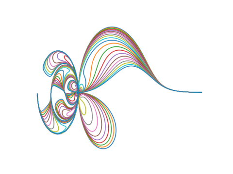
The plot above was based on the gamma function. Here are a few plots replacing the gamma function with another function.
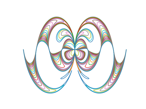
Here’s x/sin(x):
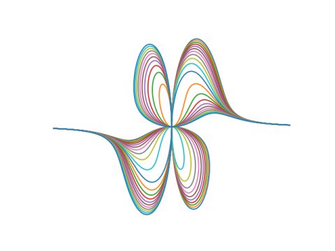
Here’s x5:
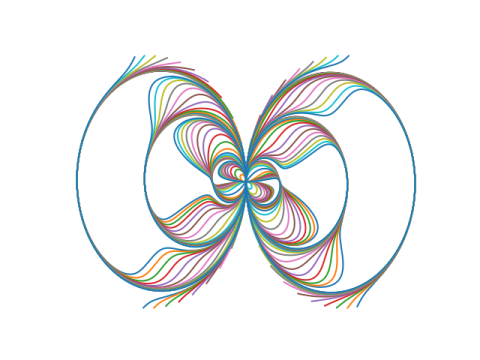
And here’s tan(x):
Here’s how the plots were created. For a given function f, plot the parametric curves given by

See [1] for what this has to do with circles and coordinates.
The plots based on a function g(x) are given by setting f(x) = g(x) + c where c = −10, −9, −8, …, 10.
Related posts
[1] Elliot Tanis and Lee Kuivinen, Circular Coordinates and Computer Drawn Designs. Mathematics Magazine. Vol 52 No 3. May, 1979.
Is there a typo in your post, or have I misunderstood the maths?
You say at teh end of the post
“The plots based on a function g(x) are given by setting f(x) = g(x) + c…”
Should that not be “f(x) = g(x) * c” – ie it is times c, not plus c
Or have I got the maths wrong?
PS I’m trying to play around with this in R
It is addition, g(x) + c, not multiplication.