Taking the derivative of a muscle car

I’ve been getting a lot of spam lately saying my website does not rank well on “certain keywords.” This is of course true: no website ranks well for every keyword.

I was joking about this on Twitter, saying that my site does not rank well for women’s shoes, muscle cars, or snails because I don’t write about these topics. J. D. Long replied saying I should write more about muscle cars.

My first thought was to do an example drawing a Shelby Cobra with cubic splines. This would not be such an artificial example. Mathematical splines are named after physical splines, devices that have been used in designing, among other things, cars.

Instead, I downloaded an image of a Shelby Cobra from Wikipedia

Original image

and played with it in Mathematica. Specifically, I applied a Sobel filter which you can think of as a kind of derivative, looking for edges, places where the pixel values have a sharp change.

Sobol filtered image

Here’s the same image with the colors reversed.

Cobra image reversed

Here’s the Mathematica code to do the edge detection.

    cobra = Import["c:/users/mail/desktop/cobra.jpg"]
    ImageConvolve[cobra, {{-1, 0, 1}, {-2, 0, 2}, {-1, 0, 1}}]

Safe Harbor and the calendar rollover problem

elderly woman

Data privacy is subtle and difficult to regulate. The lawmakers who wrote the HIPAA privacy regulations took a stab at what would protect privacy when they crafted the “Safe Harbor” list. The list is neither necessary or sufficient, depending on context, but it’s a start.

Extreme values of any measurement are more likely to lead to re-identification. Age in particular may be newsworthy. For example, a newspaper might run a story about a woman in the community turning 100. For this reason, the Safe Harbor previsions require that ages over 90 be lumped together. Specifically,

All elements of dates (except year) for dates that are directly related to an individual, including birth date, admission date, discharge date, death date, and all ages over 89 and all elements of dates (including year) indicative of such age, except that such ages and elements may be aggregated into a single category of age 90 or older.

One problem with this rule is that “age 90” is a moving target. Suppose that last year, in 2018, a data set recorded that a woman was born in 1930 and had a child in 1960. This data set was considered de-identified under the Safe Harbor provisions and published in a medical journal. On New Year’s Day 2019, does that data suddenly become sensitive? Or on New Year’s Day 2020? Should the journal retract the paper?!

No additional information is conveyed by the passage of time per se. However, if we knew in 2018 that the woman in question was still alive, and we also know that she’s alive now in 2019, we have more information. Knowing that someone born in 1930 is alive in 2019 is more informative than knowing that the same person was alive in 2018; there are fewer people in the former category than in the latter category.

The hypothetical journal article, committed to print in 2018, does not become more informative in 2019. But an online version of the article, revised with new information in 2019 implying that the woman in question is still alive, does become more informative.

No law can cover every possible use of data, and it would be a bad idea to try. Such a law would be both overly restrictive in some cases and not restrictive enough in others. HIPAA‘s expert determination provision allows a statistician to say, for example, that the above scenario is OK, even though it doesn’t satisfy the letter of the Safe Harbor rule.

More privacy posts

Data privacy Twitter account

My newest Twitter account is Data Privacy (@data_tip). There I post tweets about ways to protect your privacy, statistical disclosure limitation, etc.

I had a clever idea for the icon, or so I thought. I started with the default Twitter icon, a sort of stylized anonymous person, and colored it with the same blue and white theme as the rest of my Twitter accounts. I think it looked so much like the default icon that most people didn’t register that it had been customized. It looked like an unpopular account, unlikely to post much content.

Now I’ve changed to the new icon below, and the number of followers is increasing.
data tip icon

Related pages

Ratio of Lebesgue norm ball volumes

As dimension increases, the ratio of volume between a unit ball and a unit cube goes to zero. Said another way, if you have a high-dimensional ball inside a high-dimensional box, nearly all the volume is in the corners. This is a surprising result when you first see it, but it’s well known among people who work with such things.

In terms of Lp (Lebesgue) norms, this says that the ratio of the volume of the 2-norm ball to that of the ∞-norm ball goes to zero. More generally, you could prove, using the volume formula in the previous post, that if p < q, then the ratio of the volume of a p-norm ball to that of a q-norm ball goes to zero as the dimension n goes to infinity.

Proof sketch: Write down the volume ratio, take logs, use the asymptotic series for log gamma, slug it out.

Here’s a plot comparing p = 2 and q = 3.

Plot of volume ratio for balls in L2 and L3 norm as dimension increases

Posts on high dimensional geometry

Higher dimensional squircles

The previous post looked at what exponent makes the area of a squircle midway between the area of a square and circle of the same radius. We could ask the analogous question in three dimensions, or in any dimension.

(What do you call a shape between a cube and a sphere? A cuere? A sphube?)


The sphube

In more conventional mathematical terminology, higher dimensional squircles are balls under Lp norms. The unit ball in n dimensions under the Lp norm has volume

2^n \frac{\Gamma\left(1 + \frac{1}{p}\right)^n}{\Gamma\left( 1 + \frac{n}{p} \right)}

We’re asking to solve for p so the volume of a p-norm ball is midway between that of 2-norm ball and an ∞-norm ball. We can compute this with the following Mathematica code.

    v[p_, n_] := 2^n Gamma[1 + 1/p]^n / Gamma[1 + n/p]
    Table[ 
        FindRoot[
            v[p, n] - (2^n + v[2, n])/2, 
            {p, 3}
        ], 
        {n, 2, 10}
    ]

This shows that the value of p increases steadily with dimension:

    3.16204
    3.43184
    3.81881
    4.33311
    4.96873
    5.70408
    6.51057
    7.36177
    8.23809

We saw the value 3.16204 in the previous post. The result for three dimensions is 3.43184, etc. The image above uses the solution for n = 3, and so it has volume halfway between that of a sphere and a cube.

In order to keep the total volume midway between that of a cube and a sphere, p has to increase with dimension, making each 2-D cross section more and more like a square.

Here’s the Mathematica code to draw the cuere/sphube.

    p = 3.43184
    ContourPlot3D[
         Abs[x]^p + Abs[y]^p + Abs[z]^p == 1, 
         {x, -1, 1}, 
         {y, -1, 1}, 
         {z, -1, 1}
    ]

History of the “Squircle”

Architect Peter Panholzer coined the term “squircle” in the summer of 1966 while working for Gerald Robinson. Robinson had seen a Scientific American article on the superellipse shape popularized by Piet Hein and suggested Panholzer use the shape in a project.

Piet Hein used the term superellipse for a compromise between an ellipse and a rectangle, and the term “supercircle” for the special case of axes of equal length. While Piet Hein popularized the superellipse shape, the discovery of the shape goes back to Gabriel Lamé in 1818.

Squircle with p = 3.162034

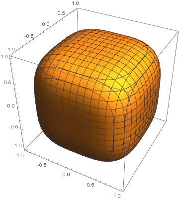
You can find more on the superellipse and squircle by following these links, but essentially the idea is to take the equation for an ellipse or circle and replace the exponent 2 with a larger exponent. The larger the exponent is, the closer the superellipse is to being a rectangle, and the closer the supercircle/squircle is to being a square.

Panholzer contacted me in response to my article on squircles. He gives several pieces of evidence to support his claim to have been the first to use the term. One is a letter from his employer at the time, Gerald Robinson. He also cites these links. [However, see Andrew Dalke’s comment below.]

Optimal exponent

As mentioned above, squircles and more generally superellipses, involve an exponent p. The case p = 2 gives a circle. As p goes to infinity, the squircle converges to a square. As p goes to 0, you get a star-shape as shown here. As noted in that same post, Apple uses p = 4 in some designs. The Sergels Torg fountain in Stockholm is a superellipse with p = 2.5. Gerald Robinson designed a parking garage using a superellipse with p = e = 2.71828.

Panholzer experimented with various exponents [1] and decided that the optimal value of p would be the one for which the squircle has an area half way between the circle and corresponding square. This would create visual interest, leaving the viewer undecided whether the shape is closer to a circle or square.

The area of the portion of the unit circle contained in the first quadrant is π/4, and so we want to find the exponent p such that the area of the squircle in the first quadrant is (1 + π/4)/2. This means we need to solve

\int_0^1 (1 - x^p)^{1/p}\, dx = \frac{\Gamma\left(\frac{p+1}{p}\right)^2}{\Gamma\left(\frac{p+2}{p} \right )} = \frac{1}{2} + \frac{\pi}{8}

We can solve this numerically [2] to find p = 3.1620. It would be a nice coincidence if the solution were π, but it’s not quite.

Sometime around 1966 Panholzer had a conference table made in the shape of a squircle with this exponent.

Computing

I asked Panholzer how he created his squircles, and whether he had access to a computer in 1966. He did use a computer to find the optimal value of p; his brother in law, Hans Thurow, had access to a computer at McPhar Geophysics in Toronto. But he drew the plots by hand.

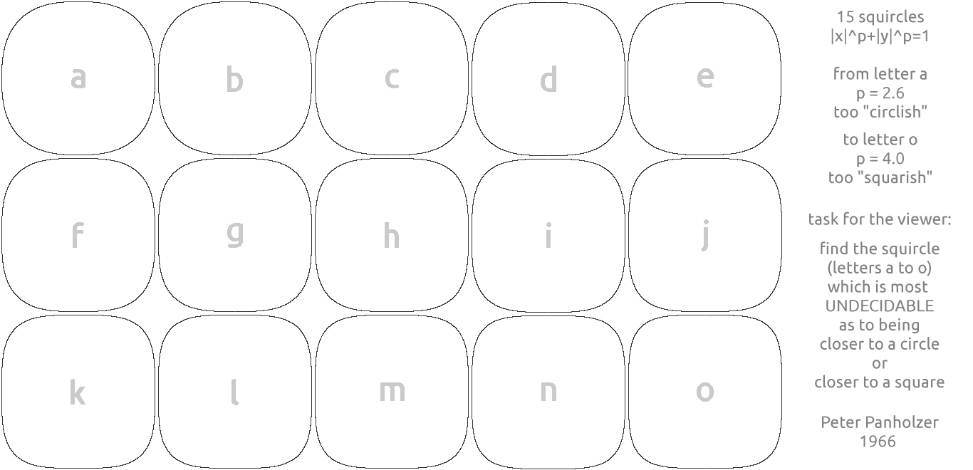
There was no plotter around at that time, but I used transparent vellum over graph paper and my architectural drawing skills with “French curves” to draw 15 squircles from p=2.6 (obviously “circlish”) to p=4.0 (obviously “squarish”).

More squircle posts

[1] The 15 plots mentioned in the quote at the end came first. A survey found that people preferred the curve corresponding to p around 3.1. Later the solution to the equation for the area to be half way between that of a circle and a square produced a similar value.

[2] Here are a couple lines of Mathematica code to find p.

    f[p_] := Gamma[1 + 1/p]^2/Gamma[1 + 2/p]
    FindRoot[f[p] - (1 + Pi/4)/2, {p, 4}]

The 4 in the final argument to FindRoot is just a suggested starting point for the search.

Covered entities: TMPRA extends HIPAA

The US HIPAA law only protects the privacy of health data held by “covered entities,” which essentially means health care providers and insurance companies. If you give your heart monitoring data or DNA to your doctor, it comes under HIPAA. If you give it to Fitbit or 23andMe, it does not. Government entities are not covered by HIPAA either, a fact that Latanya Sweeney exploited to demonstrate how service dates be used to identify individuals.

Texas passed the Texas Medical Records Privacy Act (a.k.a. HB 300 or TMPRA) to close this gap. Texas has a much broader definition of covered entity. In a nutshell, Texas law defines a covered entity to include anyone “assembling, collecting, analyzing, using, evaluating, storing, or transmitting protected health information.” The full definition, available here, says

“Covered entity” means any person who:

(A) for commercial, financial, or professional gain, monetary fees, or dues, or on a cooperative, nonprofit, or pro bono basis, engages, in whole or in part, and with real or constructive knowledge, in the practice of assembling, collecting, analyzing, using, evaluating, storing, or transmitting protected health information. The term includes a business associate, health care payer, governmental unit, information or computer management entity, school, health researcher, health care facility, clinic, health care provider, or person who maintains an Internet site;

(B) comes into possession of protected health information;

(C) obtains or stores protected health information under this chapter; or

(D) is an employee, agent, or contractor of a person described by Paragraph (A), (B), or (C) insofar as the employee, agent, or contractor creates, receives, obtains, maintains, uses, or transmits protected health information.

Update: Texas has now passed the Texas Data Privacy and Security Act (TDPSA).

Posts on other privacy regulations

Inferring religion from fitness tracker data

woman looking at fitness tracker

Fitness monitors reveal more information than most people realize. For example, it may be possible to infer someone’s religious beliefs from their heart rate data.

If you have location data, it’s trivial to tell whether someone is attending religious services. But you could make a reasonable guess from cardio monitoring data alone.

Muslim prayers occur at five prescribed times a day. If you could detect that someone is kneeling every day at precisely those prescribed times, it’s likely they are Muslim. Maybe they just happen to be stretching while Muslims are praying, but that’s less likely.

It should be possible to detect when a person is singing by looking at fitness data. If you find that someone is singing every Sunday morning, it’s likely they are attending a church service. And if someone is consistently singing on Saturday evenings, they may be attending a large church, likely Catholic, which added a Saturday night service. Maybe they just have Saturday evening voice lessons, but attending a church service is more likely.

Maybe you could infer that someone is an observant Jew because they unusually inactive on Saturdays. Of course a lot of people take it easy on Saturdays. But if someone runs, for example, six days a week but not on Saturdays, something you could certainly tell from fitness data, that’s evidence that they may be Jewish. Not proof, but evidence.

All these inferences are fallible, of course. But that’s the nature of most privacy leaks. They don’t usually offer irrefutable evidence, but they update probabilities. One of the contributions of differential privacy is to acknowledge that all personal data leaks at least a little bit of information, and it’s better to acknowledge and control the amount of information leak than to pretend it doesn’t exist.

By the way, if you to keep your Fitbit data from revealing your religion, you might reveal it anyway. This is called the Barbra Streisand Effect for reasons explained here. If you take off your Fitbit five times a day, just before the Muslim call to prayer, you’re still giving someone who has access to your data clues to your religious affiliation.

More privacy posts

Putting topological data analysis in context

I got a review copy of The Mathematics of Data recently. Five of the six chapters are relatively conventional, a mixture of topics in numerical linear algebra, optimization, and probability. The final chapter, written by Robert Ghrist, is entitled Homological Algebra and Data. Those who grew up with Sesame Street may recall the song “Which one of these, is not like the other …”

When I first heard of topological data analysis (TDA), I was excited about the possibility of putting some beautiful mathematics to practical application. But it was hard for me to put TDA in context. How do you get actionable information out of it? If you find a seven-dimensional doughnut hiding in your data, that’s very interesting, but what do you do with that information?

Robert’s chapter in the book I’m reviewing has a nice introductory paragraph that helps put TDA in context. The section heading for the paragraph is “When is Homology Useful?”

Homological methods are, almost by definition, robust, relying on neither precise coordinates nor careful estimates for efficiency. As such, they are most useful in settings where geometric precision fails. With great robustness comes both great flexibility and great weakness. Topological data analysis is more fundamental than revolutionary: such techniques are not intended to supplant analytic, probabilistic, or spectral techniques. They can however reveal a deeper basis for why some data sets and systems behave the way they do. It is unwise to wield topological techniques in isolation, assuming that the weapons of unfamiliar “higher” mathematics are clad with incorruptible silver.

Robert’s background was in engineering and more conventional applied mathematics before he turned to applications of topology, and so he brings a broader perspective to TDA than someone trained in topology looking for ways to make topology useful. He also has a decade more experience applying TDA than when I interviewed him here. I’m looking forward to reading his new chapter carefully.

As I wrote about the other day, apparently the US Army believes that topological data analysis can be useful, presumably in combination with more quantitative methods. [1] More generally, it seems the Army is interested in mathematical models that are complementary to traditional models, models that are robust and flexible. The quote above cautions that with robustness and flexibility comes weakness, though ideally weakness that is offset by other models.

More on topological data analysis

[1] Algebraic topology is quantitative in one sense and qualitative in another. It aims to describe qualitative properties using algebraic invariants. It’s quantitative in the sense of computing homology groups, but it’s not as directly quantitative as more traditional mathematical models. It’s quantitative at a higher level of abstraction.

Assumed technologies

I just had a client ship me a laptop. We never discussed what OS the computer would run. I haven’t opened the box yet, but I imagine it’s running Windows 10.

I’ve had clients assume I run Windows, but also others who assume I run Linux or Mac. I don’t recall anyone asking me whether I used a particular operating system.

When clients say “I’ll send you some code” without specifying the language, it’s usually Python. Maybe they’ve seen Python code I’ve written, but my impression is that they assume everyone knows Python.

Other tools some will assume everyone uses:

  • Bash
  • Git and Github
  • Skype
  • MS Office
  • Signal
  • Google apps
  • Adobe Photoshop and Illustrator
  • Markdown
  • Jupyter notebooks

When I was in college, nearly every computer I saw ran Unix or Mac. I had no idea that the vast majority of the world’s computers ran Windows. I was in a bubble. And like most people in a bubble, I didn’t know I was in a bubble. I wish I had seen something like this blog post.