Are squares A and B are the same color?
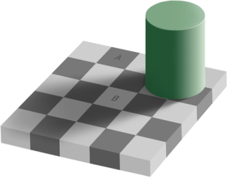
I found this illusion on John Baez’s site. It was created by Edward Adelson in 1995 and is the subject of a Wikipedia article.
Related post: Optical illusion, mathematical illusion
Are squares A and B are the same color?
I found this illusion on John Baez’s site. It was created by Edward Adelson in 1995 and is the subject of a Wikipedia article.
Related post: Optical illusion, mathematical illusion
My previous post gave three algorithms for converting color to grayscale. This post gives more examples and details.
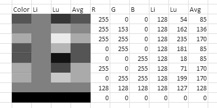
The image below is a screenshot from an Excel spreadsheet illustrating color values and how the convert to grayscale. The R, G, and B columns are the red, green, and blue component values of the color sample in the leftmost column. The columns labeled “Li”, “Lu”, and “Avg” are the grayscale values of the color using the lightness, luminosity, and average algorithms from the previous post.
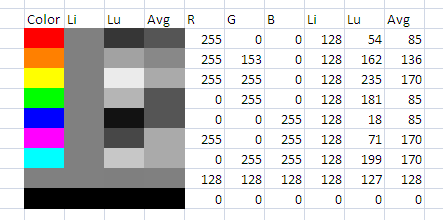
The grayscale color samples were created by asking Excel to set the background color to (X, X, X) where X is the grayscale value. For example, the background color for the “Lu” column of the first row is (54, 54, 54) since 54 is the luminosity value for pure red.
To verify the algorithms, I converted the screen shot above to a grayscale image using GIMP. The gray cells remain unchanged because all three algorithms leave gray alone; when all three RBG values are equal, it’s clear from the formulas that the grayscale value becomes the common value. The color cells in the first column become the shade of gray predicted and hence match the column of gray cells for that algorithm.
Using lightness:
Using luminosity:
Using average:
Related post: Three algorithms for converting color to grayscale
How do you convert a color image to grayscale? If each color pixel is described by a triple (R, G, B) of intensities for red, green, and blue, how do you map that to a single number giving a grayscale value? The GIMP image software has three algorithms.
The lightness method averages the most prominent and least prominent colors: (max(R, G, B) + min(R, G, B)) / 2.
The average method simply averages the values: (R + G + B) / 3.
The luminosity method is a more sophisticated version of the average method. It also averages the values, but it forms a weighted average to account for human perception. We’re more sensitive to green than other colors, so green is weighted most heavily. The formula for luminosity is 0.21 R + 0.72 G + 0.07 B.
The example sunflower images below come from the GIMP documentation.
| Original image | 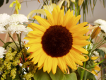 |
| Lightness | 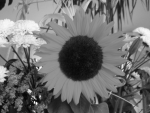 |
| Average | 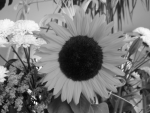 |
| Luminosity | 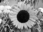 |
The lightness method tends to reduce contrast. The luminosity method works best overall and is the default method used if you ask GIMP to change an image from RGB to grayscale from the Image -> Mode menu. However, some images look better using one of the other algorithms. And sometimes the three methods produce very similar results.
***
If you found this post useful, check out @dsp_fact for daily tidbits of signal and image processing.

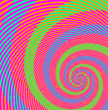
Someone sent me a link to an optical illusion while I was working on a math problem. The two things turned out to be related.
In the image below, what look like blues spiral and green spirals are actually exactly the same color. The spiral that looks blue is actually green inside, but the magenta stripes across it make the green look blue. I know you don’t believe me; I didn’t believe it either. You can open it in an image editor and use a color selector to examine it for yourself.
My math problem was also a case of two things that look different even though they are not. Maybe you can think back to a time as a student when you knew your answer was correct even though it didn’t match the answer in the back of the book. The two answers were equivalent but written differently. In an algebra class you might answer 5 / √3 when the book has 5 √3 / 3. In trig class you might answer 1 − cos2 x when the book has sin2 x. In a differential equations class, equivalent answers may look very different since arbitrary constants can obfuscate differences.
In my particular problem, I was looking at weights for Gauss-Hermite integration. I was trying to reconcile two different expressions for the weights, one in some software I’d written years ago and one given in Abramowitz and Stegun. I thought I’d found a bug, at least in my comments if not in my software. My confusion was analogous to not recognizing a trig identity. I wish I could say that the optical illusion link made me think that the two expressions may be the same and they just look different because of a mathematical illusion. That would make a good story. Instead, I discovered the equivalence of the two expressions by brute force, having Mathematica print out the values so I could compare them. Only later did I see the analogy between my problem and the optical illusion.
In case you’re interested in the details, my problem boiled down to the equivalence between Hn+1(xi)2 and 4n2Hn−1(xi)2 where Hn(x) is the nth Hermite polynomial and xi is the ith root of Hn. Here’s why these are the same. The Hermite polynomials satisfy a recurrence relation
Hn+1(x) = 2x Hn(x) − 2n Hn−1(x)
for all x. Since Hn(xi) = 0, Hn+1(xi) = −2nHn−1(x). Now square both sides.
Related post: Orthogonal polynomials
Bill the Lizard answered an image compression question on StackOverflow by pointing out the image below that shows the difference between PNG and JPEG compression when applied to line drawings.

The image comes from lbrandy.com. The left side of the image uses PNG compression, a lossless compression format. The right side uses JPEG, a lossy format that computes a Fourier transform and discards the highest frequency components. JPEG can produce smaller files for natural photographic images. But for line drawings, the artifacts of the JPEG compression are noticeable.
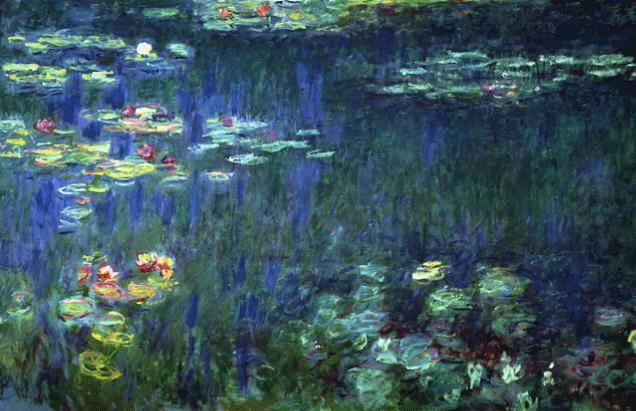
The other day Nils gave an interesting answer to a question on StackOverflow regarding color theory.
NEVER ever use pure colors. … If you have no idea what color to start with, get a classic masterpiece of painting from the net. Blur it a bit and then pick some nice colors from it. If you use some common sense it’s hard not to end with pleasant colors this way.
He gave the example of extracting this color scheme

from this painting.
Writing good installation programs is hard. It takes experience and forethought to imagine all the things that might happen on the client’s computer. Top notch programmers know that installers are critical to a user’s experience and put a lot of time into making them high quality. Not so top notch programmers think a project is done when they can get it to work on their computer.
Scott Hanselman has an interview with Paint.NET creator Rick Brewster. The main topic of the interview was the things Rick did to make Paint.NET easy to install.
Paint.NET is an image editing product written using Microsoft’s .NET framework. In a sense Paint.NET is the geometric mean between the Paint program that ships with Windows and Adope Photoshop: it does about 20x more than Paint and about 20x less than Photoshop. It does most of the things I need, but it’s small enough that I can do a brute force search of the features if I have to.
A while back I was trying to paste a figures into a LaTeX document this evening with names like foo_27.png and foo_32.2.png, putting a parameter value into the name of the plot. The former worked but the latter didn’t.
It turns out the \includegraphics command parses the file extension in a naive way to determine the file type. When it sees foo_27.png, it says “OK, a .png file”. But when it sees foo_32.2.png, it says “.2.png? I’ve never heard of that file type.”
Related post: Including graphics in LaTeX documents
Here are the rules for including images in LaTeX files as far as I can tell.
Near the top of your document, use \usepackage{graphicx} to load the graphicx package. Then at the point where you want to include your image, use \includeimage{...} where … is the path to your file.
If you want to create a PDF file with pdflatex, your image must be in PDF, PNG, or JPEG format.
If you want to create a DVI file with latex or a PS file with dvips, your image must be in PS or EPS format.
There’s no way to include a GIF file without first converting it to another file format.
If you use \usepackage{pgf} rather than \usepackage{graphics} at the top of the file, nothing changes except that you must chop the file extensions off image file names.
Related post: Watch what you name graphics files in LaTeX
VectorMagic is a free online tool from the Standford University AI lab for converting bitmap images to vector formats. The image below shows an example of what you might use this tool for.
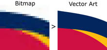
I just heard about the software and tried it out with a fairly complex image, a sample of Japanese calligraphy, and it did a beautiful job converting the image from bitmap to EPS (Encapsulated PostScript).
The software supports JPEG, GIF, PNG, BMP, and TIFF input. It supports EPS, SVG, and PNG output.
(In case you’re not familiar with graphic formats, a bitmap image is a matrix of dots. The format records what color each dot is. That works fine when an image is displayed at its original resolution. But if you make the image bigger, you just get bigger dots and things look grainy. A vector format stores the formulas for the curves that make up the image, not the dots, and computes the dots when it’s time to display the image. If you make an image larger, it computes new dots according to the formulas. Software for making bitmaps smaller is common. Software that does a good job of making bitmaps larger is rare.)
Update: VectorMagic has moved to a new domain. I’ve corrected the link above.