Draw a symbol, look it up

LaTeX users may know about Detexify, a website that lets you draw a character then looks up its TeX command. Now there’s a new site Shapecatcher that does the same thing for Unicode. According to the site, “Currently, there are 10,007 Unicode character glyphs in the database.” It does not yet support Chinese, Japanese, or Korean.

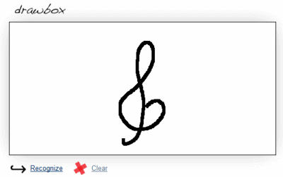
For example, I drew a treble clef on the page:

The site came back with a list of possible matches, and the first one was what I was hoping for:

Interestingly, the sixth possible match on the list was a symbol for contour integration:

Notice the treble clef response has a funny little box on the right side. That’s because my browser did not have a glyph to display that Unicode character. The browser did have a glyph for the contour integration symbol and displayed it.

Another Unicode resource I recommend is this Unicode Codepoint Chart. It is organized by code point value, in blocks of 256. If you were looking for the contour integration symbol above, for example, you could click on a link “U+2200 to U+22FF: Mathematical Operators” and see a grid of 256 symbols and click on the one you’re looking for. This site gives more detail about each character than does Shapecatcher. So you might use Shapecatcher to find where to start looking, then go to the Unicode Codepoint Chart to find related symbols or more details.

Other posts on Unicode

Typesetting “C#” in LaTeX

How do you refer to the C# programming language in LaTeX? Simply typing C# doesn’t work because # is a special character in LaTeX. You could type C#. That works, but it looks a little odd. The number sign is too big and too low.

What about using a musical sharp sign, i.e. C$\sharp$? That also looks a little odd. Even though the language is pronounced “C sharp,” it’s usually written with a number sign, not a sharp.

Let’s look at recommended ways of typesetting C++ to see whether that helps. The top answer to this question on TeX Stack Exchange is to define a new command as follows:

\newcommand{\CC}{C\nolinebreak\hspace{-.05em}\raisebox{.4ex}{\tiny\bf +}\nolinebreak\hspace{-.10em}\raisebox{.4ex}{\tiny\bf +}}

This does several things. First, it prevents line breaks between the constituent characters. It also does several things to the plus signs:

  • Draws them in closer
  • Makes them smaller
  • Raises them
  • Makes them bold

The result is what we’re subconsciously accustomed to seeing in print.

Here’s an analogous command for C#.

\newcommand{\CS}{C\nolinebreak\hspace{-.05em}\raisebox{.6ex}{\tiny\bf \#}}

And here’s the output. The number sign is a little too small.

To make a little larger number sign, replace \tiny with \scriptsize.

More LaTeX posts

Typesetting chemistry in LaTeX

Yesterday I gave the following tip on TeXtip:

Set chemical formulas with math Roman. Example: sulfate is $mathrm{SO_4^{2-}}$

TorbjoernT and scmbradley let me know there’s a better way: use Martin Hansel’s package mhchem. The package is simpler to use and it correctly handles subtle typographical details.

Using the mhchem package, sulfate would be written ce{SO4^2-}. In addition to chemical compounds, mhchem has support for bonds, arrows, and related chemical notation.

Example:

Source:

\documentclass{article}
\usepackage[version=3]{mhchem}
\parskip=0.1in
\begin{document}

\ce{SO4^2-}

\ce{^{227}_{90}Th+}

\ce{A\bond{-}B\bond{=}C\bond{#}D}

\ce{CO2 + C -> 2CO}

\ce{SO4^2- + Ba^2+ -> BaSO4 v}

\end{document}


For more information, see the mhchem package documentation.

Related posts

Google Docs OCR

Google Docs now offers OCR (optical character recognition), but I’ve had little success getting  it to work.

The link to upload files was flaky under Firefox 3.6.4. The underlined text that says “Select files to upload” is not clickable, but you can click the white space a few millimeters above or below what looks like a link. However, the clickable white space didn’t do anything when I clicked it. The link worked just fine in IE 8 and Safari 5.0.

screen shot of page to upload documents for OCR

I clicked the check box that says “Convert text from PDF or image files to Google Docs documents” and uploaded a PDF file. The file was a decent quality scan of a paper document.

section of text from a scanned article

I got a message back saying “Unable to convert document.”

So I tried again with a PDF file that had been created from a LaTeX file using pdflatex. The optical quality of the document was perfect since the document it wasn’t a scan but rather an electronic document printed directly to PDF. Moreover, the PDF file contains the plain text.  Google indexes such PDFs created with pdflatex just as easily as HTML files. However, I still got the message “Unable to convert document.”

My experience with Google OCR wasn’t a total failure. I created a Microsoft Word document with text in 12-point Times New Roman — I figured this was as commonplace as I could get — and printed it to PDF. Google Docs did successfully convert that document to text.

I imagine Google’s OCR feature will be useful once they debug it. But it doesn’t yet seem ready for prime time based on my limited experience.

The disappointing state of Unicode fonts

Modern operating systems understand Unicode internally, but font support for Unicode is spotty. For an example of the problems this can cause, take a look at these screen shots of how the same Twitter message appears differently depending on what program is used to read it.

No font can display all Unicode characters. According to Wikipedia

… it would be impossible to create such a font in any common font format, as Unicode includes over 100,000 characters, while no widely-used font format supports more than 65,535 glyphs.

However, the biggest problem isn’t the number of characters a font can display. Most Unicode characters are quite rare. About 30,000 characters are enough to display the vast majority of characters in use in all the world’s languages as well as a generous selection of symbols. However Unicode fonts vary greatly in their support even for the more commonly used ranges of characters. See this comparison chart. The only range completely covered by all Unicode fonts in the chart is the 128 characters of Latin Extended-A.

Unifont supports all printable characters in the basic multilingual plane, characters U+0000 through U+FFFF. This includes the 30,000 characters mentioned above plus many more. Unifont isn’t pretty, but it’s complete. As far as I know, it’s the only font that covers the characters below U+FFFF.

More Unicode posts

Free alternative to Consolas font

Consolas is my favorite monospace font. It’s a good programmer’s font because it exaggerates the differences between some characters that may easily be confused. It ships with Visual Studio and with many other Microsoft products. See this post for examples.

I recently found out about Inconsolata, a free font similar to Consolas. Inconsolata is part of the OFL font collection from SIL International.

Another interesting font from SIL is Andika, mentioned previously here. The Andika home page describes this font as follows.

Andika is a sans serif, Unicode-compliant font designed especially for literacy use, taking into account the needs of beginning readers. The focus is on clear, easy-to-perceive letterforms that will not be readily confused with one another.

More font posts

Adding fonts to the PowerShell and cmd.exe consoles

The default font options for the PowerShell console are limited: raster fonts and Lucida Console. Raster fonts are the default, though Lucida Console is an improvement. In my opinion, Consolas is even better, but it’s not on the list of options.

Mastering PowerShell by Tobias Weltner explains how to expand the list of font options for the PowerShell console. The same trick increases the list of font options in the Windows command prompt cmd.exe as well. The book is free for download. See page 16 for details. However, I have two comments about the instructions it gives.

First, the book says “The name must be exactly the same as the official font name, just the way it’s stated under [registry key].” However, the Consolas font is listed in the registry as “Consolas (True Type)”. You should enter “Consolas” and leave out the parenthetical description.

Second, the book says “the new font will work only after you either log off at least once or restart your computer.” When I tried it, logging off was not sufficient; I had to reboot my computer before the font change would work.

Update: In order to make this post self-contained, I’ve added below the necessary information from Mastering PowerShell.

Run regedit.exe and navigate to HKEY_LOCAL_MACHINESOFTWAREMicrosoftWindows NTCurrentVersionConsoleTrueTypeFont.

Right-click in the panel on the right side and create a new string value. Name that value “0” or “00” or however many zeros you need to create a new key. That string’s value is the name of the font to add.

Update: See Necessary criteria for fonts to be available in a command window

Related posts

I owe Microsoft Word an apology

I tried to use the Equation Editor in Microsoft Word years ago and hated it. It was hard to use and produced ugly output. I tried it again recently and was pleasantly surprised. I’m using Word 2007. I don’t remember what version I’d tried before.

I’ve long said that math written in Word is ugly, and it usually is. But the fault lies with users, like myself, not with Word. I realize now that the problem is that most people writing math in Word are not using the Equation Editor. LaTeX produces ugly math too when people do not use it correctly, though this happens less often.

Math typography is subtle. For example, mathematical symbols are set in an italic font that is not quite the same as the italic font used in prose. Also, word-like symbols such as “log” or “cos” are not set in italics. I imagine most people do not consciously notice these conventions — I never noticed until I learned to use LaTeX — but subconsciously notice when the conventions are violated. The conventions of math typography give clues that help readers distinguish, for example, the English indefinite article “a” from a variable named “a” and to distinguish the symbol for maximum from the product of variables “m”, “a”, and “x.”

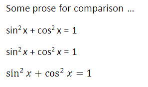
Microsoft’s Equation Editor typesets math correctly. Word documents usually do not, but only because folks usually do not use the Equation Editor. In the following example, I set the same equation three times: using ordinary text, using ordinary italic for the “x”, and finally using the Equation Editor.

screen shot of trig identity using MS Word

Note that the “x” in the third version is not the same as the italic “x” in the second version. The prose in this example is set in Calibri font and the Equation Editor uses Cambria Math font. Also, I did not tell Word to format “sin” and “cos” one way and “x” another or tell it what font to use; I simply typed sin^2 x + cos^2 x = 1 into the Equation Editor and it formatted the result as above. I haven’t used it much, but the Equation Editor seems to be more capable and easier to use than I thought.

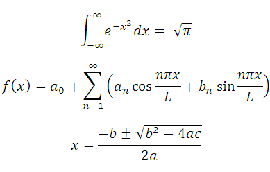
Here are a few more examples of Equation Editor output.

examples of math using Word: Gaussian integral, Fourier series, quadratic equation

I still prefer using LaTeX for documents containing math symbols. I’ve used LaTeX for many years and I can typeset equations very quickly using it. But I’m glad to know that Word can typeset equations well and that the process is easier than I thought.

I tried out the Equation Editor because Bob Matthews suggested I try MathType, a third-party equation editor add-on for Microsoft Word. I haven’t tried MathType yet but from what I hear it produces even better output.

Related post: Contrasting Microsoft Word and LaTeX

A couple thoughts on typography

Font embedding not such a good idea?

The most recent Boag World podcast interviewed Mark Boulton. Boulton has a contrarian opinion on font embedding. Nearly all web designers are excited about font embedding (the ability to have fonts download on-the-fly if a page uses a font not installed on the user’s computer). Bolton’s not so sure this is a good idea. Fonts are designed for a purpose, and most fonts were designed for print. The handful of fonts that were designed first for online viewing (Verdana, Georgia, etc.) are widely installed. If font embedding were a way to broaden the pallet of fonts designed for use on a computer monitor, that would be great. But the most likely use of font embedding would be to allow designers to use more fonts online that were not designed to be used online.

Comic Sans and dyslexia

Comic Sans is terribly overused. It’s not a bad font, but it’s often used in inappropriate contexts and has become a cliché for poor typographical taste.

However, I heard somewhere that people with dyslexia can read Comic Sans more easily than most other fonts. I think the explanation was that the font breaks some typical symmetries. For example, a “p” is not an exact mirror image of a “q.” (The former has a more pronounced serif on top.) On the other hand, the “b” and “d” do look like near mirror images. I wonder whether anyone has designed a font specifically to help people with dyslexia. Maybe such  fonts would exaggerate the asymmetries that were accidental in the design of Comic Sans. Delivering such fonts would be a good application of font embedding.

Update: Karl Ove Hufthammer left a comment pointing out Andika, a font with “easy-to-perceive letterforms that will not be readily confused with one another.”

Related posts

Typesetting music with LilyPond

I tried typesetting music in LaTeX some time ago and gave up. The packages I found were hard to install, the examples didn’t work, etc. This weekend I decided to try again. I tried plowing through the MusiXTeX documentation and got no further than I did last time.

I posted a note on StackOverflow and got some good responses. Nikhil Chelliah suggested I look at LilyPond. I had looked at LilyPond before, and @jleedev explained how to integrate LaTeX and LilyPond.

Here’s some sheet music I included in my previous post, March in 7/4 time.

sheet music example

Here’s a full-sized PDF file version of the music above. And here’s the LilyPond source code used to create the music.

\relative c' {
\time 7/4
\key f \major
\clef treble
f g f \times 2/3{ c8 c c} f4 g a
g a8. bes16 a4 g f g c,
f g f \times 2/3{ c8 c c} f4 g a
g a8. bes16 a4 g f e f
}

The notation looks cryptic at first, but it makes sense after a few minutes. The command relative c' means that the following pitches will be relative to middle C. For example, the first note, F, is the F closest to middle C. Each note is the same length as the previous note by default, and the first note is a quarter note by default. The notation c8 means that the C is an eighth note, except it’s in the context of a triplet (times 2/3) and so it’s an eighth note triplet. The next F is denoted f4 to indicate that we’re back to quarter notes.

The notation a8. says that the A is a dotted eighth note. For the next note, bes16 means a B-flat sixteenth note. The suffix “es” stands for “flat” and “is” stands for “sharp.” (The documentation says it’s Dutch. I’ve never seen it before.) I don’t understand why I had to tell it that the B was flat. The code specified earlier that the key was F major, which implies B’s are flat. I suppose the code for individual notes is decoupled from the code to draw the key signature. That would make entering music painful in keys that have lots of sharps or flats. Maybe there’s a way to specify default sharps or flats.

The comma in c, gives the absolute pitch of the C. In relative mode, LilyPond assumes by default that each pitch name refers to the pitch closest to its predecessor. The C closest to the previous note, F, would have been the C up one fourth rather than down one fifth, so the comma was necessary to tell LilyPond to go down.

If I were to do a lot of music processing, I’d probably look at a commercial package such as Sibelius. But for now I’m just interested in producing small excerpts like that above, and it looks like LilyPond may be fine.

Update: I double checked the rules about flats etc. Yes, I do have to specify explicitly that the B in this example is B-flat. If I just say b rather than bes, LilyPond will add a natural sign in front of the B! It’s strange. It is aware of the key signature: when I tell it the B is flat, it says “OK, then I don’t have to mark that specially since it’s implicit in the key signature.” And if I don’t tell it the B is flat, it says “Oh, that’s an exception to the key signature. Better mark it with a natural sign.”