Things that work best when you don't notice them

Fonts, translations, and programming languages have one thing in common: they work best when you don’t notice them.

If someone says “Hey, look at this cool font I just found!” you probably wouldn’t want to read a book set in that font. At least to an untrained eye, a great font will not stand out in a list of small samples. You have to see large blocks of text set in a font to appreciate it. Even then, most people will not consciously appreciate a very readable font.

Translations are similar. If you find yourself saying “What an interesting translation!” then the translator has probably fallen down on the job. A good translation is neither archaic nor trendy. It does not draw attention to itself but allows you to focus on the original content. I believe the English Standard Version achieves that with Bible translation.

Python is like a good font or a good translation. For years I’d look into Python briefly when someone would recommend it. I’d thumb through a Python book, but it all looked rather plain. Only later did I come to appreciate that the beauty of Python is that it is rather plain. It doesn’t call attention to itself. It just gets out of your way and lets you write programs. It seems to me that compared to other programming language communities, the Python community brags less about their language per se and more about what they’re able to do with it.

Better R console fonts

The default installation of R on Windows uses Courier New for the console font. Unfortunately, this font offers low contrast between the letter ‘l’ and the number ‘1.’ There is also poor contrast between the letter ‘O’ and the number ‘0.’ The contrast between period and commas is OK.

Lucida Console is an improvement. It has high contrast between ‘l’ and ‘1’, though ‘O’ and ‘0’ are still hard to distinguish. But my favorite console font is Consolas. It offers strong contrast between ‘l’ and ‘1’, commas and periods, and especially between lower case ‘o’, upper case ‘O’, and the number ‘0.’

Consolas is more legible while also fitting more characters into the same horizontal space. It can do this because it uses ClearType anti-aliasing while the other two fonts do not. Here is a sample of the three fonts magnified 4x to show the anti-aliasing.

I found setting the default console font in R a little tricky. Clicking on the Edit -> GUI preferences menu brings up the Rgui Configuration Editor. From there it’s obvious how to change the font. However, what I found surprising is that clicking the “OK” button only changes the font for the current session. I can’t think of another application that behaves analogously. To set your choice of font for all future sessions, click “Save” rather than “OK.”

* * *

Help integrating R into your environment

Accented letters in HTML, TeX, and MS Word

I frequently need to look up how to add diacritical marks to letters in HTML, TeX, and Microsoft Word, though not quite frequently enough to commit the information to my long-term memory. So today I wrote up a set of notes on adding accents for future reference. Here’s a chart summarizing the notes.

Accent HTML TeX Word
grave grave \` CTRL + `
acute acute \' CTRL + '
circumflex circ \^ CTRL + ^
tilde tidle \~ CTRL + SHIFT + ~
umlaut uml \" CTRL + SHIFT + :
cedilla cedil \c CTRL + ,
æ, Æ æ, Æ \ae, \AE CTRL + SHIFT + & + a or A
ø, Ø ø, Ø \o, \O CTRL + / + o or O
å, Å å, Å \aa, \AA CTRL + SHIFT + @ + a or A

The notes go into more details about how accents function in each environment and what limitations each has. For example, LaTeX will let you combine any accent with any letter, but MS Word and HTML only support letter/accent combinations that are common in spoken languages.

Greek letters and math symbols in (X)HTML

It’s not hard to use Greek letters and math symbols in (X)HTML, but apparently it’s not common knowledge either. Many pages insert little image files every time they need a special character. Such web pages look a little like ransom notes with letters cut from multiple sources.  Sometimes this is necessary but often it can be avoided.

I’ve posted a couple pages on using Greek letters and math symbols in HTML, XML, XHTML, TeX, and Unicode. I included TeX because it’s the lingua franca for math typography, and I included Unicode because the X(HT)ML representation of symbols is closely related to Unicode.

The notes give charts for encoding Greek letters and some of the most common math symbols. They explain how HTML and XHTML differ in this context and also discuss browser compatibility issues.

Contrasting Microsoft Word and LaTeX

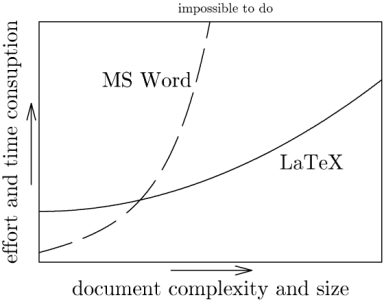
Here’s an interesting graph from Marko Pinteric comparing Microsoft Word and Donald Knuth’s LaTeX.

comparing Word and Latex. Image by Marko Pinteric.

According to the graph, LaTeX becomes easier to use relative to Microsoft Word as the task becomes more complex. That matches my experience, though I’d add a few footnotes.

  1. Most people spend most of their time working with documents of complexity to the left of the cross over.
  2. Your first LaTeX document will take much longer to write than your first Word document.
  3. Word is much easier to use if you need to paste in figures.
  4. LaTeX documents look better, especially if they contain mathematics.

See Charles Petzold’s notes about the lengths he went to in order to produce is upcoming book in Word. I imagine someone of less talent and persistence than Petzold could not have pulled it off using Word, though they would have stood a better chance using LaTeX.

Before the 2007 version, Word documents were stored in an opaque binary format. This made it harder to compare two documents. A version control system, for example, could not diff two Word documents the same way it could diff two text files. It also made Word documents difficult to troubleshoot since you had no way to look beneath the WYSIWYG surface.

However, a Word 2007 document is a zip file containing a directory of XML files and embedded resources. You can change the extension of any Office 2007 file to .zip and unzip it, inspect and possibly change the contents, the re-zip it. This opens up many new possibilities.

I’ve written some notes that may be useful for people wanting to try out LaTeX on Windows.

Cutting and pasting Turing

Charles Petzold describes on his blog how he wrote his book The Annotated Turing, a commentary on Alan Turing‘s seminal computer science paper. The book is scheduled to be released June 10. Petzold began by literally cutting and pasting pieces of Turing’s paper. He worked on the book away from his computer for the first couple months.

As a programmer and author, Petzold has no aversion to using computers. He says “I gave up handwriting … sometime around 1982 when I first learned WordStar on my Osborne 1.” But he discovered that he thought more deeply about the subject of his book when he wasn’t distracted by typesetting issues. He’s a technical wizard, but he makes selective use of technology.