Suppose you’re trying to study the distribution of something by simulation. The average of your simulation values gives you an estimate of the mean value of the thing you’re simulating.
Next you want to have an idea how much the thing you’re simulating varies. You estimate the percentiles of your distribution by the percentiles of your samples. How variable are your estimates? For example, you estimate the 90th percentile of your distribution by finding the 90th percentile of your samples. How much is your estimate likely to change if you rerun you simulation with a new random number generator seed?
How does the variability of the percentiles depend on the percentile you’re looking at? For example, you might expect the median, i.e. the 50th percentile, to be the most stable. And as you start looking at more extreme percentiles, say the 5th or 95th, you might expect more variability. But how much more variability? A lot more or a little more?
To explore the questions above, let’s suppose we’re sampling from a standard normal distribution. (Of course if we really were sampling from something so well known as a normal distribution, we wouldn’t be doing simulation. But we need to pick something for illustration, so let’s use something simple.)
Suppose we simulate n values, sort them, and take the kth largest value. This is called the kth order statistic. For example, we might estimate the 90th percentile of our distribution by using n = 1000 and k = 900. The distribution of the kth order statistic from n samples is known analytically (it’s a short derivation; see here) and so we can use it to make some plots.
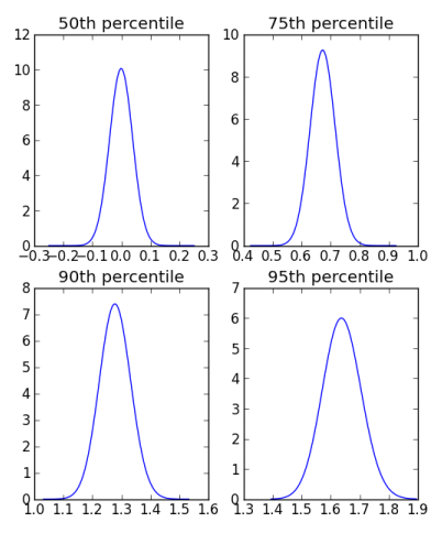
These plots use n = 1000. Each uses the same horizontal scale, so you can see how the distributions get wider as we move to higher percentiles. The distribution for the 95th percentile is about twice as wide as the distribution for the median.
Each plot is centered at the corresponding quantile for the standard normal distribution. For example, the plot for the distribution of the 75th percentile of the samples is centered at the 75th percentile of the standard normal.
The distribution for the sample median is unbiased, symmetric about 0. The distributions for the 75th and 90th percentiles are slightly biased to the left, i.e. they slightly underestimate the true values on average. The 95th percentile, however, is slightly biased in the opposite direction. [Update: As pointed out in the comments below, it seems the appearance of bias was a plotting artifact.]
If you’d like to see the details of how the plot was made, here is the Python code.
import scipy as sp
import scipy.stats
import scipy.special
import matplotlib.pyplot as plt

def pdf(y, n, k):
    Phi = scipy.stats.norm.cdf(y)
    phi = scipy.stats.norm.pdf(y)
    return scipy.stats.beta.pdf(Phi, k, n+1-k)*phi

def plot_percentile(p):
    center = scipy.stats.norm.ppf(0.01*p)
    t = sp.linspace(center-0.25, center+0.25, 100)
    plt.plot(t, pdf(t, 1000, 10*p))
    plt.title( "{0}th percentile".format(p) )

plt.subplot(221)
plot_percentile(50)
plt.subplot(222)
plot_percentile(75)
plt.subplot(223)
plot_percentile(90)
plt.subplot(224)
plot_percentile(95)
plt.show()

