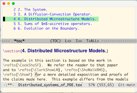
Posts tagged as:

LaTeX

Separating presentation from content

by John on November 14, 2011

In the late ’90s I went to a fair number of Microsoft presentations. One presentation would say “The problem with Technology X is that it mixes presentation and content. We’ve introduced Technology Y to make your code cleaner, separating presentation and content.” A few months later I’d be at another presentation that would announce “The problem with Technology Y is that it mixes presentation and content. We’ve introduced Technology Z …” (Does this remind anyone else of The Cat in the Hat Comes Back?)

When I first learned LaTeX, I was told that one of its strengths is that it separates presentation and content. Then a few years later I hear complaints that the problem with LaTeX is that it mingles presentation and content, unlike XHTML. A few years later, guess what? XHTML mixes presentation and content, so we need something else.

I shut down when I hear someone announce that everything before their product was bad because it mixed presentation and content, and now with their solution, presentation and content will be completely separate.

Sometimes one technology really does make a cleaner separation of presentation and content. But at best the separation is relative. LaTeX separates presentation and content more than Word, though not as much as well-written HTML and CSS, maybe. But presentation and content cannot be entirely separated. Nor is their unanimous agreement on what exactly the dividing line is between the two.

Many people don’t want to separate their presentation and content. They don’t understand why this would be desirable, and they’ll fight against anything designed to encourage separation. Maybe they need to learn the advantages, or maybe they’re just doing the best they can to get their job done and they can’t be bothered with long term advantages that may not materialize.

The principle of separating presentation and content is admirable. It really does have advantages, but it’s easier said than done.

{ 8 comments }

Typesetting “C#” in LaTeX

by John on October 18, 2011

How do you refer to the C# programming language in LaTeX? Simply typing C# doesn’t work because # is a special character in LaTeX. You could type C\#. That works, but it looks a little odd. The number sign is too big and too low. [click to continue...]

{ 3 comments }

Bundled versus unbundled version history

by John on June 13, 2011

The other day I said to a colleague that an advantage to LaTeX over Microsoft Word is that it’s easy to version LaTeX files because they’re just plain text. My colleague had the opposite view. He said that LaTeX was impossible to version because its files are just plain text. How could we interpret the same facts so differently?

I was thinking about checking files in and out of a version control system. With a text file, the version control system can tell you exactly how two versions differ. But with something like a Word document, the system will give an unhelpful message like “binary files differ.”

My colleague was thinking about using the change tracking features of Microsoft Word. He’s accustomed to seeing documents in isolation, such as a file attachment in an email. In that setting, a plain text file has no version history, but a Word document may.

I assumed version information would be external to the document. He assumed the version information would be bundled with the document. My view is typical of software developers. His is typical of everyone else.

These two approaches are analogous to functional programming versus object oriented programming. Version control systems have a functional view of files. The versioning functionality is unbundled from the file content, in part because the content (typically source code files) could be used by many different applications. Word provides a sort of object oriented versioning system, bundling versioning functionality with the data.

As with functional versus object oriented programming, there’s no “right” way to solve this problem, only approaches that work better in different contexts. I much prefer using a version control system to track changes to my files, but that approach won’t fly with people who don’t share a common version control system or don’t use version control at all.

Related posts:

Contrasting Microsoft Word and LaTeX
Complexity of HTML and LaTeX
I owe Microsoft Word an apology

{ 10 comments }

Typesetting chemistry in LaTeX

by John on December 8, 2010

Yesterday I gave the following tip on TeXtip:

Set chemical formulas with math Roman. Example: sulfate is $\mathrm{SO_4^{2-}}$

TorbjoernT and scmbradley let me know there’s a better way: use Martin Hansel’s package mhchem. The package is simpler to use and it correctly handles subtle typographical details.

Using the mhchem package, sulfate would be written \ce{SO4^2-}. In addition to chemical compounds, mhchem has support for bonds, arrows, and related chemical notation.

Example:

Source:

\documentclass{article}
\usepackage[version=3]{mhchem}
\parskip=0.1in
\begin{document}

\ce{SO4^2-}

\ce{^{227}_{90}Th+}

\ce{A\bond{-}B\bond{=}C\bond{#}D}

\ce{CO2 + C -> 2CO}

\ce{SO4^2- + Ba^2+ -> BaSO4 v}

\end{document}


For more information, see the mhchem package documentation.

Related posts:

Top four LaTeX mistakes
Hyperlinks in LaTeX-generated PDF

{ 7 comments }

Serious lessons from Knuth’s joke

by John on October 4, 2010

On June 30, 2010 Donald Knuth announced iTeX, the successor to TeX. His announcement was an extended parody of much of what people recommend as the “right” way to develop software.

TeX has been extremely successful. The vast majority of math and computer science is published using TeX. And yet Knuth implies that TeX would have been an obscure failure if he had developed it using trendy software development techniques.

Here’s the video of Knuth’s presentation.

{ 2 comments }

Daily tip Twitter account FAQ

by John on September 23, 2010

This post answers some frequently asked questions regarding my daily tip accounts on Twitter.

How many followers do you have?

About 2800 people are following at least one of these accounts at the time of writing, each following between 2 and 3 accounts on average for a total of about 5900 follows combining all accounts.

How do you schedule your posts?

I schedule the tips a week to a month in advance using HootSuite. Each account posts at the same time each week day starting with SansMouse at 9:30 AM and ending with AlgebraFact at 1:30 PM (US Central Time). Once in a while a tip will go out late due to a Twitter API failure. I occasionally sprinkle in a few unscheduled tweets but I keep the volume low.

What if I don’t use Twitter?

You can subscribe to a Twitter feed via RSS just as you would a blog. For example, you could follow Twitter accounts via Google Reader.

How advanced are these tips?

The SansMouse and RegexTip are in a cycle that starts with the most familiar tips and then moves on to less familiar ones. I mix elementary and advanced material in the mathematical accounts, though there’s a greater range in some accounts. If a tip is more elementary or more advanced than you’d like, you may find something more to your liking in a day or two.

Do you take suggestions? Questions?

I welcome corrections as well as suggestions for new tips. General suggestions are helpful, but I especially appreciate specific tweets.

I like to answer questions when I can, though I can’t respond to every question.

Any plans for new accounts?

I have a couple ideas I’m considering. If you have a suggestion for another daily tip account, let me know.

What about questions about specific accounts?

The following isn’t Q&A format, but it answers some common questions.

SansMouse icon SansMouse is my oldest daily tip account. It gives one Windows keyboard shortcut each day. Most tips apply across all applications, but some tips are specific to popular software packages. Ben Jaffe has an analogous Twitter account commandtab for Mac OS.

RegexTip icon RegexTip is currently the second most popular daily tip account with 1025 followers at the time of writing. This account gives tips for writing regular expressions as well as tips for how regular expressions are used in different environments. I mostly stick to the regular expression syntax supported by Perl 5, Microsoft’s .NET languages, JavaScript, etc.

TeXtip icon TeXtip gives tips for typesetting in TeX and LaTeX. Topics include TeX commands, software for working with LaTeX, tips on typography, etc. I basically stick to LaTeX, though much applies to plain TeX. Also, I don’t say much about add-on packages but stick to the heart of LaTeX.

ProbFact icon ProbFact is currently the most popular daily tip account with 1100 followers. This account gives one fact per day from probability. Probability and statistics are intimately related, but this account primarily sticks to probability proper, though some posts are more statistical. People have suggested I start a statistical counterpart to ProbFact, but I have no plans to do so.

AlgebraFact icon AlgebraFact gives facts from linear algebra, number theory, group theory, etc. A few of the facts are advanced but most are not. I’ve gotten a few complaints for including number theory, but that’s been part of the charter from the beginning. The name AlgebraAndNumberTheoryFact would be more accurate, but too long.

TopologyFact icon TopologyFact gives theorems from topology (point-set topology, algebraic topology, etc.) and geometry. Point-set topology has a lot of theorems that can be condensed into 140 characters but I find other areas harder to tweet about. I could use some help here. I’d like to include more geometry: Euclidean geometry, differential geometry, etc. But I don’t want to include material so esoteric that not many will understand it.

AnalysisFact icon AnalysisFact is the most advanced account on average. Some of the posts are elementary, but some fairly advanced. Topics include real and complex analysis, functional analysis, special functions, differential equations, etc.

I’m doing a drawing to give away either a coffee mug or T-shirt to someone who mentions these tips on Twitter. Tomorrow is the last day to enter.

JohnDCook icon I also have a personal Twitter account. I use this account to post links, interact with friends, etc. I try to keep the signal to noise ratio fairly high, though not as high as the tip accounts.

{ 1 comment }

Complexity of HTML and LaTeX

by John on May 12, 2010

Sometime around 1994, my office mate introduced me to HTML by saying it was 10 times simpler than LaTeX. At the time I thought he was right. Now I’m not so sure. Maybe he was right in 1994 when the expectations for HTML were very low.

It is easier to bang out a simple, ugly HTML page than to write your first LaTeX document. When you compare the time required to make an attractive document, the effort becomes more comparable. The more sophisticated you get, the simpler LaTeX becomes by comparison.

Of course the two languages are not exactly comparable. HTML targets a web browser while LaTeX targets paper. HTML would be much simpler if people only used it to create documents to print out on their own printer. A major challenge with HTML is not knowing how someone else will use your document. You don’t know what browser they will view it with, at what resolution, etc. For that matter, you don’t know whether they’re even going to view it at all — they may use a screen reader to listen to the document.

Writing HTML is much more complicated than writing LaTeX if you take a broad view of all that is required to do it well: learning about accessibility and internationalization, keeping track of browser capabilities and market shares, adapting to evolving standards, etc. The closer you look into it, the less HTML has in common with LaTeX. The two languages are not simply two systems of markup; they address different problems.

Related links:

Side benefits of accessibility
Math symbols in HTML, XML, TeX, and Unicode
Top four LaTeX mistakes

{ 9 comments }

Top four LaTeX mistakes

by John on February 15, 2010

Here are four of the most common typesetting errors I see in books and articles created with LaTeX.

1) Quotes

Quotation marks in LaTeX files begin with two back ticks, ``, and end with two single quotes, ''.

The first “Yes” was written as

``Yes.''

in LaTeX while the one with the backward opening quote was written as

"Yes."

2) Differentials

Differentials, most commonly the dx at the end of an integer, should have a little space separating them from other elements. The “dx” is a unit and so it needs a little space to keep from looking like the product of “d” and “x.” You can do this in LaTeX by inserting \, before and between differentials.

The first integral was written as

 \int_0^1 f(x) \, dx

while the second forgot the \, and was written as

 \int_0^1 f(x)  dx

The need for a little extra space around differentials becomes more obvious in multiple integrals.

The first was written as

dx \, dy = r \, dr \, d\theta

while the second was written as

dx  dy = r  dr  d\theta

3) Multi-letter function names

The LaTeX commands for typesetting functions like sin, cos, log, max, etc. begin with a backslash. The command \log keeps “log,” for example, from looking like the product of variables “l”, “o”, and “g.”

The first example above was written as

\log e^x = x

and the second as

log e^x = x

The double angle identity for sine is readable when properly typeset and a jumbled mess when the necessary backslashes are left out.

The first example was written

\sin 2u = 2 \sin u \cos u

and the second as

sin 2u = 2 sin u cos u

4) Failure to use math mode

LaTeX uses math mode to distinguish variables from ordinary letters. Variables are typeset in math italic, a special style that is not the same as ordinary italic prose.

The first sentence was written as

Given a matrix $A$ and vector $b$, solve $Ax = b$.

and the second as

Given a matrix A and vector b, solve Ax = b.

Related posts:

Microsoft equation editor
Converting Excel tables to LaTeX
Typesetting music in LaTeX
Contrasting Word and LaTeX
Things that work best when you don’t notice them

{ 25 comments }

Including LaTeX in an Inkscape drawing

by John on December 22, 2009

My previous post described how to include an Inkscape drawing in a LaTeX document. This post describes how to use LaTeX in an Inkscape drawing, which is probably more useful. The LaTeX output is included not as bitmap but as a vector drawing that can then be manipulated with all the features of Inkscape.

labeled triangle

The Inkscape book describes the InkLaTeX extension, but the web site for InkLaTeX recommends a newer extension textext. Once textext is installed, you can insert LaTeX into an Inkscape drawing by going to the Extensions menu and selecting “TeX Text”. This launches a window in which to type your LaTeX source.

Before I could install textext, I had to install pstoedit. The textext extension also requires LaTeX and Ghostscript, but these were already on my computer. pstoedit has several installation options; I chose the default basic option and that worked. Also, pstoedit says that it requires two Visual C++ runtime DLLs: msvcr70.dll and msvcp70.dll. I already had these, but the pstoedit site gives a link to where you can find these DLLs if you need them.

I had Inkscape running when installed textext and I had to restart Inkscape to see the “TeX Text” menu.

Related post:

Including an Inkscape drawing in LaTeX

{ 2 comments }

Including an Inkscape drawing in LaTeX

by John on December 22, 2009

The Inkscape drawing package can export to a large variety of vector drawing formats, including LaTeX. If you save your drawing to a file foo.tex, you can include the file in a LaTeX document as follows.

\documentclass{article}
\usepackage{pstricks}
\begin{document}
Testing Inkscape \LaTeX\ output.

\input{foo.tex}

\end{document}

Of course you could always export the drawing to an image format and include that image the way you’d include any other image. But you also have the option of directly including the content Inkscape output in your LaTeX file rather than referencing it as an external file using the \input statement. This makes your LaTeX file self-contained and is something you could not do, for example, with a PNG file.

Two notes:

  1. You must use the pstricks package.
  2. You must compile the file with latex and not pdflatex. To create a PDF file, you must first compile to PostScript.

The next post is a sort of opposite of this one. It explains how to use LaTeX inside an Inkscape drawing.

{ 2 comments }

How to write multi-part definitions in LaTeX

by John on September 14, 2009

This post explains how to typeset multi-part definitions in LaTeX.

The absolute value function is a simple example of a two-part definition.

absolute value definition

The Möbius function is a more complicated example of a three-part definition.

definition of Mobius function

Here’s how you could write LaTeX for the absolute value definition.

|x| =
\left\{
	\begin{array}{ll}
		x  & \mbox{if } x \geq 0 \\
		-x & \mbox{if } x < 0
	\end{array}
\right.

The right-hand side of the equation is an array with an opening brace sized to fit on the left. Braces are special characters and so the opening brace needs to be escaped with a backslash. LaTeX requires a \right for every \left but the dot in \right. says to make the matching container on the right side empty.

Since this pattern comes up fairly often, it’s handy to have a command to encapsulate it. We define \twopartdef as follows.

\newcommand{\twopartdef}[4]
{
	\left\{
		\begin{array}{ll}
			#1 & \mbox{if } #2 \\
			#3 & \mbox{if } #4
		\end{array}
	\right.
}

Then we could call it as follows:

|x| = \twopartdef { x } {x \geq 0} {-x} {x < 0}

The command \threepartdef is very similar to \twopartdef.

\newcommand{\threepartdef}[6]
{
	\left\{
		\begin{array}{lll}
			#1 & \mbox{if } #2 \\
			#3 & \mbox{if } #4 \\
			#5 & \mbox{if } #6
		\end{array}
	\right.
}

You could call \threepartdef for the Möbius function as follows.

\mu(n) = \threepartdef
{1}      {n=1}
{0}      {a^2 \,|\, n \mbox{ for some } a > 1}
{(-1)^r} {n \mbox{ has } r \mbox{ distinct prime factors}}

Related posts:

Typesetting music in LaTeX
How to display side-by-side figures in LaTeX
Including images in LaTeX
LaTeX and PowerPoint presentations
How to put PDF properties in a LaTeX file

{ 9 comments }

I owe Microsoft Word an apology

by John on July 15, 2009

I tried to use the Equation Editor in Microsoft Word years ago and hated it. It was hard to use and produced ugly output. I tried it again recently and was pleasantly surprised. I’m using Word 2007. I don’t remember what version I’d tried before.

I’ve long said that math written in Word is ugly, and it usually is. But the fault lies with users, like myself, not with Word. I realize now that the problem is that most people writing math in Word are not using the Equation Editor. LaTeX produces ugly math too when people do not use it correctly, though this happens less often.

Math typography is subtle. For example, mathematical symbols are set in an italic font that is not quite the same as the italic font used in prose. Also, word-like symbols such as “log” or “cos” are not set in italics. I imagine most people do not consciously notice these conventions — I never noticed until I learned to use LaTeX — but subconsciously notice when the conventions are violated. The conventions of math typography give clues that help readers distinguish, for example, the English indefinite article “a” from a variable named “a” and to distinguish the symbol for maximum from the product of variables “m”, “a”, and “x.”

Microsoft’s Equation Editor typesets math correctly. Word documents usually do not, but only because folks usually do not use the Equation Editor. In the following example, I set the same equation three times: using ordinary text, using ordinary italic for the “x”, and finally using the Equation Editor.

screen shot of trig identity using MS Word

Note that the “x” in the third version is not the same as the italic “x” in the second version. The prose in this example is set in Calibri font and the Equation Editor uses Cambria Math font. Also, I did not tell Word to format “sin” and “cos” one way and “x” another or tell it what font to use; I simply typed sin^2 x + cos^2 x = 1 into the Equation Editor and it formatted the result as above. I haven’t used it much, but the Equation Editor seems to be more capable and easier to use than I thought.

Here are a few more examples of Equation Editor output.

examples of math using Word: Gaussian integral, Fourier series, quadratic equation

I still prefer using LaTeX for documents containing math symbols. I’ve used LaTeX for many years and I can typeset equations very quickly using it. But I’m glad to know that Word can typeset equations well and that the process is easier than I thought.

I tried out the Equation Editor because Bob Matthews suggested I try MathType, a third-party equation editor add-on for Microsoft Word. I haven’t tried MathType yet but from what I hear it produces even better output.

Related post: Contrasting Microsoft Word and LaTeX

{ 21 comments }

Create offline, analyze online

by John on June 11, 2009

Sitting at a computer changes the way you think. You need to know when to walk away from the computer and when to come back.

I think mind mapping software is a bad idea. Mind maps are supposed to capture free associations. But the very act of sitting down at a computer puts you in an analytical frame of mind. In other words, mind mapping is a right-brain activity, but sitting at a computer encourages left-brain thinking. Mind mapping software might be a good way to digitize a map after you’ve created it on paper, but I don’t think it’s a good way to create a map.

When I need to sort out projects and priorities, I do it on paper. After that I may type up the results. I like to capture ideas on paper or on my voice recorder but then store them online.

When I do math, I scribble on paper, then type up my results in LaTeX. Scribbling helps me generate ideas; LaTeX helps me find errors. I’ve found that fairly short cycles of scribbling and typing work best for me, a few cycles a day.

In the past, we did a lot of things on paper because we had no choice. Today we do a lot of things on computers today just because we can. It’s going to take a while to sift through the new options and decide which ones are worthwhile and which are not.

Recommended books

Daniel Pink’s book A Whole New Mind has a good discussion of left-brain versus right-brain thinking. As he points out, the specialization between the left and right hemispheres of the brain is more complicated than once thought. However, the terms “left-brain” and “right-brain” are still useful metaphors even if they’re not precise neuroscience.

Also, to read more on how computers influence our thinking, see Andy Hunt’s book Pragmatic Thinking and Learning.

Related posts

A stimulating work environment
Living within chosen limits
Tim Bray’s high-tech monastic cell
What’s wrong with paper?
Getting to the bottom of things

{ 10 comments }

Typesetting music in LaTeX and LilyPond

by John on March 15, 2009

I tried typesetting music in LaTeX some time ago and gave up. The packages I found were hard to install, the examples didn’t work, etc. This weekend I decided to try again. I tried plowing through the MusiXTeX documentation and got no further than I did last time.

I posted a note on StackOverflow and got some good responses. Nikhil Chelliah suggested I look at LilyPond. I had looked at LilyPond before, and @jleedev explained how to integrate LaTeX and LilyPond.

Here’s some sheet music I included in my previous post, March in 7/4 time.

sheet music example

Here’s a full-sized PDF file version of the music above. And here’s the LilyPond source code used to create the music.

\relative c' {
\time 7/4
\key f \major
\clef treble
f g f \times 2/3{ c8 c c} f4 g a
g a8. bes16 a4 g f g c,
f g f \times 2/3{ c8 c c} f4 g a
g a8. bes16 a4 g f e f
}

The notation looks cryptic at first, but it makes sense after a few minutes. The command \relative c' means that the following pitches will be relative to middle C. For example, the first note, F, is the F closest to middle C. Each note is the same length as the previous note by default, and the first note is a quarter note by default. The notation c8 means that the C is an eighth note, except it’s in the context of a triplet (\times 2/3) and so it’s an eighth note triplet. The next F is denoted f4 to indicate that we’re back to quarter notes.

The notation a8. says that the A is a dotted eighth note. For the next note, bes16 means a B-flat sixteenth note. The suffix “es” stands for “flat” and “is” stands for “sharp.” (The documentation says it’s Dutch. I’ve never seen it before.) I don’t understand why I had to tell it that the B was flat. The code specified earlier that the key was F major, which implies B’s are flat. I suppose the code for individual notes is decoupled from the code to draw the key signature. That would make entering music painful in keys that have lots of sharps or flats. Maybe there’s a way to specify default sharps or flats.

The comma in c, gives the absolute pitch of the C. In relative mode, LilyPond assumes by default that each pitch name refers to the pitch closest to its predecessor. The C closest to the previous note, F, would have been the C up one fourth rather than down one fifth, so the comma was necessary to tell LilyPond to go down.

If I were to do a lot of music processing, I’d probably look at a commercial package such as Sibelius. But for now I’m just interested in producing small excerpts like that above, and it looks like LilyPond may be fine.

Update: I double checked the rules about flats etc. Yes, I do have to specify explicitly that the B in this example is B-flat. If I just say b rather than bes, LilyPond will add a natural sign in front of the B! It’s strange. It is aware of the key signature: when I tell it the B is flat, it says “OK, then I don’t have to mark that specially since it’s implicit in the key signature.” And if I don’t tell it the B is flat, it says “Oh, that’s an exception to the key signature. Better mark it with a natural sign.”

{ 11 comments }

How to display side-by-side figures in LaTeX

by John on January 14, 2009

The other day I tried putting two graphs side-by-side by setting R’s mfrow parameter. That made the graphs look odd because not everything was scaled proportionately. Then someone told me I could use a LaTeX command to place my original graphs side-by-side rather than creating a new image.

The trick is to use the subfigure package. Include the directive \usepackage{subfigure} at the top of your file, then use code something like the following.

\begin{figure}
\centering
\mbox{\subfigure{\includegraphics[width=3in]{fig1.pdf}}\quad
\subfigure{\includegraphics[width=3in]{fig2.pdf} }}
\caption{Text pertaining to both graphs ...} \label{fig12}
\end{figure}

If you put text in square brackets immediately after the \subfigure command, that text will be a caption for the corresponding sub-figure. For example, the LaTeX code above might be changed to include the following.

...\subfigure[Description of left graph]{\includegraphics...

{ 23 comments }