A LaTeX document looks better than an HTML document, but an HTML document looks better than an awkward hybrid of HTML and inline images created by LaTeX.
My rule is to only use LaTeX-generated images for displayed equations and not for math symbols in the middle of a sentence. This works pretty well, but it’s less than ideal. I use HTML for displayed equations too when I can. Over time I’ve learned how to do more in HTML, and browser support for special characters has improved [1].
My personal prohibition on inline images requires saying in words what I would say in symbols if I were writing LaTeX. For example, in the context of complex variables I have written “z conjugate” rather than put a conjugate bar over z.
There’s a way to fix the particular problem of typesetting conjugates: the Unicode character U+0305 will put a bar (i.e. conjugation symbol) over a character. For example:
If z = a + b i then z̅ − b i.
Here’s the HTML code for the sentence above:
If <em>z</em> = <em>a</em> + <em>b</em> <em>i</em>
then <em>z̅</em> − <em>b</em> <em>i</em>.
Note that the character U+0305, written in HTML as ̅, goes inside the em tags. A couple other things: I put a hair space (U+200A) between b and i, and I used a minus sign (U+2212) rather than a hyphen.
I normally just use a hyphen for a minus sign when I’m blogging about math, but sometimes this doesn’t look right. For example, yesterday’s post about fractional factorial designs had three tables filled with plus signs and minus signs. I first used a hyphen, but that didn’t look right because it was too narrow to visually pair with the plus signs.
Just as you can use U+0305 to put a bar on top of a character, you can use U+20D7 to put a vector on top. For example,
x⃗ = (x₁, x₂, x₃).
This was created with
<em>x⃗</em> = (<em>x</em>₁,
<em>x</em>₂, <em>x</em>₃).
Here I used the Unicode characters for subscript 1, subscript 2, and subscript 3. Sometimes these look better than <sub>1</sub> etc, but not always. Here’s the equation for x⃗ using sub tags:
x⃗ = (x1, x2, x3).
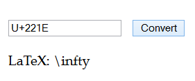
Unicode typically has all the symbols you need to write mathematics. You can use this page to find the Unicode counterpart to most LaTeX symbols. But text is inherently linear, and you need more than text to lay out typesetting in two dimensions.
Update: Looks like I spoke too soon. The tricks presented here work well on Linux and Mac but not on Windows. Some readers are saying the vector symbol is missing on Windows. On my Windows laptop the bar and vector appear but are not centered over the intended character.
Related posts
- Common math symbols in Unicode and TeX
- Accented letters in Unicode and TeX
- Unicode characters for fractions
- Unicode numbers
[1] When I started blogging you couldn’t count on browsers having font support for all the mathematical symbols you might want to use. (This post summarizes my experience as of nine years ago.) Now I believe you can, especially for any symbol in the BMP (Basic Multilingual Plane, code points below FFFF). I haven’t gotten feedback from anyone saying they’re missing symbols that I use.