A web built on LaTeX

The other day on TeXtip, I threw this out:

Imagine if the web had been built on LaTeX instead of HTML …

Here are some of the responses I got:

  • It would have been more pretty looking.
  • Frightening.
  • Single tear down the cheek.
  • No crap amateurish content because of the steep learning curve, and beautiful rendering … What a dream!
  • Shiny math, crappy picture placement: glad it did not!
  • Overfull hboxes EVERYWHERE.
  • LaTeX would have become bloated, and people would be tweeting about HTML being so much better.
  • Noooo! LaTeX would have been “standardised”, “extended” and would by now be a useless pile of complexity.

Use typewriter font for code inside prose

There’s a useful tradition of using a typewriter font, or more generally some monospaced font, for bits of code sprinkled in prose. The practice is analogous to using italic to mark, for example, a French mot dropped into an English paragraph. In HTML, the code tag marks content as software code, which a browser typically will render in a typewriter font.

Here’s a sentence from a new article on Python at Netflix that could benefit a few code tags.

These features (and more) have led to increasingly pervasive use of Python in everything from small tools using boto to talk to AWS, to storing information with python-memcached and pycassa, managing processes with Envoy, polling restful APIs to large applications with requests, providing web interfaces with CherryPy and Bottle, and crunching data with scipy.

Here’s the same sentence with some code tags.

These features (and more) have led to increasingly pervasive use of Python in everything from small tools using boto to talk to AWS, to storing information with python-memcached and pycassa, managing processes with Envoy, polling restful APIs to large applications with requests, providing web interfaces with CherryPy and Bottle, and crunching data with scipy.

It’s especially helpful to let the reader know that packages like requests are indeed packages. It helps to clarify, for example, whether Wes McKinney has been stress testing pandas or pandas. That way we know whether to inform animal protection authorities or to download a new version of a library.

Unicode to LaTeX

I’ve run across a couple websites that let you enter a LaTeX symbol and get back its Unicode value. But I didn’t find a site that does the reverse, going from Unicode to LaTeX, so I wrote my own.

Unicode / LaTeX Conversion

If you enter Unicode, it will return LaTeX. If you enter LaTeX, it will return Unicode. It interprets a string starting with “U+” as a Unicode code point, and a string starting with a backslash as a LaTeX command.

screenshot of www.johndcook.com/unicode_latex.png

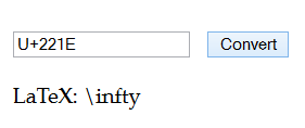
For example, the screenshot above shows what happens if you enter U+221E and click “convert.” You could also enter infty and get back U+221E.

However, if you go from Unicode to LaTeX to Unicode, you won’t always end up where you started. There may be multiple Unicode values that map to a single LaTeX symbol. This is because Unicode is semantic and LaTeX is not. For example, Unicode distinguishes between the Greek letter Ω and the symbol Ω for ohms, the unit of electrical resistance, but LaTeX does not.

Letters that fell out of the alphabet

Mental Floss had an interesting article called 12 letters that didn’t make the alphabet. A more accurate title might be 12 letters that fell out of the modern English alphabet.

I thought it would have been better if the article had included the Unicode values of the letters, so I did a little research and created the following table.

Name Capital Small
Thorn U+00DE U+00FE
Wynn U+01F7 U+01BF
Yogh U+021C U+021D
Ash U+00C6 U+00E6
Eth U+00D0 U+00F0
Ampersand U+0026
Insular g U+A77D U+1D79
Thorn with stroke U+A764 U+A765
Ethel U+0152 U+0153
Tironian ond U+204A
Long s U+017F
Eng U+014A U+014B


Once you know the Unicode code point for a symbol, you can find out more about it, for example, here.

Automatic delimiter sizes in LaTeX

I recently read a math book in which delimiters never adjusted to the size of their content or the level of nesting. This isn’t unusual in articles, but books usually pay more attention to typography.

Here’s a part of an equation from the book:

\varphi^{-1} (\int \varphi(f+g) \,d\mu)

Larger outer parentheses make the equation much easier to read, especially as part of a complex equation. It’s clear at a glance that the function φ-1 applies to the result of the integral.

\varphi^{-1} \left(\int \varphi(f+g) \,d\mu\right)

The first equation was typeset using

    \varphi^{-1} ( \int \varphi(f+g) \,d\mu )

The latter used left and right to tell LaTeX that the parentheses should grow to match the size of the content between them.

    \varphi^{-1} \left( \int \varphi(f+g) \,d\mu \right)

You can use \left and \right with more delimiters than just parentheses: braces, brackets, ceiling, floor, etc. And the left and right delimiters do not need to match. You could make a half-open interval, for example, with \left( on one side and \right] on the other.

For every \left delimiter there must be a corresponding \right delimiter. However, you can make one of the pair empty by using a period as its mate. For example, you could start an expression with \left[ and end it with \right. which would create a left bracket as tall as the tallest thing between that bracket and the corresponding \right. command. Note that \right. causes nothing to be displayed, not even a period.

The most common example of a delimiter with no mate may be a curly brace on the left with no matching brace on the right. In that case you’d need to open with \left\{. The backslash in front of the brace is necessary to tell LaTeX that you want a literal brace and that you’re not just using the brace for grouping.

The paper is too big

In response to the question “Why are default LaTeX margins so big?” Paul Stanley answers

It’s not that the margins are too wide. It’s that the paper is too big!

This sounds flippant, but he gives a compelling argument that paper really is too big for how it is now used.

As is surely by now well-known, the real question is the size of the text block. That is a really important factor in legibility. As others have noted, the optimum line length is broadly somewhere between 60 characters and 75 characters.

Given reasonable sizes of font which are comfortable for reading at the distance we want to read at (roughly 9 to 12 point), there are only so many line lengths that make sense. If you take a book off your shelf, especially a book that you would actually read for a prolonged period of time, and compare it to a LaTeX document in one of the standard classes, you’ll probably notice that the line length is pretty similar.

The real problem is with paper size. As it happens, we have ended up with paper sizes that were never designed or adapted for printing with 10-12 point proportionally spaced type. They were designed for handwriting (which is usually much bigger) or for typewriters. Typewriters produced 10 or 12 characters per inch: so on (say) 8.5 inch wide paper, with 1 inch margins, you had 6.5 inches of type, giving … around 65 to 78 characters: in other words something pretty close to ideal. But if you type in a standard proportionally spaced font (worse, in Times—which is rather condensed because it was designed to be used in narrow columns) at 12 point, you will get about 90 to 100 characters in the line.

He then gives six suggestions for what to do about this. You can see his answer for a full explanation. Here I’ll just summarize his points.

  1. Use smaller paper.
  2. Use long lines of text but extra space between lines.
  3. Use wide margins.
  4. Use margins for notes and illustrations.
  5. Use a two column format.
  6. Use large type.

Given these options, wide margins (as in #3 and #4) sound reasonable.

Gutenberg + Readability

Here’s a very simple idea: Use Project Gutenberg for content and Readability for style.

Project Gutenberg has a large collection of public domain books in digital form. The books are available in several formats, none of which are ideal for reading. Project Gutenberg provides text without much styling in order to make it easier for people to use the content as they please.

You can go to the HTML version of a book on Gutenberg and use Readability (or Instapaper) to format it for easier reading. Importing the HTML page to a Kindle similarly improves the formatting.

* * *

Has anyone made a style sheet to approximate the look of Readability or Instapaper? I’d like to use something like that to improve the appearance of the static HTML pages on my site.

Readability

The Readability bookmarklet lets you reformat any web to make it easier to read. It strips out flashing ads and other distractions. It uses black text on a white background, wide margins, a moderate-sized font, etc. I use Readability fairly often. (Instapaper is a similar service. I discuss it at the end of this post.)

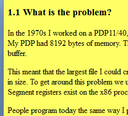
Yesterday I used it to reformat an article on literate programming. For some inexplicable reason, the author chose to use a lemon yellow background. It’s ironic that the article is about making source code easier to read. The content of the article is easy to read, but the format is not.

Readability to the rescue! Here are before and after screen shots.

Before:
After:
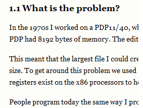
I recommend the article, Example of Literate Programming in HTML [Update: link went away], and I also recommend using reformatting the page unless you enjoy reading black text on a yellow background.

Readability did a good job until about half way through the article. The article has C and HTML code examples, and perhaps these confused Readability. (Readability usually handles code samples well. It correctly formats the first few code samples in this article.) The last half of the article renders like source code, and the font gets smaller and smaller.
I ran the page through an HTML validator to see whether some malformed HTML could be the source of the problem. The validator found numerous problems, so perhaps that was the issue.

I haven’t seen Readability fail like this before. I’ve been surprised how well it has handled some pages I thought might trip it up.

I ended up saving the article and editing its source, changing the bgcolor value to white. It’s a nice article on literate programming once you get past the formatting. The best part of the article is the first section, and that much Readability formats correctly.

Instapaper

Instapaper reformats web pages similarly. It produces a narrower column of text, but otherwise the output looks quite similar.

Instapaper did not discover the title of the literate programming article. (The title of the article was not in an <h1> tag as software might expect but was only in a <title> tag in the page header.) However, it did format the entire body of the article correctly.

I find it slightly more convenient to use the Readability bookmarklet than to submit a link to Instapaper. I imagine there are browser plug-ins that make Instapaper just as easy to use, though I haven’t looked into this because I’m usually satisfied with Readability.

Related posts

Draw a symbol, look it up

LaTeX users may know about Detexify, a website that lets you draw a character then looks up its TeX command. Now there’s a new site Shapecatcher that does the same thing for Unicode. According to the site, “Currently, there are 10,007 Unicode character glyphs in the database.” It does not yet support Chinese, Japanese, or Korean.

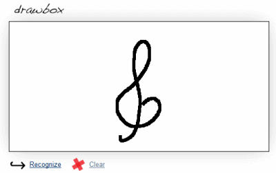
For example, I drew a treble clef on the page:

The site came back with a list of possible matches, and the first one was what I was hoping for:

Interestingly, the sixth possible match on the list was a symbol for contour integration:

Notice the treble clef response has a funny little box on the right side. That’s because my browser did not have a glyph to display that Unicode character. The browser did have a glyph for the contour integration symbol and displayed it.

Another Unicode resource I recommend is this Unicode Codepoint Chart. It is organized by code point value, in blocks of 256. If you were looking for the contour integration symbol above, for example, you could click on a link “U+2200 to U+22FF: Mathematical Operators” and see a grid of 256 symbols and click on the one you’re looking for. This site gives more detail about each character than does Shapecatcher. So you might use Shapecatcher to find where to start looking, then go to the Unicode Codepoint Chart to find related symbols or more details.

Other posts on Unicode

Typesetting “C#” in LaTeX

How do you refer to the C# programming language in LaTeX? Simply typing C# doesn’t work because # is a special character in LaTeX. You could type C#. That works, but it looks a little odd. The number sign is too big and too low.

What about using a musical sharp sign, i.e. C$\sharp$? That also looks a little odd. Even though the language is pronounced “C sharp,” it’s usually written with a number sign, not a sharp.

Let’s look at recommended ways of typesetting C++ to see whether that helps. The top answer to this question on TeX Stack Exchange is to define a new command as follows:

\newcommand{\CC}{C\nolinebreak\hspace{-.05em}\raisebox{.4ex}{\tiny\bf +}\nolinebreak\hspace{-.10em}\raisebox{.4ex}{\tiny\bf +}}

This does several things. First, it prevents line breaks between the constituent characters. It also does several things to the plus signs:

  • Draws them in closer
  • Makes them smaller
  • Raises them
  • Makes them bold

The result is what we’re subconsciously accustomed to seeing in print.

Here’s an analogous command for C#.

\newcommand{\CS}{C\nolinebreak\hspace{-.05em}\raisebox{.6ex}{\tiny\bf \#}}

And here’s the output. The number sign is a little too small.

To make a little larger number sign, replace \tiny with \scriptsize.

More LaTeX posts