PATE framework for differentially private machine learning

Machine learning models can memorize fragments of their training data and return these fragments verbatim. I’ve seen instances, for example, where I believe an LLM returned phrases verbatim from this site. It’s easy to imagine how medical data might leak this way.

How might you prevent this? And how might you do it in a way that is easy to defend?

One such approach is the PATE framework. PATE stands for Private Aggregation of Teacher Ensembles. PATE was introduced in [1] and refined in [2].

In the PATE framework, you divide your sensitive data into n disjoint subsets and train a “teacher” model on each subset. These subsets are formed so that only one teacher has access to data from a particular individual.

Only these teacher models have direct access to sensitive data, and these models will not be released into production. Instead, the teacher models are used to train a “student” model.

The student model asks questions of the teacher models and so the student model is only indirectly trained on sensitive data. Furthermore, differential privacy is inserted between the student and teacher models as a further layer of privacy protection. So the student model is actually not trained on the answers from the teacher models but from an aggregate of the teacher models with a (ideally small) amount of randomness thrown in to further protect privacy. Publicly available data is also added to the training set for the student model.

There are a couple clever refinements in [2] that stretch the framework’s privacy budget.

To be more selective, our new mechanisms leverage some pleasant synergies between privacy and utility in PATE aggregation. For example, when teachers disagree, and there is no real consensus, the privacy cost is much higher; however, since such disagreement also suggest that the teachers may not give a correct answer, the answer may simply be omitted.

Differential privacy is a way of quantifying the notion that an individual’s participation or lack of participation in a database makes little difference. If the teacher models disagree, it may because an individual who is an outlier has had a large influence on the teacher model that was trained on his data. If you protect the privacy of the “teachers” then you protect the privacy of the individuals since no more than one teacher was training on any given individual’s data. When there is consensus among the teachers, there’s no need to spend much of the privacy budget.

The authors go on to say

Similarly, teachers may avoid giving an answer where the student already is confidently predicting the right answer.

Since each query uses some amount of the privacy budget, avoiding even asking questions saves budget.

Related posts

[1] Nicholas Papernot et al. Semi-supervised Knowledge Transfer for Deep Learning from Private Training Data arXiv:1610.05755

[2] Nicolas Papernot et al. Scalable Private Learning with PATE. arXiv:1802.08908v1

Cosine similarity does not satisfy the triangle inequality

The previous post looked at cosine similarity for embeddings of words in vector spaces. Word embeddings like word2vec map words into high-dimensional vector spaces in such a way that related words correspond to vectors that are roughly parallel. Ideally the more similar the words, the smaller the angle between their corresponding vectors.

The cosine similarity of vectors x and y is given by

\cos(\theta) = \frac{\mathbf{x} \cdot \mathbf{y}}{ ||\mathbf{x} || \,||\mathbf{y} || }

If the vectors are normalized to have length 1 (which word embeddings are typically not) then cosine similarity is just dot product. Vectors are similar when their cosine similarity is near 1 and dissimilar when their cosine similarity is near 0.

If x is similar to y and y is similar to z, is x similar to z? We could quantify this as follows.

Let cossim(x, y) be the cosine similarity between x and y.

If cossim(x, y)= 1 − ε1, and cossim(y, z) =1 − ε2, is cossim(x, z) at least 1 − ε1 − ε2? In other words, does the complement of cosine similarity satisfy the triangle inequality?

Counterexample

The answer is no. I wrote a script to search for a counterexample by generating random points on a sphere. Here’s one of the examples it came up with.

    x = [−0.9289  −0.0013   0.3704]
    y = [−0.8257   0.3963   0.4015]
    z = [−0.6977   0.7163  −0.0091]

Let d1 = 1 − cossim(x, y), d2 = 1 − cossim(y, z), and d3 be 1 − cossim(x, z).

Then d1 = 0.0849, d2 = 0.1437, and d3 = 0.3562 and so d3 > d1 + d2.

Triangle inequality

The triangle inequality does hold if we work with θs rather than their cosines. The angle θ between two vectors is the distance between these two vectors interpreted as points on a sphere and the triangle inequality does hold on the sphere.

Approximate triangle inequality

If the cosine similarity between x and y is close to 1, and the cosine similarity between y and z is close to 1, then the cosine similarity between x and z is close to one, though the triangle inequality may not hold. I wrote about this before in the post Nearly parallel is nearly transitive.

I wrote in that post that the law of cosines for spherical trigonometry says

cos c = cos a cos b + sin a sin b cos γ

where γ is the angle between the arcs a and b. If cos a = 1 − ε1, and cos b = 1 − ε2, then

cos a cos b = (1 − ε1)(1 − ε2) = 1 − ε1 − ε2 + ε1 ε2

If ε1 and ε2 are small, then their product is an order of magnitude smaller. Also, the term

sin a sin b cos γ

is of the same order of magnitude. So if 1 − cossim(x, y) =  ε1 and 1 − cossim(y, z) =  ε2 then

1 − cossim(x, z) =  ε1 + ε1 + O1 ε2)

Is the triangle inequality desirable?

Cosine similarity does not satisfy the triangle inequality, but do we want a measure of similarity between words to satisfy the triangle inequality? You could argue that semantic similarity isn’t transitive. For example, lion is similar to king in that a lion is a symbol for a king. And lion is similar to house cat in that both are cats. But king and house cat are not similar. So the fact that cosine similarity does not satisfy the triangle inequality might be a feature rather than a bug.

Related posts

Jaccard index and jazz albums

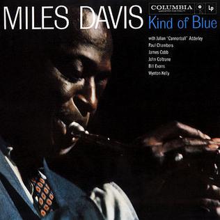
Miles Davis Kind of Blue album cover

Jaccard index is a way of measuring the similarity of sets. The Jaccard index, or Jaccard similarity coefficient, of two sets A and B is the number of elements in their intersection, AB, divided by the number of elements in their union, AB.

J(A, B) = \frac{|A \cap B|}{|A \cup B|}

Jaccard similarity is a robust way to compare things in machine learning, say in clustering algorithms, less sensitive to outliers than other similarity measures such as cosine similarity.

Miles Davis Albums

Here we’ll illustrate Jaccard similarity by looking at the personnel on albums by Miles Davis. Specifically, which pair of albums had more similar personnel: Kind of Blue and Round About Midnight, or Bitches Brew and In a Silent Way?

There were four musicians who played on both Kind of Blue and Round About Midnight: Miles Davis, Cannonball Adderly, John Coltrane, and Paul Chambers.

There were six musicians who played on both Bitches Brew and In a Silent Way: Miles Davis, Wayne Shorter, Chick Corea, Dave Holland, and John McLaughlin, Joe Zawinul.

The latter pair of albums had more personnel in common, but they also had more personnel in total.

There were 9 musicians who performed on either Kind of Blue or Round About Midnight. Since 4 played on both albums, the Jaccard index comparing the personnel on the two albums is 4/9.

In a Silent Way and especially Bitches Brew used more musicians. A total of 17 musicians performed on one of these albums, including 6 who were on both. So the Jaccard index is 6/17.

Jaccard distance

Jaccard distance is the complement of Jaccard similarity, i.e.

d_J(A, B) = 1 - J(A,B)

In our example, the Jaccard distance between Kind of Blue and Round About Midnight is 1 − 4/9 = 0.555. The Jaccard distance between Bitches Brew and In a Silent Way is 1 − 6/17 = 0.647.

Jaccard distance really is a distance. It is clearly a symmetric function of its arguments, unlike Kulback-Liebler divergence, which is not.

The difficulty in establishing that Jaccard distance is a distance function, i.e. a metric, is the triangle inequality. The triangle inequality does hold, though this is not simple to prove.

Corners stick out more in high dimensions

High-dimensional geometry is full of surprises. For example, nearly all the area of a high-dimensional sphere is near the equator, and by symmetry it doesn’t matter which equator you take.

Here’s another surprise: corners stick out more in high dimensions. Hypercubes, for example, become pointier as dimension increases.

How might we quantify this? Think of a pyramid and a flag pole. If you imagine a ball centered at the top of a pyramid, a fair proportion of the volume of the ball contains part of the pyramid. But if you do the same for a flag pole, only a small proportion of the ball contains pole; nearly all the volume of the ball is air.

So one way to quantify how pointy a corner is would be to look at a neighborhood of the corner and measure how much of the neighborhood intersects the solid that the corner is part of. The less volume, the pointier the corner.

Consider a unit square. Put a disk of radius r at a corner, with r < 1. One quarter of that disk will be inside the square. So the proportion of the square near a particular corner is πr²/4, and the proportion of the square near any corner is πr².

Now do the analogous exercise for a unit cube. Look at a ball of radius r < 1 centered at a corner. One eighth of the volume of that ball contains part of the cube. The proportion of cube’s volume located within a distance r of a particular corner is πr³/6, and the proportion located within a distance r of any corner is 4πr³/3.

The corner of a cube sticks out a little more than the corner of a square. 79% of a square is within a distance 0.5 of a corner, while the proportion is 52% for a cube. In that sense, the corners of a cube stick out a little more than the corners of a square.

Now let’s look at a hypercube of dimension n. Let V be the volume of an n-dimensional ball of radius r < 1. The proportion of the hypercube’s volume located within a distance r of a particular corner is V / 2n and the proportion located with a distance r of any corner is simply V.

The equation for the volume V is

V = \frac{\pi^{\frac{n}{2}} r^n}{\Gamma\left(\frac{n}{2} + 1\right)}

If we fix r and let n vary, this function decreases rapidly as n increases.

Saying that corners stick out more in high dimensions is a corollary of the more widely known fact that a ball in a box takes up less and less volume as the dimension of the ball and the box increase.

Let’s set r = 1/2 and plot how the volume of a ball varies with dimension n.

Volume of a ball of radius 1/2 in dimension n

You could think of this as the volume of a ball sitting inside a unit hypercube, or more relevant to the topic of this post, the proportion of the volume of the hypercube located with a distance 1/2 of a corner.

Nearly all the area in a high-dimensional sphere is near the equator

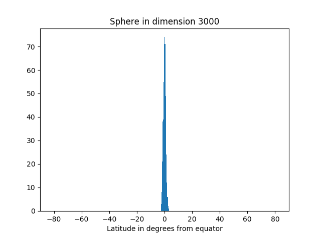
Nearly all the area of a high-dimensional sphere is near the equator.  And by symmetry, it doesn’t matter which equator you take. Draw any great circle and nearly all of the area will be near that circle.  This is the canonical example of “concentration of measure.”

What exactly do we mean by “nearly all the area” and “near the equator”? You get to decide. Pick your standard of “nearly all the area,” say 99%, and your definition of “near the equator,” say within 5 degrees. Then it’s always possible to take the dimension high enough that your standards are met. The more demanding your standard, the higher the dimension will need to be, but it’s always possible to pick the dimension high enough.

This result is hard to imagine. Maybe a simulation will help make it more believable.

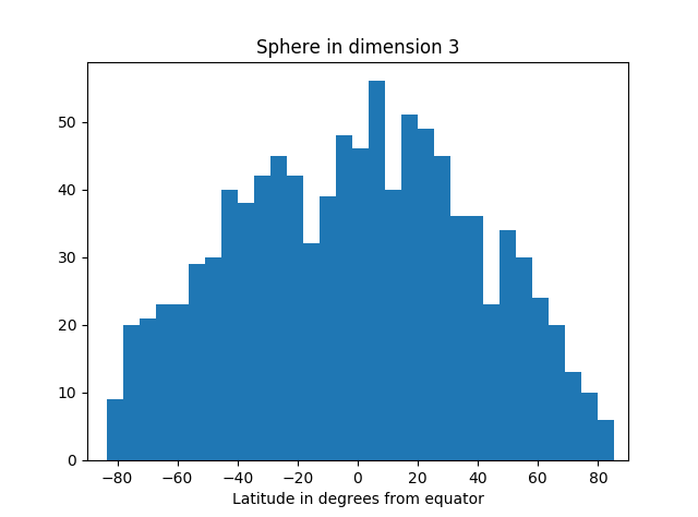
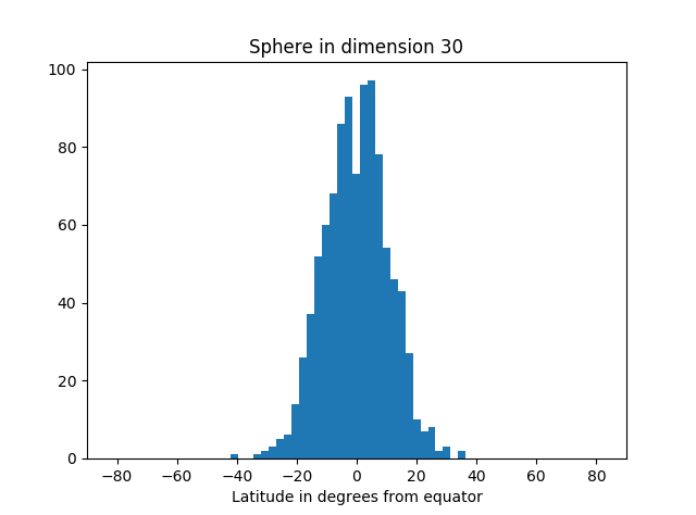
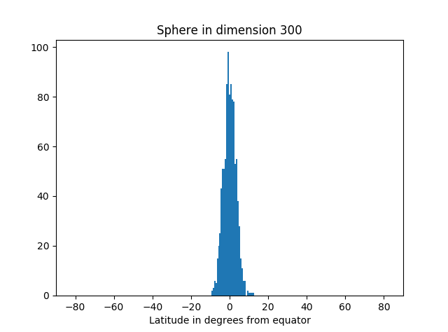
In the simulation below, we take as our “north pole” the point (1, 0, 0, 0, …, 0). We could pick any unit vector, but this choice is convenient. Our equator is the set of points orthogonal to the pole, i.e. that have first coordinate equal to zero. We draw points randomly from the sphere, compute their latitude (i.e. angle from the equator), and make a histogram of the results.

The area of our planet isn’t particularly concentrated near the equator.

But as we increase the dimension, we see more and more of the simulation points are near the equator.

Here’s the code that produced the graphs.

from scipy.stats import norm
from math import sqrt, pi, acos, degrees
import matplotlib.pyplot as plt

def pt_on_sphere(n):
    # Return random point on unit sphere in R^n.
    # Generate n standard normals and normalize length.
    x = norm.rvs(0, 1, n)
    length = sqrt(sum(x**2))
    return x/length

def latitude(x):
    # Latitude relative to plane with first coordinate zero.
    angle_to_pole = acos(x[0]) # in radians
    latitude_from_equator = 0.5*pi - angle_to_pole
    return degrees( latitude_from_equator )

N = 1000 # number of samples

for n in [3, 30, 300, 3000]: # dimension of R^n
    
    latitudes = [latitude(pt_on_sphere(n)) for _ in range(N)]
    plt.hist(latitudes, bins=int(sqrt(N)))
    plt.xlabel("Latitude in degrees from equator")
    plt.title("Sphere in dimension {}".format(n))
    plt.xlim((-90, 90))
    plt.show()

Not only is most of the area near the equator, the amount of area outside a band around the equator decreases very rapidly as you move away from the band. You can see that from the histograms above. They look like a normal (Gaussian) distribution, and in fact we can make that more precise.

If A is a band around the equator containing at least half the area, then the proportion of the area a distance r or greater from A is bound by exp( -(n-1)r² ). And in fact, this holds for any set A containing at least half the area; it doesn’t have to be a band around the equator, just any set of large measure.

Related post: Willie Sutton and the multivariate normal distribution

Valuing results and information

Chris Wiggins gave an excellent talk at Rice this afternoon on data science at the New York Times. In the Q&A afterward, someone asked how you would set up a machine learning algorithm where you’re trying to optimize for outcomes and for information.

Here’s how I’ve approached this dilemma in the past. Information and outcomes are not directly comparable, so any objective function combining the two is going to add incommensurate things. One way around this is to put a value not on information per se but on what you’re going to do with the information.

In the context of a clinical trial, you want to treat patients in the trial effectively, and you want a high probability of picking the best treatment at the end. You can’t add patients and probabilities meaningfully. But why do you want to know which treatment is best? So you can treat future patients effectively. The value of knowing which treatment is best is the increase in the expected number of future successful treatments. This gives you a meaningful objective: maximize the expected number of effective treatments, of patients in the trial and future patients treated as a result of the trial.

The hard part is guessing what will be done with the information learned in the trial. Of course this isn’t exactly known, but it’s the key to estimating the value of the information. If nobody will be treated any differently in the future no matter how the trial turns out—and unfortunately this may be the case—then the trial should be optimized strictly for the benefit of the people in the trial. On the other hand, if a trial will determine the standard of care for thousands of future patients, then there is more value in picking the best treatment.

The big deal about neural networks

In their book Computer Age Statistical Inference, Brad Efron and Trevor Hastie give a nice description of neutral networks and deep learning.

The knee-jerk response [to neural networks] from statisticians was “What’s the big deal? A neural network is just a nonlinear model, not too different from many other generalizations of linear models.”

While this may be true, neural networks brought a new energy to the field. They could be scaled up and generalized in a variety of ways … And most importantly, they were able to solve problems on a scale far exceeding what the statistics community was used to. This was part computing scale expertise, part liberated thinking and creativity on the part of this computer science community.

After enjoying considerable popularity for a number of years, neural networks were somewhat sidelined by new inventions in the mid 1990’s. … Neural networks were passé. But then they re-emerged with a vengeance after 2010 … the reincarnation now being called deep learning.

Demystifying artificial intelligence

animated face

Computers do what we tell them to do. Period. Any talk of computers doing things they weren’t programmed to do is only a way of speaking. It’s a convenient shorthand when used properly, misleading mysticism when used improperly.

When you write a program

        print(24*7)

you could say that the computer isn’t programmed to print the number 168 in the sense that the code did not say

        print(168)

But of course the computer was programmed to print the number 168. It just wasn’t directly programmed to do so. Instead, it was given data and algorithms to apply to that data to produce the result. The program isn’t very useful because the degree of indirection is tiny. Artificial intelligence is more interesting because it increases the degree of indirection, but it’s still software instructing a computer to take in data and apply algorithms.

When someone says

A computer did this without being programmed!

mentally edit their statement to say

A computer did this without being directly programmed to do so!

The latter may still be impressive, but it’s not magic.

I was at a presentation once where software vendors were claiming that their software “discovered” the equation of motion for a pendulum. The software wasn’t directly programmed to do this, but it was programmed to read in data and find the best fit to the data from a set of basis functions which included sines and cosines. And it correctly found that a linear combination of sines and cosines best described the pendulum’s motion.

The pendulum example was not that impressive, though some applications of artificial intelligence truly are impressive, delivering results several layers of abstraction away from what the software was directly programmed to do. If there’s anything mysterious involved, it’s the statistical regularity of the world that allowed the software to make correct inference from the data it was given.

Big p, Little n

Statisticians use n to denote the number of subjects in a data set and p to denote nearly everything else. You’re supposed to know from context what each p means.

In the phrase “big n, little p” the symbol p means the number of measurements per subject. Traditional data sets are “big n, little p” because you have far more subjects than measurements per subject. For example, maybe you measure 10 things about 1000 patients.

Big data sets, such as those coming out of bioinformatics, are often “big p, little n.” For example, maybe you measure 20,000 biomarkers on 50 patients. This turns classical statistics sideways, literally and figuratively, literally in the sense that a “big p, little n” data set looks like the transpose of a “big n, little p” data set.

From the vantage point of a traditional statistician, “big p, little n” data sets give you very little to work with. If n is small, it doesn’t matter how big p is. In the example above, n = 50, not a big data set. But the biologist will say “What do you mean it’s not a big data set? I’ve given you 1,000,000 measurements!”

So how to you take advantage of large p even though n is small? That’s the big question. It summarizes the research program of many people in statistics and machine learning. There’s no general answer, at least not yet, though progress is being made in specific applications.

Related post: Nomenclatural abomination