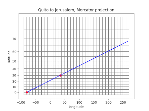
The previous post touched on how Lewis and Clark recorded celestial observations so that the data could be turned into coordinates after they returned from their expedition. I intend to write a series of posts about celestial navigation, and this post will discuss one fundamental topic: line of position (LOP).
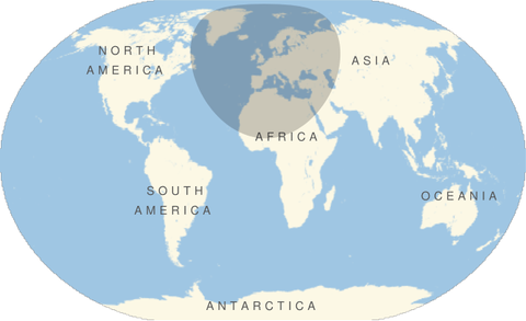
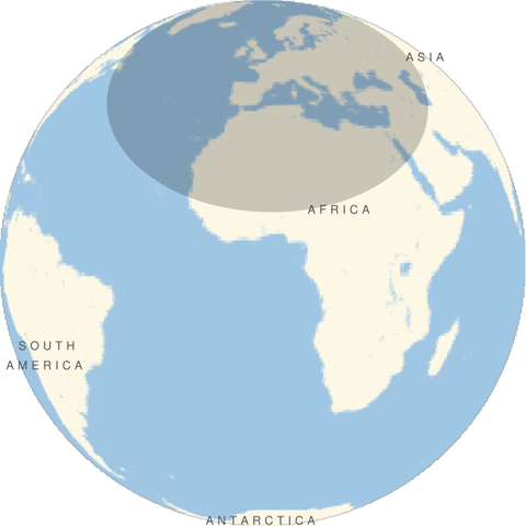
Pick a star that you can observe [1]. At any particular time, there is exactly one point on the Earth’s surface directly under the star, the point where a line between the center of the Earth and the star crosses the Earth’s surface. This point is called the geographical position (GP) of the star.
This GP can be predicted and tabulated. If you happen to be standing at the GP, and know what time it is, these tables will tell your position. Most likely you’re not going to be standing directly under the star, and so it will appear to you as having some deviation from vertical. The star would appear at the same angle from vertical for ring of observers. This ring is called the line of position (LOP).
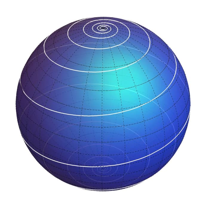
The LOP is a “small circle” in a technical sense. A great circle is the intersection of the Earth’s surface with a plane through the Earth’s center, like a line of longitude. A small circle is the intersection of the surface with a plane that does not pass through the center, like a line of latitude.
The LOP is a small circle only in contrast to a great circle. In fact, it’s typically quite large, so large that it matters that it’s not in the plane of the GP. You have to think of it as a slice through a globe, not a circle on a flat map, and therein lies some mathematical complication, a topic for future poss. The center of the LOP is the GP, and the radius of the LOP is an arc. This radius is measured along the Earth’s surface, not as the length of a tunnel.
One observation of a star reduces your set of possible locations to a circle. If you can observe two stars, or the same star at two different times, you know that you’re at the intersection of the two circles. These two circles will intersect in two points, but if you know roughly where you are, you can rule out one of these points and know you’re at the other one.
[1] At the time of the Lewis and Clark expedition, these were the stars of interest for navigation in the northern hemisphere: Antares, Altair, Regulus, Spica, Pollux, Aldebaran, Formalhaut, Alphe, Arietes, and Alpo Pegas. Source: Undaunted Courage, Chapter 9.