I listened to the 99% Invisible podcast about The Real Book this morning and thought back to my first copy.
My first year in college I had a jazz class, and I needed to get a copy of The Real Book, a book of sheet music for jazz standards. The book that was illegal at the time, but there was no legal alternative, and I had no scruples about copyright back then.
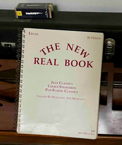
When a legal version came out later I replaced my original book with the one in the photo below.
The podcast refers to “When Hal Leonard finally published the legal version of the Real Book in 2004 …” but my book says “Copyright 1988 Sher Music Co.” Maybe Hal Leonard published a version in 2004, but there was a version that came out years earlier.
The podcast also says “Hal Leonard actually hired a copyist to mimic the old Real Book’s iconic script and turn it into a digital font.” But my 1988 version looks not unlike the original. Maybe my version used a kind of typesetting common in jazz, but the Hal Leonard version looks even more like the original handwritten sheet music.
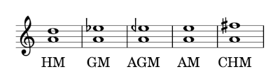
in an earlier post I said that the arithmetic mean of two frequencies an octave apart is an interval of a perfect fifth, and the geometric mean gives a tritone. This post will look at a few other means.
The intervals for HM, AM, and CHM are exact, using just tuning. The intervals for GM is exact using equal temperament. The AGM is not close to a chromatic tone in any system.
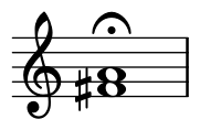
If we take the means of A 440 and A 880, the AGM is an E half-flat (hence the backward flat sign above).
Equations
Here are the equations for the various means:
The AGM is defined iteratively: Take the GM and AM of the pair of numbers, then take the GM and AM of the result, and so on, taking the limit. More detail here.
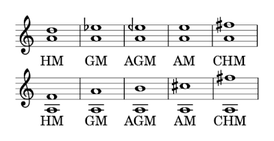
What if we look at frequencies two octaves apart, 220 Hz and 880 Hz? You might expect the size of the intervals to double. That intuition is exactly correct for the geometric mean: a tritone is half an octave (on a log scale) and so two tritones is an octave.
This intuition is also approximately correct for the arithmetic-geometric mean. But it over-estimates the harmonic mean and under-estimates the arithmetic and contraharmonic means.
A few weeks ago I wrote about how the dissonance of a musical interval is related to the complexity of the frequency ratio as a fraction, where complexity is measured by the sum of the numerator and denominator. Consonant intervals have simple frequency ratios and dissonant intervals have complex frequency ratios.
By this measure, the most consonant interval, other than an octave, is a perfect fifth. And the most dissonant interval is a tritone, otherwise known as the diminished fifth or augmented fourth. So in some sense perfect fifths and tritones are opposites, but they are both ways of splitting an octave in half, just on different scales.
Linear scale versus log scale
When we say simple frequency ratios are consonant and complex frequency ratios are dissonant, we are speaking about ratios on a linear scale. But we often think of musical notes on a logarithmic scale. For example, we think of the notes in a chromatic scale as being evenly spaced, and they are evenly spaced, but on a log scale.
If we divide an octave in half on a linear scale, we get a perfect fifth. For example, if we take an A 440 and an A 880 an octave higher, the arithmetic mean, the midpoint on a linear scale, we get E 660.
But if we divide an octave in half on a log scale, we get a tritone, three whole steps or six half steps out of 12 half steps in a chromatic scale. The midpoint on a log scale is the geometric mean. The geometric mean of 440 and 880 is 440 √2 = 622, which is D#.
So we take the midpoint of an octave on a linear scale we get the most consonant interval, a perfect fifth, but if we take the midpoint of an octave on a log scale we get the most dissonant interval, a tritone.
Tritone substitution
Intervals of a fifth are so consonant that they don’t contribute much to the character of a chord. It is common to leave out the fifth.
Tritones, however, are essential to the sound of a chord. In fact, it is common to replace a chord with a different chord that maintains the same tritone. For example, in the key of C, the G7 chord contains B and F, a tritone. The chord C#7 contains the same two notes (though the F would be written as E#), and you’ll often see a C#7 chord substituted for a G7 chord. So a song that had a Dm–G7–C progression might be rewritten as Dm–C#7–C, creating a downward chromatic motion in the base line.
This is called a tritone substitution. You could think of the name two ways. In the discussion above we talked about preserving the tritone in a chord. But notice we also changed the root of the chord by a tritone, replacing G with C#. More generally, replacing any chord with a chord whose root is a tritone away is called a tritone substitution or simply tritone sub. For example, a D minor chord does not contain a tritone, but we could still do a tritone sub, replacing Dm with G#m because D and G# are a tritone apart.
The last chapter of George Box’s book Improving Almost Anything contains the lyrics to “I Am the Very Model of a Professor Statistical,” to be sung to the tune of “I Am the Very Model of a Modern Major General” by Gilbert & Sullivan.
Here’s the original:
The original song has a few funny math-related lines.
I’m very well acquainted, too, with matters mathematical,
I understand equations, both the simple and quadratical,
About binomial theorem I’m teeming with a lot o’ news,
With many cheerful facts about the square of the hypotenuse.
I’m very good at integral and differential calculus;
I know the scientific names of beings animalculous:
In short, in matters vegetable, animal, and mineral,
I am the very model of a modern Major-General.
Here are a few lines from George Box’s version.
I relentlessly uncover any aberrant contingency
I strangle it with rigor and stifle it with stringency
I understand the different symbols be they Roman, Greek, or cuneiform
And every distribution from the Cauchy to the uniform.
With derivation rigorous each lemma I can justify
My every estimator I am careful to robustify
In short in matters logical, mathematical, idealistical
I am the very model of a professor statistical.
Gilbert & Sullivan have come up on this blog a couple other times:
George Box has come up too, but only once. (I’m surprised he hasn’t come up more; I should rectify that.) This post has a great quote from Box: “To find out what happens to a system when you interfere with it, you have to interfere with it (and not just passively observe it).”
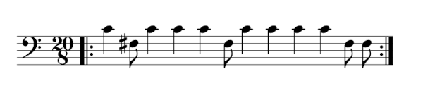
The song YYZ by Rush opens with a theme based on the rhythm of “YYZ” in Morse code:
-.-- -.-- --..
YYZ is the designation for the Toronto Pearson International Airport, the main airport serving Toronto. The idea for the song came from hearing the airport identifier in Morse code.
However, the song puts no spaces between rhythm corresponding to each letter. Here’s what the opening riff would look like in sheet music:
Each dash is a middle C and each dot is an F# a tritone below middle C.
When I listen to the song, I don’t hear YYZ. My mind splits up the rhythm with each sequence of long notes starting a group:
-. ---. ----..
So I hear the 20/8 time signature as (3 + 7 + 10)/8.
In terms of Morse code, -. is N. Interpreting the other groupings depends on what you mean by Morse code. The American amateur radio community defines Morse code as 40 characters: the 26 letters of the Latin alphabet, 10 digits, and 4 more symbols: / = , . Using that definition of Morse code, there are no symbols corresponding to ---. or ----... There is no symbol corresponding to ---- either. More on unused sequences here.
However, sometimes ---. is used for Ö and ---- for Š. So the way I hear “YYX” would be more like “NÖŠI”.
There are many other ways to parse -.---.----.. into Morse code symbols. For example, NO1I
-. --- .---- ..
Enumeration
How many ways could you split -.---.----.. into valid Morse code?
Here’s an outline of a recursive algorithm to enumerate the possibilities.
Start at the beginning and list the possible symbols formed by consecutive dots and dashes. In our case the possible symbols are T, N, K, and Y. So the possibilities are
T (-) added to the front of all sequences that start with .---.----..
N (-.) added to the front of all sequences that start with ---.----..
K (-.-) added to the front of all sequences that start with --.----..
Y (-.--) added to the front of all sequences that start with -.----..
So for the first bullet point, for example, how would we find all sequences that start with .---.----..? Use the same idea.
E (.) added to the front of all sequences that start with ---.----..
A (.-) added to the front of all sequences that start with --.----..
W (.--) added to the front of all sequences that start with -.----..
J (.---) added to the front of all sequences that start with .----..
So pull off all the symbols you can from the beginning of the list of dots and dashes and in each case recurse on the rest of the list.
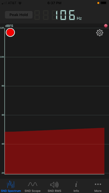
We finished a bottle of wine this evening, and I blew across the top as I often do. (Don’t worry: I only do this at home. If we’re ever in a restaurant together, I won’t embarrass you by blowing across the neck of an empty bottle.)
The pitch sounded lower than I expected, so I revisited some calculations I did last year.
As I wrote about here, a wine bottle is approximately a Helmhotz resonator. The geometric approximation is not very good, but the pitch prediction usually is. An ideal Helmholtz resonator is a cylinder attached to a sphere, and a typical wine bottle is more like a cylinder attached to a larger cylinder. But the formula predicting pitch is robust to departures from ideal assumptions.
As noted before, the formula for the fundamental frequency of a Helmholtz resonator is
where the variables are as follows:
f, frequency in Hz
v, velocity of sound
A, area of the opening
L, length of the neck
V, volume
The opening diameter was 2 cm, the neck length 9 cm, and the volume 750 cm³. All these are typical. The predicted frequency is f = 118 Hz. The measured frequency was 106 Hz, measured by the Sonic Tools phone app.
The actual frequency was about 10% lower than predicted. This is about a whole step lower in musical terms. I could certainly hear an interval that large if I heard the two pitches sequentially. But I don’t have perfect pitch, and so I’m skeptical whether I could actually notice a pitch difference of that size from memory.
Intervals of a fourth, such as the interval from C to F, are common in western music, but consecutive intervals of this size are not. Quartal harmony is based on intervals of fourths, and quartal melodies use a lot of fourths, particularly consecutive fourths.
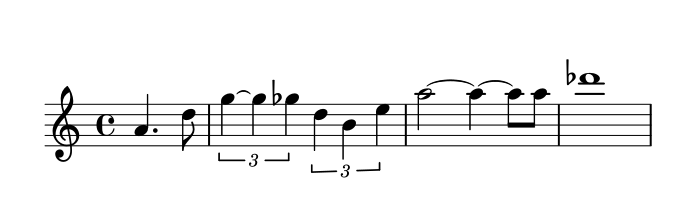
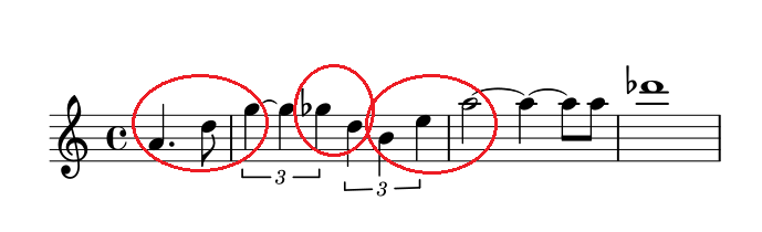
Maybe the most famous quartal melody is the opening fanfare to Star Trek (original series). Here’s a transcription of the opening line:
And here is the same music with the intervals of a fourth circled.
The theme opens with two consecutive fourths, there’s an augmented fourth in the middle, then two more consecutive fourths. There are two major thirds in the phrase above, which you could call diminished fourths.
Incidentally, there are four bell tones before the melody above begins, and the interval between the first two tones is a fourth.
Making the sheet music
Here’s the Lilypond source code I used to create the images above.
The lowest C on a piano is called C1 in scientific pitch notation. The C one octave up is C2 and so forth. Middle C is C4.
The frequency of Cn is approximately 2n+4 Hz. This would be exact if C0 were 16 Hz, but it’s a little flat. In order to make A4 have frequency 440 Hz, CO must have frequency 16.3516.
Notes other than C take their number from the nearest C below. So A4 is the A above C4, middle C. The lowest note on a standard piano, the A below C1, is A0.
At one point in time C0 was defined to be exactly 16 Hz. The frequencies of notes have been defined slightly differently across time and location.
Mathematically perfect octaves, however, don’t sound quite right. The highest notes on a piano would sound flat if every octave were exactly twice the frequency of the previous octave. So we tune the lowest notes a little lower than the math would say to, and the high notes higher.
In the original thread I said that C0 was the lowest C on a piano when I should have said C1.
No discussion of mathematics and piano tuning would be complete without mentioning Fermi problems. As I discuss here,
These problems are named after Enrico Fermi, someone who was known for being able to make rough estimates with little or no data.
A famous example of a Fermi problem is “How many piano tuners are there in New York?” I don’t know whether this goes back to Fermi himself, but it’s the kind of question he would ask. Of course nobody knows exactly how many piano tuners there are in New York, but you could guess about how many piano owners there are, how often a piano needs to be tuned, and how many tuners it would take to service this demand.
A few days ago I wrote about Frequency Shift Keying (FSK), a way to encode digital data in an analog signal using two frequencies. The extension to multiple frequencies is called, unsurprisingly, Multiple Frequency Shift Keying (MFSK). What is surprising is how MFSK sounds.
When I first heard MFSK I immediately recognized it as an old science fiction sound effect. I believe it was used in the original Star Trek series and other shows. The sound is in once sense very unusual, which is why it was chosen as a sound effect. But in another sense it’s familiar, precisely because it has been used as a sound effect.
Each FSK pulse has two possible states and so carries one bit of information. Each MFSK pulse has 2n possible states and so carries n bits of information. In practice n is often 3, 4, or 5.
Why does it sound strange?
An MFSK signal will jump between the possible frequencies in no apparent; if the data is compressed before encoding, the sequence of frequencies will sound random. But random notes on a piano don’t sound like science fiction sound effects. The frequencies account for most of the strangeness.
MFSK divides its allowed bandwidth into uniform frequency intervals. For example, a 500 Hz bandwidth might be divided into 32 frequencies, each 500/32 Hz apart. The tones sound strange because they are uniformly on a linear scale, whereas we’re used to hearing notes uniformly spaced on a logarithmic scale. (More on that here.)
In a standard 12-note chromatic scale, the ratios between consecutive frequencies is constant, each frequency being about 6% larger than the previous one. More precisely, the ratio between consecutive frequencies equals the 12th root of 2. So if you take the logarithm in base 2, the distance between each of the notes is 1/12.
In MFSK the difference between consecutive frequencies is constant, not the ratio. This means the higher frequencies will sound closer together because their ratios are closer together.
Pulse shaping
As I discussed in the post on FSK, abrupt frequency changes would cause a signal to use an awful lot of bandwidth. The same is true of MFSK, and as before the solution is to taper the pulses to zero on the ends by multiplying each pulse by a windowing function. The FSK post shows how much bandwidth this saves.
When I created the audio files below, at first I didn’t apply pulse shaping. I knew it was important to signal processing, but I didn’t realize how important it is to the sound: you can hear the difference, especially when two consecutive frequencies are the same.
Audio files
The following files are a 5-bit encoding. They encode random numbers k from 0 to 31 as frequencies of 1000 + 1000k/32 Hz.
Here’s what a random sample sounds like at 32 baud (32 frequency changes per second) with pulse shaping.
If you know of examples of MFSK used as a sound effect, please email me or leave a comment below.
Here’s one example I found: “Sequence 2” from this page of sound effects sounds like a combination of teletype noise and MFSK. The G7 computer sounds like MFSK too.
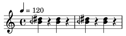
According to this page, a dial tone in DTMF [1] is a chord of two sine waves at 350 Hz and 440 Hz. In musical notation:
According to the same page, a busy signal is a combination of 480 Hz and 620 Hz with pulses of 1/2 second.
Note that the bottom note is an B half flat, i.e. midway between a B and a B flat, denoted by the backward flat sign. The previous post on DTMF tones also used quarter tone notation because the frequencies don’t align well with a conventional chromatic scale. The frequencies were chosen to be easy to demodulate rather than to be musically in tune.
Audio files
Here are audio files corresponding to the notation above.