Spectral flatness

White noise has a flat power spectrum. So a reasonable way to measure how close a sound is to being pure noise is to measure how flat its spectrum is.

Spectral flatness is defined as the ratio of the geometric mean to the arithmetic mean of a power spectrum.

The arithmetic mean of a sequence of n items is what you usually think of as a mean or average: add up all the items and divide by n.

The geometric mean of a sequence of n items is the nth root of their product. You could calculate this by taking the arithmetic mean of the logarithms of the items, then taking the exponential of the result. What if some items are negative? Since the power spectrum is the squared absolute value of the FFT, it can’t be negative.

So why should the ratio of the geometric mean to the arithmetic mean measure flatness? And why pure tones have “unflat” power spectra?

If a power spectrum were perfectly flat, i.e. constant, then its arithmetic and geometric means would be equal, so their ratio would be 1. Could the ratio ever be more than 1? No, because the geometric mean is always less than or equal to the arithmetic mean, with equality happening only for constant sequences.

In the continuous realm, the Fourier transform of a sine wave is a pair of delta functions. In the discrete realm, the FFT will be large at two points and small everywhere else. Why should a concentrated function have a small flatness score? If one or two of the components are 1’s and the rest are zeros, the geometric mean is zero. So the ratio of geometric and arithmetic means is zero. If you replace the zero entries with some small ε and take the limit as ε goes to zero, you get 0 flatness as well.

Sometimes flatness is measured on a logarithmic scale, so instead of running from 0 to 1, it would run from -∞ to 0.

Let’s compute the flatness of some examples. We’ll take a mixture of a 440 Hz sine wave and Gaussian white noise with varying proportions, from pure sine wave to pure noise. Here’s what the flatness looks like as a function of the proportions.

spectral flatness

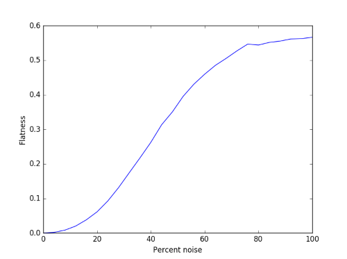
The curve is fairly smooth, though there’s some simulation noise at the right end. This is because we’re working with finite samples.

Here’s what a couple of these signals would sound like. First 30% noise and 70% sine wave:

(download)

And now the other way around, 70% noise and 30% sine wave:

(download)

Why does the flatness of white noise max out somewhere between 0.5 and 0.6 rather than 1? White noise only has a flat spectrum in expectation. The expected value of the power spectrum at every frequency is the same, but that won’t be true of any particular sample.

RelatedPsychoacoustics

The acoustics of kettledrums

typmani

Kettledrums (a.k.a. tympani) produce a definite pitch, but in theory they should not. At least the simplest mathematical model of a kettledrum would not have a definite pitch. Of course there are more accurate theories that align with reality.

Unlike many things that work in theory but not in practice, kettledrums work in practice but not in theory.

A musical sound has a definite pitch when the first several Fourier components are small integer multiples of the lowest component, the fundamental. A pitch we hear at 100 Hz would have a first overtone at 200 Hz, the second at 300 Hz, etc. It’s the relative strengths of these components give each instrument its characteristic sound.

An ideal string would make a definite pitch when you pluck it. The features of a real string discarded for the theoretical simplicity, such as stiffness, don’t make a huge difference to the tonality of the string.

An ideal circular membrane would vibrate at frequencies that are much closer together than consecutive integer multiples of the fundamental. The first few frequencies would be at 1.594, 2.136, 2.296, 2.653, and 2.918 times the fundamental. Here’s what that would sound like:

(download)

I chose amplitudes of 1, 1/2, 1/3, 1/4, 1/5, and 1/6. This was somewhat arbitrary, but not unrealistic. Including more than the first six Fourier components would make the sound even more muddled.

By comparison, here’s what it would sound like with the components at 2x up to 6x the fundamental, using the same amplitudes.

(download)

This isn’t an accurate simulation of tympani sounds, just something simple but more realistic than the vibrations of an idea membrane.

The real world complications of a kettledrum spread out its Fourier components to make it have a more definite pitch. These include the weight of air on top of the drum, the stiffness of the drum head, the air trapped in the body of the drum, etc.

If you’d like to read more about how kettle drums work, you might start with The Physics of Kettledrums by Thomas Rossing in Scientific American, November 1982.

Green noise and Barks

Colors of noise

In a previous post I explained the rationale behind using names of colors to refer to different kinds of noise. The basis is an analogy between the spectra of sounds and the spectra of light. Red noise is biased toward the low end of the audio spectrum just as red light is toward the low end of the visible spectrum. Blue noise is biased toward the high end, just as blue light is toward the high end of the visible spectrum.

Green noise

Green noise is based on a slightly different analogy with light as described here:

Blue, green and other noise colours seem not to be rigorously defined although the word “colour” is used a lot in describing noise. Some define the 7 rainbow colours to correspond to a width of about three critical bands in the Bark frequency scale such that green lies in the corresponding point of greatest sensitivity … [just as green light has] the greatest sensitivity for the eye. This identifies green noise as the most troublesome for speech systems.

This is different than the usual definition of red noise etc. in that it speaks of colors limited to a particular frequency range rather than being weighted toward that range. Usually red noise contains a broad spectrum of frequencies, but the weighted like 1/f2, so the spectrum decreases fairly quickly as frequency increases.

Barks

So what is this Bark frequency scale? First of all, the Bark scale was named in honor of acoustician Heinrich Barkhausen. On this scale, the audible spectrum runs from 0 to 24, each Bark being a sort of psychologically equal division. Lots of things in psychoacoustics work on the Bark scale rather than the scale of Hertz.

There are multiple ways to convert from Hz to Bark and back, each slightly different but approximately equivalent. A convenient form is

z = 6 arcsinh(f/600)

where f is frequency in Hertz and z is frequency in Bark. One reason this form is convenient is that it’s easy to invert:

f = 600 sinh(z/6)

A frequency of 24 Bark corresponds to around 16 kHz, so the audible spectrum doesn’t quite end at 24, at least for most young people, but applications are most concerned with the range of 0–24 Bark.

Update: Here’s an online calculator to convert between Hz and Bark.

The paragraph above is a little vague about where the color boundaries should be. When it says there are seven intervals, each “a width of about three critical bands,” I assume it means to divide the range of 0–24 Bark into seven equal pieces, making each 24/7 or 3.4 Barks wide. If we do this, red would run from 0–3.43 Barks, orange from 3.43–6.86, yellow from 6.86–12.29, green from 10.29–13.71, etc.

This would put green noise in the range of 1612 to 2919 Hz. Human hearing is most sensitive around 2000 Hz, near the middle of this interval.

In musical notation, the frequency range of green noise runs from G6 to F#7. See this post for an explanation of the pitch notation and Python code for computing it from frequency.

Update: See the next post for how to create an audio file of green noise in Python. Here’s a spectral plot from that post showing that the frequencies in the noise are in the expected range.

spectral plot of green noise

Need help with signal processing or acoustics?

How to digitize a graph

Suppose you have a graph of a function, but you don’t have an equation for it or the data that produced it. How can you reconstruction the function?

There are a lot of software packages to digitize images. For example, Web Plot Digitizer is one you can use online. Once you have digitized the graph at a few points, you can fit a spline to the points to approximately reconstruct the function. Then as a sanity check, plot your reconstruction to see if it looks like the original. It helps to have the same aspect ratio so you’re not distracted by something that doesn’t matter, and so that differences that do matter are easier to see.

For example, here is a graph from Zwicker and Fastl’s book on psychoacoustics. It contains many graphs with no data or formulas. This particular one gives the logarithmic transmission factor between free field and the peripheral hearing system.

Here’s Python code to reconstruct the functions behind these two curves.

import matplotlib.pyplot as plt
import numpy as np
from scipy import interpolate 

curve_names = ["Free", "Diffuse"]
plot_styles = { "Free" : 'b-', "Diffuse" : 'g:'}

data = {}
for name in curve_names:
    data = np.loadtxt("{}.csv".format(name), delimiter=',')

    x = data[:,0]
    y = data[:,1]
    spline = interpolate.splrep(x, y)
    xnew = np.linspace(0, max(x), 100)
    ynew = interpolate.splev(xnew, spline, der=0)
    plt.plot(xnew, ynew, plot_styles[name])
 
logical_x_range  = 24    # Bark
logical_y_range  = 40    # dB
physical_x_range = 7     # inch
physical_y_range = 1.625 # inch

plt.legend(curve_names, loc=2)
plt.xlabel("critical-band rate")
plt.ylabel("attenuation")
plt.xlim((0, logical_x_range))


plt.axes().set_aspect( 
    (physical_y_range/logical_y_range) / 
    (physical_x_range/logical_x_range) )
ax = plt.gca()
ax.get_xaxis().set_ticks([0, 4, 8, 12, 16, 20, 24])
ax.get_yaxis().set_ticks([-10, 0, 10, 20, 30])

plt.show()

Here’s the reconstructed graph.

Roughness of amplitude modulated tones

A recent post pointed out that two pure tones that are fairly close in pitch create a rough sound. The roughness increases with the frequency difference, up to a point, then decreases.

This post will look at a roughness in a different setting, amplitude modulation. Several psychoacoustics researchers have suggested that perceived roughness increases as a power of modulation depth, up to a maximum. That is,

R \sim m^p

where the signal is

[1 + m\cos(2\pi f_m t)] \cos(2\pi f_c t)

Some have suggested, based on empirical studies, that p = 2, while other have suggested that p varies as a function of the frequency fc of the carrier wave.

Here is an audio (.wav) file where the modulation depth varies as a function of time, m = 0.1t where t is time in seconds.


In this example the carrier frequency fc is 1000 Hz and the modulation frequency fm is 60 Hz.

Reference: Psychoacoustical Roughness: Implementation of an Optimized Model. P. Daniel and R. Weber. Acoustia 83 (1997) 113–123

Related: Psychoacoustics consulting

Acoustic roughness

When two pure tones are nearly in tune, you hear beats. The perceived pitch is the average of the two pitches, and you hear it fluctuate as many times per second as the difference in frequencies. For example, an A 438 and an A 442 together sound like an A 440 that beats four times per second. (Listen)

As the difference in pitches increases, the combined tone sounds rough and unpleasant. Here are sound files combining two pitches that differ by 16 Hz and 30 Hz.

16 Hz:

30 Hz:

The sound becomes more pleasant as the tones differ more in pitch. Here’s an example of pitches differing by 100 Hz. Now instead of hearing one rough tone, we hear two distinct tones in harmony. The two notes are at frequencies 440-50 Hz and 440+50 Hz, approximately the G and B above middle C.

100 Hz:

If we separate the tones even further, we hear one tone again. Here we separate the tones by 300 Hz. Now instead of hearing harmony, we hear only the lower tone, 440+150 Hz. The upper tone, 440+150 Hz, changes the quality of the lower tone but is barely perceived directly.

300 Hz:

We can make the previous example sound a little better by making the separation a little smaller, 293 Hz. Why? Because now the two tones are an octave apart rather than a little more than an octave. Now we hear the D above middle C.

293 Hz:

Update: Here’s a continuous version of the above examples. The separation of the two pitches at time t is 10t Hz.

Continuous:

Here’s Python code that produced the .wav files. (I’m using Python 3.5.1. There was a comment on an earlier post from someone having trouble using similar code from Python 2.7.)

from scipy.io.wavfile import write
from numpy import arange, pi, sin, int16, iinfo

N = 48000 # sampling rate per second
x = arange(3*N) # 3 seconds of audio

def beats(t, f1, f2):
    return sin(2*pi*f1*t) + sin(2*pi*f2*t)

def to_integer(signal):
    # Take samples in [-1, 1] and scale to 16-bit integers
    m = iinfo(int16).max
    M = max(abs(signal))
    return int16(signal*m/M)

def write_beat_file(center_freq, delta):
    f1 = center_freq - 0.5*delta
    f2 = center_freq + 0.5*delta    
    file_name = "beats_{}Hz_diff.wav".format(delta)
    write(file_name, N, to_integer(beats(x/N, f1, f2)))

write_beat_file(440, 4)
write_beat_file(440, 16)
write_beat_file(440, 30)
write_beat_file(440, 100)
write_beat_file(440, 293)

In my next post on roughness I get a little more quantitative, giving a power law for roughness of an amplitude modulated signal.

Related: Psychoacoustics consulting

Creating police siren sounds with frequency modulation

Yesterday I was looking into calculating fluctuation strength and playing around with some examples. Along the way I discovered how to create files that sound like police sirens. These are sounds with high fluctuation strength.

police car lights

The Python code below starts with a carrier wave at fc = 1500 Hz. Not surprisingly, this frequency is near where hearing is most sensitive. Then this signal is modulated with a signal with frequency fm. This frequency determines the frequency of the fluctuations.

The slower example produced by the code below sounds like a police siren. The faster example makes me think more of an ambulance or fire truck. Next time I hear an emergency vehicle I’ll pay more attention.

If you use a larger value of the modulation index β and a smaller value of the modulation frequency fm you can make a sound like someone tuning a radio, which is no coincidence.

Here are the output audio files in .wav format:

slow.wav

fast.wav

from scipy.io.wavfile import write
from numpy import arange, pi, sin, int16

def f(t, f_c, f_m, beta):
    # t    = time
    # f_c  = carrier frequency
    # f_m  = modulation frequency
    # beta = modulation index
    return sin(2*pi*f_c*t - beta*sin(2*f_m*pi*t))

def to_integer(signal):
    # Take samples in [-1, 1] and scale to 16-bit integers,
    # values between -2^15 and 2^15 - 1.
    return int16(signal*(2**15 - 1))

N = 48000 # samples per second
x = arange(3*N) # three seconds of audio

data = f(x/N, 1500, 2, 100)
write("slow.wav", N, to_integer(data))

data = f(x/N, 1500, 8, 100)
write("fast.wav", N, to_integer(data))

More frequency modulation posts

Octave holes on a saxophone

I’ve played saxophone since I was in high school, and I thought I knew how saxophones work, but I learned something new this evening. I was listening to a podcast [1] on musical acoustics and much of it was old hat. Then the host said that a saxophone has two octave holes.  Really?! I only thought there was only one.

When you press the octave key on the back of a saxophone with your left thumb, the pitch goes up an octave. Sometimes this causes a key on the neck to open up and sometimes it doesn’t [2]. I knew that much.

Saxophone with octave key not open on a high note

Saxophone with octave key open on a high note


I thought that when this key didn’t open, the octaves work like they do on a flute: no mechanical change to the instrument, but a change in the way you play. And to some extent this is right: You can make the pitch go up an octave without using the octave key. However, when the octave key is pressed there is a second hole that opens up when the more visible one on the neck closes.

Octave hole for low notes on a saxophone

According to the podcast, the first saxophones had two octave keys to operate with your thumb. You had to choose the correct octave key for the note you’re playing. Modern saxophones work the same as early saxophones except there is only one octave key controlling two octave holes.

* * *

[1] Musical Acoustics from The University of Edinburgh, iTunes U.

[2] On the notes written middle C up to A flat, the octave key raises the little hole I wasn’t aware of. For higher notes the octave key raises the octave hole on the neck.


Quantifying Loudness

How do you quantify how loud a sound is? Sounds like a simple question, but it’s not.

What is loudness?

It’s not hard to measure the physical intensity of a sound, but loudness is the perceived intensity of a sound. It is not a physical phenomena but a psychological phenomena.

Loudness is subjective, but not entirely so. There is general consensus regarding what it means for two sounds to be equally loud, and even for ratios, such as saying when one sound is twice as loud as the other. Loudness is quantifiable, but not easily so.

What does loudness depend on?

Loudness depends on several properties of a sound, such as its frequency, bandwidth, and duration. Loudness must depend on frequency because sounds that are too low or too high have no loudness at all because we simply cannot hear them. But even with the range of audible frequencies, loudness varies quite a bit by pitch. The graph below, via Wikipedia, shows equal loudness contours. The blue lines are from work by Fletcher and Munson in 1937. The red lines are the revised curves per the ISO 226:2003 standard.

Fletcher-Munson curves

The horizontal axis is frequency in Hz and the vertical axis is sound pressure level in decibels. The contour lines represent combinations of frequency and sound pressure level that are perceived to be equally loud. If a tuba and a flute sound equally loud, the sound pressure level coming from the tuba is much higher.

Notice that the curves are not parallel, They’re much closer together for low frequencies than for midrange frequencies, though they are roughly parallel for high frequencies. This means that if you recorded a piano, for example, playing each of its keys at equal loudness, the pitches wouldn’t sound equally loud unless you played the recording back at its original volume.

Complexities and simplifications

As complicated as this is, it’s still a simplification. It is based on pure tones, simple sine waves. A single musical instrument, much less an orchestra or a jackhammer, are more complicated. Loudness is highly nonlinear, and so you cannot say that the loudness of two sounds is the sum of their individual loudnesses. A-weighting is a relatively simple way to convert sound pressure levels to loudness, but is only accurate for pure tones at fairly low loudness levels.

To simplify thing further, consider a single pure tone, a sine wave at 1 kHz. (This is almost two octaves above middle C. See details here.) Loudness level in phons is defined to match sound pressure level in decibels for a 1 kHz pure tone. So a sound has a loudness level of 40 phons, for example, if it is perceived to be as loud as a pure 1 hKz tone at 40 dB.

At 1 kHz, loudness increases by a factor of 2 for every 10 dB increase in sound pressure level. But because nothing is simple in psychoacoustics, even this is a simplification. It only holds for sounds with loudness level 40 dB or greater. A quiet room is around 40 phons, so the added complications below 40 phons may not be relevant in many applications.

A pure tone at 1 kHz and 20 dB sounds more than four times softer than the same tone at 40 dB. The definition of loudness level in phons still holds below 40 phons. An oboe has a loudness level of 20 phons if it has the same loudness as a sine wave with frequency 1 kHz and sound pressure level 20 dB. But an oboe at 30 phons will sound more than twice as loud as one at 20 phons.

Update: New blog post comparing guitar samples at the same sound pressure level but with differing loudness and sharpness.

Summary

So where are we as far as calculating loudness? We’ve said a lot about what you can’t do, what complications have to be considered. But we’ve concluded this much: for a pure 1 kHz tone, the loudness in phons equals (by definition) the sound pressure level in decibels. And we’ve said how in principle you could define the loudness of other sounds: compare them to a 1 kHz tone that’s just as loud. We haven’t said how to compute this, only how you could determine it empirically.

In future posts I may write about how you do this using the ISO 532B standard or the newer ANSI S3.4-2007 standard.

Related links

Colors of noise

The term white noise is fairly common. People unfamiliar with its technical meaning will describe some sort of background noise, like a fan, as white noise. Less common are terms like pink noise, red noise, etc.

The colors of noise are defined various ways, but they’re all based on an analogy between the power spectrum of the noisy signal and the spectrum of visible light. This post gives the motivations and intuitive definitions. I may give rigorous definitions in some future post.

White noise has a flat power spectrum, analogous to white light containing all other colors (frequencies) of light.

Pink noise has a power spectrum inversely proportional to its frequency f (or in some definitions, inversely proportional to fα for some exponent α near 1). Visible light with such a spectrum appears pink because there is more power toward the low (red) end of the spectrum, but a substantial amount of power at higher frequencies since the power drops off slowly.

The spectrum of red noise is more heavily weighted toward low frequencies, dropping off like  1/f2, analogous to light with more red and less white. Confusingly, red noise is also called Brown noise, not after the color brown but after the person Robert Brown, discoverer of Brownian motion.

Blue noise is the opposite of red, with power increasing in proportion to frequency, analogous to light with more power toward the high (blue) frequencies.

Grey noise is a sort of psychologically white noise. Instead of all frequencies having equal power, all frequencies have equal perceived power, with lower actual power in the middle and higher actual power on the high and low end.