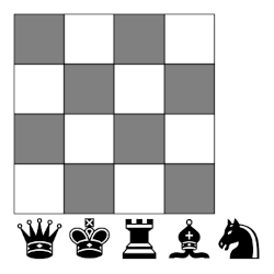
Uncategorized

Zooming in on a fractalish plot

The exponential sum of the day page on my site draws an image every day by plugging the month, day, and year into a formula. Details here.

Today’s image looks almost solid blue in the middle.

The default plotting line width works well for most days. For example, see what the sum of the day will look line on July 1 this year. Making the line width six times thinner reveals more of the detail in the middle.

You can see even more detail in a PDF of the plot.

Typesetting Sha and Bitcoin

I went down a rabbit hole this week using two symbols in LaTeX. The first was the Russian letter Sha (Ш, U+0248), and the second was the currency symbol for Bitcoin (₿, U+20BF).

Sha

I thought there would be a LaTeX package that would include Ш as a symbol rather than as a Russian letter, just as \pi produces π as a symbol rather than as a Greek letter per se, but apparently there isn’t. I was surprised, since Ш is used in math for at least three different things [1].

When I post on @TeXtip how to produce various symbols in LaTeX, I often get a reply telling me I should simply paste in the Unicode character and use XeTeX. That’s what I ended up doing, except one does not simply use XeTeX.

You have to set the font to one that contains a glyph for the character you want, and you have to use a font encoding package. I ended up adding these two lines to my file header:

    \usepackage[T2A]{fontenc}
    \usepackage{eulervm}

That worked, but only when I compiled with pdflatex, not xelatex.

Bitcoin

I ended up using a different but analogous tactic for the Bitcoin symbol. I used fontspec, Liberation Sans, and xelatex rather than fontenc, Euler, and pdflatex. These were the lines I added to the header:

    \usepackage{fontspec}
    \setmainfont{Liberation Sans}

Without these two lines I get the error message

    Missing character: There is no ₿ (U+20BF) in font ...

I didn’t need to use ₿ and Ш in the same document, but the approach in this section works for both. The approach in the previous section will not work for ₿ because the Euler font does not contain a gylph for ₿.

Related posts

[1] The three mathematical uses of Ш that I’m aware of are the shuffle product, the Dirac comb distribution, and Tate–Shafarevich group.

Houston’s long term planning

When I hear American cities criticized for lack of long-term planning, my initial thought is that this is a good thing because the future cannot be predicted or directed very far in advance, and cities should be allowed to grow organically. Houston, in particular, is subject to a lot of criticism because of its lack of zoning, which I also think is a good thing. [1]

With that in mind, I was very surprised to see the following thread [2] from Aaron Renn.

Maybe the craziest thing about Houston’s third beltway, Grand Parkway, is that the idea originated in 1961, when the Houston metro area population was only 1.2 million people. [It’s now 7.8 million. — JC]

“In October 1965, plans for the Grand Parkway became public. The Houston City Planning Commission released a draft version of the 1966 Major Thoroughfare and Freeway Plan showing the new third loop on the official planning map.”

“The City Planning Commission approved the route and scheduled a public hearing for February 17, 1966. The Houston Chronicle enthusiastically endorsed the new route, saying, ‘No sensible citizen can doubt that this freeway will be needed eventually.’”

Aaron’s quotations are from Houston Freeways.

To a very crude approximation, a map of Houston looks like three concentric rings [2]. According to the sources cited above, planning for the outer ring began long before the middle ring was completed. The first section of the Grand Parkway opened in 1994, and it’s maybe three quarters finished currently.

Maybe what has made Houston successful is that it planned far ahead on a macro scale, but has not micromanaged as much as most cities.

[1] Along these lines, see James Scott’s book Seeing Like a State for examples of failures in long-range state planning. Or if you don’t have the to read the book, you might want to read Venkatash Rao’s article A Big Little Idea Called Legibility.

[2] It’s not exactly a thread. It’s a series of posts that quote the first sentence.

[3] When the outer ring, the Grand Parkway, is completed, it will be the longest beltway in the US and encompass more area than the state of Rhode Island.

Multiplying by quaternions on the left and right

The map that takes a quaternion x to the quaternion qx is linear, so it can be represented as multiplication by a matrix. The same is true of the map that takes x to xq, but the two matrices are not the same because quaternion multiplication does not commute.

Let qa + bi + cjdk and let qM be the matrix that represents multiplication on the left by q. Then

_qM = \begin{bmatrix} a & -b & -c & -d \\ b & a & -d & c \\ c & d & a & -b \\ d & -c & b & a \\ \end{bmatrix}

Now let Mq be the matrix that represents multiplication on the right by q. Then

M_q = \begin{bmatrix} a & -b & -c & -d \\ b & a & d & -c \\ c & -d & a & b \\ d & c & -b & a \\ \end{bmatrix}

Can prove both matrix representations are correct by showing that they do the right thing when q = 1, ij, and k. The rest follows by linearity.

You might speculate that the matrix representation for multiplying on the right by q might be the transpose of the matrix representation for multiplying on the left by q. You can look at the matrices above and see that’s not the case.

In this post I talk about how to represent rotations with quaternions, and in this post I give an equation for the equivalent rotation matrix for a rotation described by a quaternion. You can prove that the matrix representation is correct by multiplying out qM and Mq* . Keep in mind that q in that case is a unit quaterion, so the sum of the squares of its components add to 1.

Related posts

Alternative exp and log notation

The other day I stumbled on an article [1] that advocated writing ab as ab and loga(b) as ab.

\begin{align*} a &\uparrow b \equiv a^b  \\ a &\downarrow b \equiv \log_a b \end{align*}

This is a special case of Knuth’s up arrow and down arrow notation. Knuth introduces his arrows with the intention of repeating them to represent hyperexponentiation and iterated logarithms. But the emphasis in [1] is more on the pedagogical advantages of using a single up or down arrow.

Advantages

One advantage is that the notation is more symmetric. Exponents and logs are inverses of each other, and up and down arrows are visual inverses of each other.

Another advantage is that the down arrow notation makes the base of the logarithm more prominent, which is sometimes useful.

Finally, the up and down arrow notation is more typographically linear:  ab and ab stay within a line, whereas ab and loga(b) extend above and below the line. LaTeX handles subscripts and superscripts well, but HTML doesn’t. That’s one reason I usually write exp(x) rather than ex here.

Comparison

Here are the basic properties of logs and exponents using conventional notation.

\begin{align} a^b = c &\iff \log_a c = b \\ \log_b 1 &= 0 \\ \log_b b &= 1 \\ \log_b(b^x) &= x \\ b^{\log_b x} &= x \\ \log_b xy &= \log_b x + \log_b y \\ \log_b \frac{x}{y} &= \log_b x - \log_by \\ a^{\log_b c} &= c^{\log_b a} \\ \log_a b^c &= c (\log_a b) \\ (\log_b a) (\log_a x) &= \log_b x \end{align}

Here are the same properties using up and down arrow notation.

\begin{align} a \uparrow b = c &\iff a \downarrow c = b \\ b \downarrow 1 &= 0 \\ b \downarrow b &= 1 \\ b \downarrow (b \uparrow x) &= x \\ b \uparrow (b \downarrow x) &= x \\ b \downarrow xy &= b \downarrow x + b \downarrow y \\ b \downarrow \frac{x}{y} &= b \downarrow x - b \downarrow y \\ a \uparrow (b \downarrow c) &= c \uparrow (b \downarrow a ) \\ a \downarrow (b \uparrow c) &= c (a \downarrow b) \\ (b \downarrow a) (a \downarrow x) &= b \downarrow x \end{align}

Related posts

[1] Margaret Brown. Some Thoughts on the Use of Computer Symbols in Mathematics. The Mathematical Gazette, Vol. 58, No. 404 (Jun., 1974), pp. 78-79

A crowded little chess puzzle

Here’s a puzzle by Martin Gardner [1].

Can a queen, king, rook, bishop, and knight be placed on a 4² board so no piece attacks another?

There are two solutions, plus symmetries.

Note that in all non-attacking chess puzzles, the colors of the pieces are irrelevant. In the solutions I chose the piece colors to be the opposite of the square colors strictly for aesthetic reasons.

More chess posts

More Martin Gardner posts

[1] Martin Gardner. Some New Results on Nonattacking Chess Tasks. Math Horizons. February 2001, pp 10–12.

The non-attacking bishops problem

How many bishops can you place on a chessboard so that no bishop is attacking any other bishop?

For a standard 8 × 8 chessboard the answer is 14. In general, for an n × n chessboard the answer is 2n − 2.

Here’s one way to place the maximum number of non-attacking bishops.

To see that the bishops cannot attack each other, I think it’s helpful to imagine extending the chessboard so that each bishop attacks the same number of squares. Then we can see that they miss each other.

Related posts

Frequency of names of English monarchs

After I wrote the code to make the bar graph of papal names for the previous post, I decided to reuse the code to make a similar graph for monarchs of England. Just as there is some complication in counting papal names, there are even more complications in counting names of English monarchs.

Who was the first king of England? I went with Æthelstan (924–927). Was Lady Jane Grey queen of England? Not for my chart. Note that Edward the Elder and Edward the Martyr came before Henry I.

Incidentally, John is the most common name for a pope and the least common for a king of England. Several monarch names are unique, but John’s name is conspicuously not reused since he was an odious king. I remember my world history teacher saying there would never be another English king named John, something I found disappointing at the time.

Frequency of papal names

The new pope chose the name Leo XIV. That made me curious about the distribution of names of popes and so I made the graph below. (I’m Protestant, so wasn’t familiar to me.)

Looks like Leo is tied with Clement for fourth place, the top three names being John, Benedict, and Gregory.

There are a few oddities in counting the names due to the time in the Middle Ages when there was disagreement over who was pope. For this reason some popes are listed twice, sorta like how Grover Cleveland and Donald Trump each appear twice in the list of US presidents. And although the last pope named John was John XXIII, 21 popes have been named John: there was no John XX due to a clerical error, and John XVI was declared an antipope.

I also made a higher resolution PDF.