Hand-drawn Graphviz diagrams

The Sketchviz site lets you enter GraphViz code and get out something that looks hand-drawn. I decided to try it on some of the GraphViz diagrams I’ve made for this blog.

Here’s a diagram from my post on Rock, Paper, Scissors, Lizard, Spock.

The Sketchviz site defaults to Tinos font, which does not look hand-drawn. Maybe you’d want that sometimes: neatly typeset labels and hand-drawn boxes and arrows. In my case, I thought it looked better to use Sedgwick Ave which looks closer to handwriting.

***

Some posts with GraphViz diagrams:

Some of these posts include GraphViz source.

Optimization, Dominoes, and Frankenstein

Robert Bosch has a new book coming out next week titled OPT ART: From Mathematical Optimization to Visual Design. This post will look at just one example from the book: creating images of Frankenstein’s monster [1] using dominoes.

Frankenstein made from 3 sets of double nine dominoes

The book includes two images, a low-resolution image made from 3 sets of dominoes and a high resolution image made from 48 sets. These are double nine dominoes rather than the more common double six dominoes because the former allow a more symmetric arrangement of dots. There are 55 dominoes in a double nine set. (Explanation and generalization here.)

Image of Frankenstein's monster made from 48 sets of double nine dominoes

The images are created by solving a constrained optimization problem. You basically want to use dominoes whose brightness is proportional to the brightness of the corresponding section of a photograph. But you can only use the dominoes you have, and you have to use them all.

You would naturally want to use double nines for the brightest areas since they have the most white spots and double blanks for the darkest areas. But you only have three of each in the first image, forty eight of each in the second, and you have to make do with the rest of the available pieces. So you solve an optimization problem to do the best you can.

Each domino can be places horizontally or vertically, as long as they fit the overall shape of the image. In the first image, you can see the orientation of the pieces if you look closely. Here’s a little piece from the top let corner.

Domino orientation

One double six is placed vertically in the top left. Next to it are another double six and a double five placed horizontally, etc.

There are additional constraints on the optimization problem related to contrast. You don’t just want to match the brightness of the photograph as well as you can, you also want to maintain contrast. For example, maybe a five-two domino would match the brightness of a couple adjacent squares in the photograph, but a seven-one would do a better job of making a distinction between contrasting regions of the image.

Bosch explains that the problem statement for the image using three sets of dominoes required 34,265 variables and 385 domino constraints. It was solved using 29,242 iterations of a simplex algorithm and required a little less than 2 seconds.

The optimization problem for the image created from 48 sets of dominoes required 572,660 variables and 5,335 constraints. The solution required 30,861 iterations of a simplex algorithm and just under one minute of computation.

Related posts

[1] In the Shelley’s novel Frankenstein, the doctor who creates the monster is Victor Frankenstein. The creature is commonly called Frankenstein, but strictly speaking that’s not his name. There’s a quote—I haven’t been able to track down its source—that says “Knowledge is knowing that Frankenstein wasn’t the monster. Wisdom is knowing that Frankenstein was the monster.” That is, the monster’s name wasn’t Frankenstein, but what Victor Frankenstein did was monstrous.

Drawing with Unicode block characters

My previous post contained the image below.

The point of the post was that the numbers that came up in yet another post made the fractal image above when you wrote them in binary. Here’s the trick I used to make that image.

To make the pattern of 0’s and 1’s easier to see, I wanted to make a graphic with black and white squares instead of the characters 0 and 1. I thought about writing a program to create an image using strings of 0’s and 1’s as input, but then I thought of something more direct.

The Unicode character U+2588 is just a solid rectangle. I replaced the 1’s with U+2588 and replaced the 0’s with spaces. So I made a text file that looked like the image above, and took a screen shot of it. The only problem was that the image was rectangular. I thought the pattern would be easier to see if it were a square, so I changed the aspect ratio on the image.

Here’s another example using Unicode block elements, this time to make a little bar graph, sorta like Edward Tufte’s idea of a sparkline. The characters U+2581 through U+2588 produce bars of increasing height.

bar graph of English letter frequencies

To create images like this, your font needs to include glyphs for Unicode block elements. The font needs to be monospaced as well so the letters will line up under the blocks. The example above was created using the APL385. It also looks good in Hack and Input Mono. In some fonts the block characters don’t align consistently on the baseline.

Here’s the Python code that produced the above graph of English letter frequencies.

# Letter frequencies via
# http://www.norvig.com/mayzner.html
freq = [ 
  8.04, 1.48, 3.34, 3.82, 12.49,
  2.40, 1.87, 5.05, 7.57,  0.16,
  0.54, 4.07, 2.51, 7.23,  7.64,
  2.14, 0.12, 6.28, 6.51,  9.28,
  2.73, 1.05, 1.68, 0.23,  1.66,
  0.09,
]
m = max(freq)

for i in range(26):
    u = int(8*freq[i]/m)
    ch = chr(0x2580+u) if u > 0 else " "
    print(ch, end="")

print()
for i in range(26):
    print(chr(0x41+i), end="")

How to compute the area of a polygon

If you know the vertices of a polygon, how do you compute its area? This seems like this could be a complicated, with special cases for whether the polygon is convex or maybe other considerations. But as long as the polygon is “simple,” i.e. the sides meet at vertices but otherwise do not intersect each other, then there is a general formula for the area.

The formula

List the vertices starting anywhere and moving counterclockwise around the polygon: (x1y1), (x2y2), …, (xnyn). Then the area is given by the formula below.

A = \frac{1}{2} \begin{vmatrix} x_1 & x_2 & \ldots & x_n & x_1\\ y_1 & y_2 & \ldots & y_n & y_1 \end{vmatrix}

But what does that mean? The notation is meant to be suggestive of a determinant. It’s not literally a determinant because the matrix isn’t square. But you evaluate it in a way analogous to 2 by 2 determinants: add the terms going down and to the right, and subtract the terms going up and to the right. That is,

x1 y2 + x2 y3 + … xn y1y1 x2y2 x3 – … –  yn x1

This formula is sometimes called the shoelace formula because the pattern of multiplications resembles lacing a shoe. It’s also called the surveyor’s formula because it’s obviously useful in surveying.

Update: Here is an analogous formula for centroid.

Numerical implementation

As someone pointed out in the comments, in practice you might want to subtract the minimum x value from all the x coordinates and the minimum y value from all the y coordinates before using the formula. Why’s that?

If you add a constant amount to each vertex, you move your polygon but you don’t change the area. So in theory it makes no difference whether you translate the polygon before computing its area. But in floating point, it can make a difference.

The cardinal rule of floating point arithmetic is to avoid subtracting nearly equal numbers. If you subtract two numbers that agree to k significant figures, you can lose up to k figures of precision. We’ll illustrate this by taking a right triangle with base 2 and height π. The area should remain π as we translate the triangle away from the origin, we lose precision the further out we translate it.

Here’s a Python implementation of the shoelace formula.

    def area(x, y):
        n = len(x)
        s = 0.0
        for i in range(-1, n-1):
            s += x[i]*y[i+1] - y[i]*x[i+1]
        return 0.5*s

If you’re not familiar with Python, a couple things require explanation. First, range(n-1) is a list of integers starting at 0 but less than n-1. Second, the -1 index returns the last element of the array.

Now, watch how the precision of the area degrades as we shift the triangle by powers of 10.

    import numpy as np

    x = np.array([0.0, 0.0, 2.0])
    y = np.array([np.pi, 0.0, 0.0])

    for n in range(0, 10):
        t = 10**n
        print( area(x+t, y+t) )

This produces

    3.141592653589793
    3.1415926535897825
    3.1415926535901235
    3.1415926535846666
    3.141592651605606
    3.1415929794311523
    3.1416015625
    3.140625
    3.0
    0.0

Shifting by small amounts doesn’t make a noticeable difference, but we lose between one and two significant figures each time we increase t by a multiple of 10. We only have between 15 and 16 significant figures to start with in a standard floating point number, and so eventually we completely run out of significant figures.

When implementing the shoelace formula, we want to do the opposite of this example: instead of shifting coordinates so that they’re similar in size, we want to shift them toward the origin so that they’re not similar in size.

Related post: The quadratic formula and low-precision arithmetic

Drawing Spirograph curves in Python

I was looking back over an old blog post and noticed some code in the comments that I had overlooked. Tom Pollard gives the following code for drawing Spirograph-like curves.

import matplotlib.pyplot as plt
from numpy import pi, exp, real, imag, linspace

def spiro(t, r1, r2, r3):
    """
    Create Spirograph curves made by one circle of radius r2 rolling 
    around the inside (or outside) of another of radius r1.  The pen
    is a distance r3 from the center of the first circle.
    """
    return r3*exp(1j*t*(r1+r2)/r2) + (r1+r2)*exp(1j*t)

def circle(t, r):
    return r * exp(1j*t)

r1 = 1.0
r2 = 52.0/96.0
r3 = 42.0/96.0

ncycle = 13 # LCM(r1,r2)/r2

t = linspace(0, ncycle*2*pi, 1000)
plt.plot(real(spiro(t, r1, r2, r3)), imag(spiro(t, r1, r2, r3)))
plt.plot(real(circle(t, r1)), imag(circle(t, r1)))
 
fig = plt.gcf()
fig.gca().set_aspect('equal')
plt.show()

Tom points out that with the r parameters above, this produces the default curve on Nathan Friend’s Inspirograph app.

Related: Exponential sum of the day

Paul Klee meets Perry the Platypus

I was playing around with something in Mathematica and one of the images that came out of it surprised me.

filter contour plot

It’s a contour plot for the system function of a low pass filter.

    H[z_] := 0.05634*(1 + 1/z)*(1 - 1.0166/z + 1/z^2) /
            ((1 - 0.683/z)*(1 - 1.4461/z + 0.7957/z^2))
    ContourPlot[ Arg[H[Exp[I (x + I y)]]], 
                 {x, -1, 1}, {y, -1, 1}, 
                 ColorFunction -> "StarryNightColors"]

It looks sorta like a cross between Paul Klee’s painting Senecio

Senecio by Paul Klee, 1922

and Perry the Platypus from Phineas and Ferb.

Perry the Platypus from Phineas and Ferb

Area of a triangle and its projections

Let S be the area of triangle T in three-dimensional space. Let AB, and C be area of the projections of T to the xyyz, and xz planes respectively. Then

S2A2B2C2.

There’s an elegant proof of this theorem here using differential forms. Below I’ll sketch a less elegant but more elementary proof.

You could prove the identity above by using the fact that the area of a triangle spanned by two vectors is half the length of their cross product. Suppose ab, and c are the locations of the three corners of T. Then

S2 = v2/2,

where

v = (a – b) × (c – b)

and by v2 we mean the dot product of v with itself.

Write out the components of v2 and you get three squared terms. Notice that when you set the x components to zero, i.e. project onto the yz plane, the first of the three terms is unchanged and the other two are zero. In other words, the first of the three terms of v2 is A2. A similar argument shows that the other two terms are B2 and C2.


ASCII art diagrams

“Technology is additive.” — Kevin Kelly

Old technologies never die. Instead, their range of application shrinks. Or maybe it grows when conditions change.

ASCII art, drawing pictures with fixed-width plain text characters, is no longer how many people want to produce diagrams. Just fire up Adobe Illustrator and you get incomparably more resolution of expression.

And yet there are times when ASCII art comes in handy. You can, for example, paste it into source code files. Someone more familiar with Emacs than Illustrator may be able to produce a simple diagram in the former faster than the latter. And it can be relatively easy to programmatically produce a large number of ASCII art diagrams, depending on the nature of the diagrams.

It’s also possible to use ASCII art as a way to specify nicely rendered images. I’ll show how to do that with ditaa below.

Here’s an ASCII version of the conjugate prior diagram I made some time ago:


                          +-------------+
                          |             |
                          | Exponential |
                          |             |
                          +-------------+
                                 |
                          lambda |                                                          
                                 v
+-------------+           +-------------+           +-------------+
|             |   tau     |             |   lambda  |             |
|  Lognormal  |---------->|    Gamma    |<----------| Poisson     |
|             |           |             |---+       |             |
+-------------+           +-------------+   |       +-------------+
      |                         ^ ^         | beta
      |                   tau   | |         | 
      | tau                     | +---------+
      |                   +-------------+ 
      +------------------>|             |
                          |     Normal  |
                          |             |----+
                          +-------------+    | 
                                     ^       | mu
                                     |       |
                                     +-------+


And here’s the image produced by ditaa processing the ASCII diagram above:

Conjugate prior diagram produced by ditaa

Update: See my next post on how to create ASCII art diagrams and their graphic version from ditaa using Emacs org mode.

Update: When I first made the diagram above, I tried using Greek letters, e.g. using β rather than “beta,” but this didn’t work. I thought “OK, I suppose it’s not really ASCII art if you use non-ASCII characters.” But someone told me Unicode characters worked for him, so I tried again when I wrote the follow up post and it worked.

My first attempt, from a Windows laptop, calling ditaa from the command line, did not work. My second attempt, running inside org-mode from a Windows desktop, did work. My third attempt, running from Emacs on Linux also worked.

ditaa diagram using Unicode symbols


Nicholas Higham on Mathematics in Color

This is reprint of Nick Higham’s post of the same title from the Princeton University Press blog, used with permission.

circle-rgb.jpg

Color is a fascinating subject. Important early contributions to our understanding of it came from physicists and mathematicians such as Newton, Young, Grassmann, Maxwell, and Helmholtz. Today, the science of color measurement and description is well established and we rely on it in our daily lives, from when we view images on a computer screen to when we order paint, wallpaper, or a car, of a specified color.

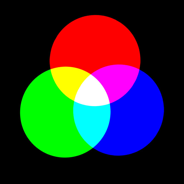
For practical purposes color space, as perceived by humans, is three-dimensional, because our retinas have three different types of cones, which have peak sensitivities at wavelengths corresponding roughly to red, green, and blue. It’s therefore possible to use linear algebra in three dimensions to analyze various aspects of color.

Metamerism

A good example of the use of linear algebra is to understand metamerism, which is the phenomenon whereby two objects can appear to have the same color but are actually giving off light having different spectral decompositions. This is something we are usually unaware of, but it is welcome in that color output systems (such as televisions and computer monitors) rely on it.

Mathematically, the response of the cones on the retina to light can be modeled as a matrix-vector product Af, where A is a 3-by-n matrix and f is an n-vector that contains samples of the spectral distribution of the light hitting the retina. The parameter n is a discretization parameter that is typically about 80 in practice. Metamerism corresponds to the fact that Af1 = Af2  is possible for different vectors f1 and f2. This equation is equivalent to saying that Ag = 0 for a nonzero vector gf1 – f2, or, in other words, that a matrix with fewer rows than columns has a nontrivial null space.

Metamerism is not always welcome. If you have ever printed your photographs on an inkjet printer you may have observed that a print that looked fine when viewed indoors under tungsten lighting can have a color cast when viewed in daylight.

LAB Space: Separating Color from Luminosity

In digital imaging the term channel refers to the grayscale image representing the values of the pixels in one of the coordinates, most often R, G, or B (for red, green, and blue) in an RGB image. It is sometimes said that an image has ten channels. The number ten is arrived at by combining coordinates from the representation of an image in three different color spaces. RGB supplies three channels, a space called LAB (pronounced “ell-A-B”) provides another three channels, and the last four channels are from CMYK (cyan, magenta, yellow, black), the color space in which all printing is done.

LAB is a rather esoteric color space that separates luminosity (or lightness, the L coordinate) from color (the A and B coordinates). In recent years photographers have realized that LAB can be very useful for image manipulations, allowing certain things to be done much more easily than in RGB. This usage is an example of a technique used all the time by mathematicians: if we can’t solve a problem in a given form then we transform it into another representation of the problem that we can solve.

As an example of the power of LAB space, consider this image of aeroplanes at Schiphol airport.

060721-1320-30-8896-org.jpg

Original image.

Suppose that KLM are considering changing their livery from blue to pink. How can the image be edited to illustrate how the new livery would look? “Painting in” the new color over the old using the brush tool in image editing software would be a painstaking task (note the many windows to paint around and the darker blue in the shadow area under the tail). The next image was produced in
just a few seconds.

060721-1320-30-8896-lab.jpg

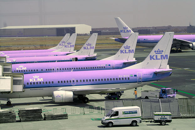
Image converted to LAB space and A channel flipped.

How was it done? The image was converted from RGB to LAB space (which is a nonlinear transformation) and then the coordinates of the A channel were replaced by their negatives. Why did this work? The A channel represents color on a green–magenta axis (and the B channel on a blue–yellow axis). Apart from the blue fuselage, most pixels have a small A component, so reversing the sign of this component doesn’t make much difference to them. But for the blue, which has a negative A component, this flipping of the A channel adds just enough magenta to make the planes pink.

You may recall from earlier this year the infamous photo of a dress that generated a huge amount of interest on the web because some viewers perceived the dress as being blue and black while others saw it as white and gold. A recent paper What Can We Learn from a Dress with Ambiguous Colors? analyzes both the photo and the original dress using LAB coordinates. One reason for using LAB in this context is its device independence, which contrasts with RGB, for which the coordinates have no universally agreed meaning.

Nicholas J. Higham is the Richardson Professor of Applied Mathematics at The University of Manchester, and editor of The Princeton Companion to Applied Mathematics. His article Color Spaces and Digital Imaging in The Princeton Companion to Applied Mathematics gives an introduction to the mathematics of color and the representation and manipulation of digital images. In particular, it emphasizes the role of linear algebra in modeling color and gives more detail on LAB space.

Related posts

Pretty squiggles

Here’s an image that came out of something I was working on this morning. I thought it might make an interesting border somewhere.

The blue line is sin(x), the green line 0.7 sin(φ x), and the red line is their sum. Here φ is the golden ratio (1 + √5)/2. Even though the blue and green curves are both periodic, their sum is not because the ratio of their frequencies is irrational. So you could make this image as long as you’d like and the red curve would never exactly repeat.

Update: See Almost periodic functions