This post will reveal the connection between my two previous posts: one on the Star Trek lemma and one on Pythagorean triples.
In the process of writing the latter, I looked at the Wikipedia article on Pythagorean triples and noticed this curious paragraph.
In every Pythagorean triangle, the radius of the incircle and the radii of the three excircles are positive integers. Specifically, for a primitive triple the radius of the incircle is r = n(m − n), and the radii of the excircles opposite the sides m2 − n2, 2mn, and the hypotenuse m2 + n2 are respectively m(m − n), n(m + n), and m(m + n).
The citation for the paragraph above was the book by my former officemate, which led to the post on the Star Trek lemma. The passage in Arthur Baragar’s book that Wikipedia cites is Exercise 15.3.
Let ΔABC be a right angle triangle with sides of integer length. Prove that the inradius r and the exradii ra, rb, and rc are all integers.
I don’t know whether Arthur discovered this theorem, but I’ll call it Baragar’s theorem for this post.
Incircles and excircles
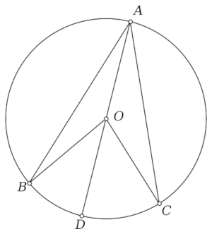
To unpack Baragar’s theorem, let’s start by saying what incircles and excircles are. Incircles are more familiar. The incircle of a triangle is the largest circle that can be inscribed inside the triangle, and the radius of this circle is the inradius.
Since an incircle is an inscribed circle, you might expect an excircle to be a circumscribed circle, but that’s not it. There are three excircles, one for each side. To find the excircle for a side, extend the other two sides and find the circle tangent to the side and the two extensions. The radius of an excircle is its exradius.
Proof
Baragar’s theorem follows directly from Euclid’s formula for Pythagorean triples mentioned in the previous post

and formulas for the inradius r and the exradii ra, rb, and rc.

Here K is the area of the triangle, which in our case is ab/2, and s is the semiperimeter, half the perimeter.
Expressing the radii in terms of m and n gives the values cited by Wikipedia above.
Illustrating the theorem
I’d like to write a Python script to illustrate the theorem, and knowing the radii of the circles help, but we also need to know the centers of the circles.
The center of the incircle is the weighted average of the vertices, with weights given by the lengths of the opposite sides. That is, if the vertices are A, B, and C, and the sides opposite these vertices are a, b, and c, the the incenter is

The centers for the excircles have remarkably similar expressions. For the incenter of the circle opposite a vertex, flip the sign of the corresponding side.

Python code
Putting it all together, here’s an illustrate the theorem.
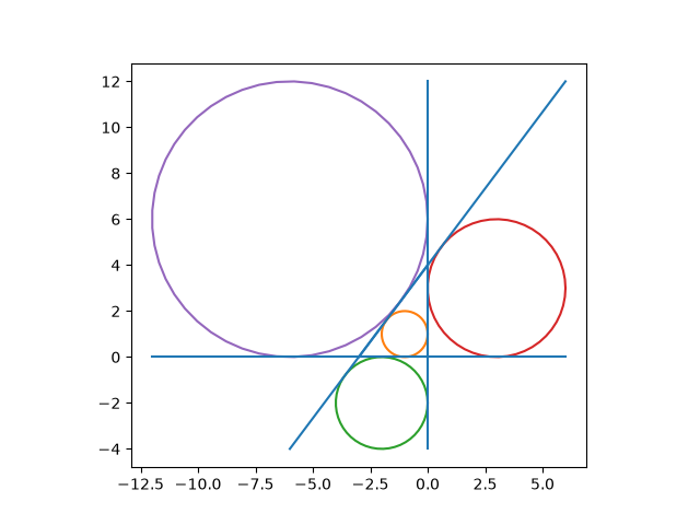
And here’s the code that produced it. Note that everything in this section works for right triangles in general, not just Pythagorean triangles.
import numpy as np
import matplotlib.pyplot as plt

def connect(A, B):
    plt.plot([A[0], B[0]], [A[1], B[1]], "C0")

def draw_circle(c, r, color):
    t = np.linspace(0, 2*np.pi)
    plt.plot(r*np.cos(t) + c[0], r*np.sin(t) + c[1], color=color)

a, b, c, = 3, 4, 5

A = np.array([0, b])
B = np.array([-a, 0])
C = np.array([0, 0])

s = (a + b + c)/2
K = a*b/2
r = K/s
ra = K/(s - a)
rb = K/(s - b)
rc = K/(s - c)
I = (a*A + b*B + c*C)/(a + b + c)
Ia = (-a*A + b*B + c*C)/(-a + b + c)
Ib = (a*A - b*B + c*C)/(a - b + c)
Ic = (a*A + b*B - c*C)/(a + b - c)

draw_circle(I, r, "C1")
draw_circle(Ia, ra, "C2")
draw_circle(Ib, rb, "C3")
draw_circle(Ic, rc, "C4")

plt.plot([-2*rc, 2*rb], [0, 0], "C0")
plt.plot([0, 0], [-2*ra, 2*rc], "C0")
plt.plot([(-2*ra - b)*a/b, 2*rb], [-2*ra, 2*rb*b/a + b], "C0")

plt.gca().set_aspect("equal")
plt.show()