Recreating the Vertigo poster

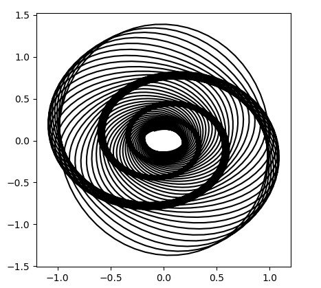
In his new book The Perfect Shape, Øyvind Hammer shows how to create a graph something like the poster for Alfred Hitchcock’s movie Vertigo.

Poster from Hitchcock's Vertigo

Hammer’s code uses a statistical language called Past that I’d never heard of. Here’s my interpretation of his code using Python.

      import matplotlib.pyplot as plt
      from numpy import arange, sin, cos, exp
      
      i  = arange(5000)
      x1 = 1.0*cos(i/10.0)*exp(-i/2500.0)
      y1 = 1.4*sin(i/10.0)*exp(-i/2500.0)
      d  = 450.0
      vx = cos(i/d)*x1 - sin(i/d)*y1
      vy = sin(i/d)*x1 + cos(i/d)*y1
      
      plt.plot(vx, vy, "k")
      
      h = max(vy) - min(vy)
      w = max(vx) - min(vx)
      plt.axes().set_aspect(w/h)
      plt.show()

This code produces what’s called a harmonograph, related to the motion of a pendulum free to move in x and y directions:

Harmonograph

It’s not exactly the same as the movie poster, but it’s definitely similar. If you find a way to modify the code to make it closer to the poster, leave a comment below.

Inverse Fibonacci numbers

As with the previous post, this post is a spinoff of a blog post by Brian Hayes. He considers the problem of determining whether a number n is a Fibonacci number and links to a paper by Gessel that gives a very simple solution: A positive integer n is a Fibonacci number if and only if either 5n2 − 4 or 5n2 + 4 is a perfect square.

If we know n is a Fibonacci number, how can we tell which one it is? That is, if n = Fm, how can we find m?

For large m, Fm is approximately φm / √ 5 and the error decreases exponentially with m. By taking logs, we can solve for m and round the result to the nearest integer.

We can illustrate this with SymPy. First, let’s get a Fibonacci number.

      >>> from sympy import *
      >>> F = fibonacci(100)
      >>> F
      354224848179261915075

Now let’s forget that we know F is a Fibonacci number and test whether it is one.

      >>> sqrt(5*F**2 - 4)
      sqrt(627376215338105766356982006981782561278121)

Apparently 5F2 – 4 is not a perfect square. Now let’s try 5F2 + 4.

      >>> sqrt(5*F**2 + 4)
      792070839848372253127

Bingo! Now that we know it’s a Fibonacci number, which one is it?

      >>> N((0.5*log(5) + log(F))/log(GoldenRatio), 10)
      100.0000000

So F must be the 100th Fibonacci number.

It looks like our approximation gave an exact result, but if we ask for more precision we see that it did not.

      >>> N((0.5*log(5) + log(F))/log(GoldenRatio), 50)
      99.999999999999999999999999999999999999999996687654

Related posts

Fat-tailed random matrices

Suppose you fill the components of a matrix with random values. How are the eigenvalues distributed?

We limit our attention to large, symmetric matrices. We fill the entries of the matrix on the diagonal and above the diagonal with random elements, then fill in the elements below the diagonal by symmetry.

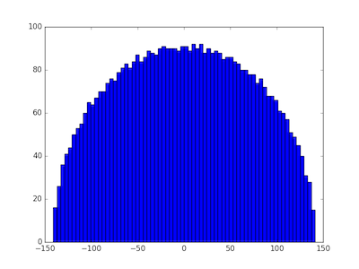
If we choose our random values from a thin-tailed distribution, then Wigner’s semicircle law tells us what to expect from our distribution. If our matrices are large enough, then we expect the probability density of eigenvalues to be semicircular. To illustrate this, we’ll fill a matrix with samples from a standard normal distribution and compute its eigenvalues with the following Python code.

      import numpy as np
      import matplotlib.pyplot as plt

      N = 5000
      A = np.random.normal(0, 1, (N, N))    
      B = (A + A.T)/np.sqrt(2)
      eigenvalues = np.linalg.eigvalsh(B) 
      print(max(eigenvalues), min(eigenvalues))

      plt.hist(eigenvalues, bins=70)
      plt.show()

We first create an N by N non-symmetric matrix, then make it symmetric by adding it to its transpose. (That’s easier than only creating the upper-triangular elements.) We divide by the square root of 2 to return the variance of each component to its original value, in this case 1. The eigenvalues in this particular experiment ran from −141.095 to 141.257 and their histogram shows the expected semi-circular shape.

eigenvalue distribution with normally distributed matrix entries

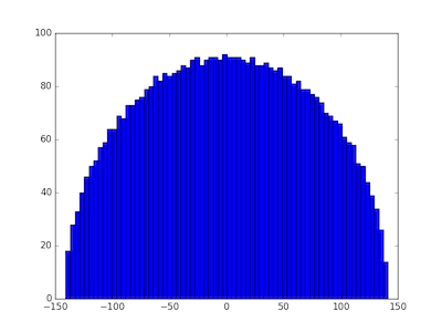
Wigner’s semicircle law does not require the samples to come from a normal distribution. Any distribution with finite variance will do. We illustrate this by replacing the normal distribution with a Laplace distribution with the same variance and rerunning the code. That is, we change the definition of the matrix A to

      A = np.random.laplace(0, np.sqrt(0.5), (N, N))

and get very similar results. The eigenvalues ran from −140.886 to 141.514 and again we see a semicircular distribution.

eigenvalue distribution for matrix with entries drawn from Laplace distribution

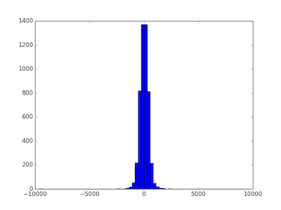
But what happens when we draw samples from a heavy-tailed distribution, i.e. one without finite variance? We’ll use a Student-t distribution with ν = 1.8 degrees of freedom. When ν > 2 the t-distribution has variance ν/(ν − 2), but for smaller values of ν it has no finite variance. We change the definition of the matrix A to the following:

      A = np.random.standard_t(1.8, (N, N))

and now the distribution is quite different.

eigenvalue distribution for matrix with entries drawn from Student t distribution with 1.8 degrees of freedom

In this case the minimum eigenvalue was −9631.558 and the largest was 9633.853. When the matrix components are selected from a heavy-tailed distribution, the eigenvalues also have a heavier-tailed distribution. In this case, nearly all the eigenvalues are between -1000 and 1000, but the largest and smallest were 10 times larger. The eigenvalues are more variable, and their distribution looks more like a normal distribution and less like a semicircle.

The distributions for all thin-tailed symmetric matrices are the same. They have a universal property. But each heavy-tailed distribution gives rise to a different distribution on eigenvalues. With apologies to Tolstoy, thin-tailed matrices are all alike; every thick-tailed matrix is thick-tailed in its own way.

Update: As the first comment below rightfully points out, the diagonal entries should be divided by 2, not sqrt(2). Each of the off-diagonal elements of A + AT are the sum of two independent random variables, but the diagonal elements are twice what they were in A. To put it another way, the diagonal elements are the sum of perfectly correlated random variables, not independent random variables.

I reran the simulations with the corrected code and it made no noticeable difference, either to the plots or to the range of the eigenvalues.

Distribution of numbers in Pascal’s triangle

This post explores a sentence from the book Single Digits:

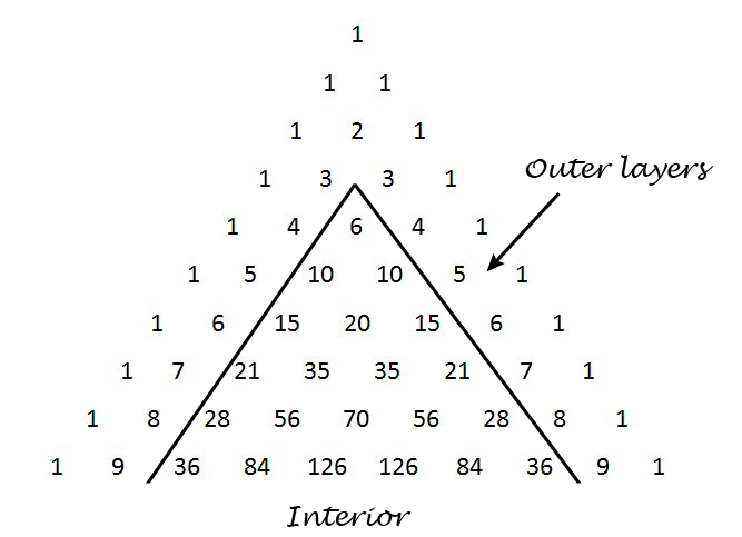
Any number in Pascal’s triangle that is not in the outer two layers will appear at least three times, usually four.

Pascal’s triangle contains the binomial coefficients C(nr) where n ranges over non-negative numbers and r ranges from 0 to n. The outer layers are the elements with r equal to 0, 1, n-1, and n.

Pascal's triangle

We’ll write some Python code to explore how often the numbers up to 1,000,000 appear. How many rows of Pascal’s triangle should we compute? The smallest number on row n is C(n, 2). Now 1,000,000 is between C(1414, 2) and C(1415, 2) so we need row 1414. This means we need N = 1415 below because the row numbers start with 0.

I’d like to use a NumPy array for storing Pascal’s triangle. In the process of writing this code I realized that a NumPy array with dtype int doesn’t contain Python’s arbitrary-sized integers. This makes sense because NumPy is designed for efficient computation, and using a NumPy array to contain huge integers is unnatural. But I’d like to do it anyway, and the way to make it happen is to set dtype to object.

    import numpy as np
    from collections import Counter
    
    N = 1415 # Number of rows of Pascal's triangle to compute
    
    Pascal = np.zeros((N, N), dtype=object)
    Pascal[0, 0] = 1
    Pascal[1,0] = Pascal[1,1] = 1
    
    for n in range(2, N):
        for r in range(0, n+1):
            Pascal[n, r] = Pascal[n-1, r-1] + Pascal[n-1, r]
    
    c = Counter()
    for n in range(4, N):
        for r in range(2, n-1):
            p = Pascal[n, r]
            if p <= 1000000:
                c[p] += 1

When we run this code, we find that our counter contains 1732 elements. That is, of the numbers up to one million, only 1732 of them appear inside Pascal’s triangle when we disallow the outer two layers. (The second layer contains consecutive integers, so every positive integer appears in Pascal’s triangle. But most integers only appear in the second layer.)

When Single Digits speaks of “Any number in Pascal’s triangle that is not in the outer two layers” this cannot refer to numbers that are not in the outer two layers because every natural number appears in the outer two layers. Also, when it says the number “will appear at least three times, usually four” it is referring to the entire triangle, i.e. including the outer two layers. So another way to state the sentence quoted above is as follows.

Define the interior of Pascal’s triangle to be the triangle excluding the outer two layers. Every number n in the interior of Pascal’s triangle appears twice more outside of the interior, namely as C(n, 1) and C(nn-1). Most often n appears at least twice in the interior as well.

This means that any number you find in the interior of Pascal’s triangle, interior meaning not in the two outer layers, will appear at least three times in the full triangle, usually more.

Here are the statistics from our code above regarding just the interior of Pascal’s triangle.

  • One number, 3003, appears six times.
  • Six numbers appear four times: 120, 210, 1540, 7140, 11628, and 24310.
  • Ten numbers appear only once: 6, 20, 70, 252, 924, 3432, 12870,  48620, 184756, and 705432.
  • The large majority of numbers, 1715 out of 1732, appear twice.

Chi-square goodness of fit test example with primes

chi squared

Yesterday Brian Hayes wrote a post about the distribution of primes. He showed how you could take the remainder when primes are divided by 7 and produce something that looks like rolls of six-sided dice. Here we apply the chi-square goodness of fit test to show that the rolls are too evenly distributed to mimic randomness. This post does not assume you’ve seen the chi-square test before, so it serves as an introduction to this goodness of fit test.

In Brian Hayes’ post, he looks at the remainder when consecutive primes are divided by 7, starting with 11. Why 11? Because it’s the smallest prime bigger than 7. Since no prime is divisible by any other prime, all the primes after 7 will have a remainder of between 1 and 6 inclusive when divided by 7. So the results are analogous to rolling six-sided dice.

The following Python code looks at prime remainders and (pseudo)random rolls of dice and computes the chi-square statistic for both.

First, we import some functions we’ll need.

    from sympy import prime
    from random import random
    from math import ceil

The function prime takes an argument n and returns the nth prime. The function random produces a pseudorandom number between 0 and 1. The ceiling function ceil rounds its argument up to an integer. We’ll use it to convert the output of random into dice rolls.

In this example we’ll use six-sided dice, but you could change num_sides to simulate other kinds of dice. With six-sided dice, we divide by 7, and we start our primes with the fifth prime, 11.

    num_sides = 6
    modulus = num_sides + 1

    # Find the index of the smallest prime bigger than num_sides
    index = 1
    while prime(index) <= modulus:
        index += 1

We’re going to take a million samples and count how many times we see 1, 2, …, 6. We’ll keep track of our results in an array of length 7, wasting a little bit of space since the 0th slot will always be 0. (Because the remainder when dividing a prime by a smaller number is always positive.)

    # Number of samples
    N = 1000000
    
    observed_primes = [0]*modulus
    observed_random = [0]*modulus

Next we “roll” our dice two ways, using prime remainders and using a pseudorandom number generator.

    for i in range(index, N+index):
        m = prime(i) % modulus
        observed_primes[m] += 1
        m = int(ceil(random()*num_sides))
        observed_random[m] += 1

The chi-square goodness of fit test depends on the observed number of events in each cell and the expected number. We expect 1/6th of the rolls to land in cell 1, 2, …, 6 for both the primes and the random numbers. But in a general application of the chi-square test, you could have a different expected number of observations in each cell.

    expected = [N/num_sides for i in range(1, modulus)]

The chi-square test statistic sums (O – E)2/E over all cells, where O stands for “observed” and E stands for “expected.”

    def chisq_stat(O, E):
        return sum( (o - e)**2/e for (o, e) in zip(O, E) )

Finally, we compute the chi-square statistic for both methods.

    ch = chisq_stat(observed_primes[1:], expected[1:])
    print(ch)

    ch = chisq_stat(observed_random[1:], expected[1:])
    print(ch)

Note that we chop off the first element of the observed and expected lists to get rid of the 0th element that we didn’t use.

When I ran this I got 0.01865 for the prime method and 5.0243 for the random method. Your results for the prime method should be the same, though you might have a different result for the random method.

Now, how do we interpret these results? Since we have six possible outcomes, our test statistics has a chi-square distribution with five degrees of freedom. It’s one less than the number of possibilities because the total counts have to sum to N; if you know how many times 1, 2, 3, 4, and 5 came up, you can calculate how many times 6 came up.

A chi-square distribution with ν degrees of freedom has expected value ν. In our case, we expect a value around 5, and so the chi-square value of 5.0243 is unremarkable. But the value of 0.01864 is remarkably small. A large chi-square statistics would indicate a poor fit, the observed numbers being suspiciously far from their expected values. But a small chi-square value suggests the fit is suspiciously good, closer to the expected values than we’d expect of a random process.

We can be precise about how common or unusual a chi-square statistic is by computing the probability that a sample from the chi square distribution would be larger or smaller. The cdf gives the probability of seeing a value this small or smaller, i.e. a fit this good or better. The sf gives the probability of seeing a value this larger or larger, i.e. a fit this bad or worse. (The scipy library uses sf for “survival function,” another name for the ccdf, complementary cumulative distribution function).

    from scipy.stats import chi2
    print(chi2.cdf(ch, num_sides-1), chi2.sf(ch, num_sides-1))

This says that for the random rolls, there’s about a 41% chance of seeing a better fit and a 59% chance of seeing a worse fit. Unremarkable.

But it says there’s only a 2.5 in a million chance of seeing a better fit than we get with prime numbers. The fit is suspiciously good. In a sense this is not surprising: prime numbers are not random! And yet in another sense it is surprising since there’s a heuristic that says primes act like random numbers unless there’s a good reason why in some context they don’t. This departure from randomness is the subject of research published just this year.

If you look at dice with 4 or 12 sides, you get a suspiciously good fit, but not as suspicious as with 6 sides. But with 8 or 20-sided dice you get a very bad fit, so bad that its probability underflows to 0. This is because the corresponding moduli, 9 and 21, are composite, which means some of the cells in our chi-square test will have no observations. (Suppose m has a proper factor a. Then if a prime p were congruent to a mod m, p would be have to be divisible by a.)

Update: See the next post for a systematic look at different moduli.

You don’t have to use “dice” that correspond to regular solids. You could consider 10-sided “dice,” for example. For such numbers it may be easier to think of spinners than dice, a spinner with 10 equal arc segments it could fall into.

Related post: Probability that a number is prime

How to create Green noise in Python

This is a follow-on to my previous post on green noise. Here we create green noise with Python by passing white noise through a Butterworth filter.

Green noise is in the middle of the audible spectrum (on the Bark scale), just where our hearing is most sensitive, analogous to the green light, the frequency where our eyes are most sensitive. See previous post for details, including an explanation of where the left and right cutoffs below come from.

Here’s the code:

from scipy.io.wavfile import write
from scipy.signal import buttord, butter, filtfilt
from scipy.stats import norm
from numpy import int16

def turn_green(signal, samp_rate):
    # start and stop of green noise range
    left = 1612 # Hz
    right = 2919 # Hz

    nyquist = (samp_rate/2)
    left_pass  = 1.1*left/nyquist
    left_stop  = 0.9*left/nyquist
    right_pass = 0.9*right/nyquist
    right_stop = 1.1*right/nyquist

    (N, Wn) = buttord(wp=[left_pass, right_pass],
                      ws=[left_stop, right_stop],
                      gpass=2, gstop=30, analog=0)
    (b, a) = butter(N, Wn, btype='band', analog=0, output='ba')
    return filtfilt(b, a, signal)

def to_integer(signal):
    # Take samples in [-1, 1] and scale to 16-bit integers,
    # values between -2^15 and 2^15 - 1.
    signal /= max(signal)
    return int16(signal*(2**15 - 1))

N = 48000 # samples per second

white_noise= norm.rvs(0, 1, 3*N) # three seconds of audio
green = turn_green(white_noise, N)
write("green_noise.wav", N, to_integer(green))

And here’s what it sounds like:

(download .wav file)

Let’s look at the spectrum to see whether it looks right. We’ll use one second of the signal so the x-axis coincides with frequency when we plot the FFT.

from scipy.fftpack import fft

one_sec = green[0:N]
plt.plot(abs(fft(one_sec)))
plt.xlim((1500, 3000))
plt.show()

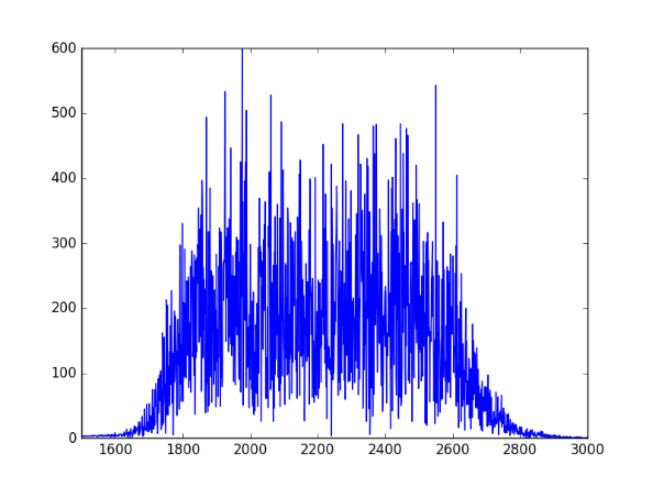
Here’s the output, concentrated between 1600 and 3000 Hz as expected:

spectral plot of green noise

How to digitize a graph

Suppose you have a graph of a function, but you don’t have an equation for it or the data that produced it. How can you reconstruction the function?

There are a lot of software packages to digitize images. For example, Web Plot Digitizer is one you can use online. Once you have digitized the graph at a few points, you can fit a spline to the points to approximately reconstruct the function. Then as a sanity check, plot your reconstruction to see if it looks like the original. It helps to have the same aspect ratio so you’re not distracted by something that doesn’t matter, and so that differences that do matter are easier to see.

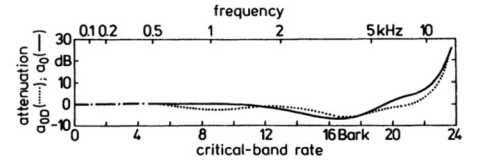
For example, here is a graph from Zwicker and Fastl’s book on psychoacoustics. It contains many graphs with no data or formulas. This particular one gives the logarithmic transmission factor between free field and the peripheral hearing system.

Here’s Python code to reconstruct the functions behind these two curves.

import matplotlib.pyplot as plt
import numpy as np
from scipy import interpolate 

curve_names = ["Free", "Diffuse"]
plot_styles = { "Free" : 'b-', "Diffuse" : 'g:'}

data = {}
for name in curve_names:
    data = np.loadtxt("{}.csv".format(name), delimiter=',')

    x = data[:,0]
    y = data[:,1]
    spline = interpolate.splrep(x, y)
    xnew = np.linspace(0, max(x), 100)
    ynew = interpolate.splev(xnew, spline, der=0)
    plt.plot(xnew, ynew, plot_styles[name])
 
logical_x_range  = 24    # Bark
logical_y_range  = 40    # dB
physical_x_range = 7     # inch
physical_y_range = 1.625 # inch

plt.legend(curve_names, loc=2)
plt.xlabel("critical-band rate")
plt.ylabel("attenuation")
plt.xlim((0, logical_x_range))


plt.axes().set_aspect( 
    (physical_y_range/logical_y_range) / 
    (physical_x_range/logical_x_range) )
ax = plt.gca()
ax.get_xaxis().set_ticks([0, 4, 8, 12, 16, 20, 24])
ax.get_yaxis().set_ticks([-10, 0, 10, 20, 30])

plt.show()

Here’s the reconstructed graph.

Creating police siren sounds with frequency modulation

Yesterday I was looking into calculating fluctuation strength and playing around with some examples. Along the way I discovered how to create files that sound like police sirens. These are sounds with high fluctuation strength.

police car lights

The Python code below starts with a carrier wave at fc = 1500 Hz. Not surprisingly, this frequency is near where hearing is most sensitive. Then this signal is modulated with a signal with frequency fm. This frequency determines the frequency of the fluctuations.

The slower example produced by the code below sounds like a police siren. The faster example makes me think more of an ambulance or fire truck. Next time I hear an emergency vehicle I’ll pay more attention.

If you use a larger value of the modulation index β and a smaller value of the modulation frequency fm you can make a sound like someone tuning a radio, which is no coincidence.

Here are the output audio files in .wav format:

slow.wav

fast.wav

from scipy.io.wavfile import write
from numpy import arange, pi, sin, int16

def f(t, f_c, f_m, beta):
    # t    = time
    # f_c  = carrier frequency
    # f_m  = modulation frequency
    # beta = modulation index
    return sin(2*pi*f_c*t - beta*sin(2*f_m*pi*t))

def to_integer(signal):
    # Take samples in [-1, 1] and scale to 16-bit integers,
    # values between -2^15 and 2^15 - 1.
    return int16(signal*(2**15 - 1))

N = 48000 # samples per second
x = arange(3*N) # three seconds of audio

data = f(x/N, 1500, 2, 100)
write("slow.wav", N, to_integer(data))

data = f(x/N, 1500, 8, 100)
write("fast.wav", N, to_integer(data))

More frequency modulation posts

The empty middle: why no one is average

In 1945, a Cleveland newspaper held a contest to find the woman whose measurements were closest to average. This average was based on a study of 15,000 women by Dr. Robert Dickinson and embodied in a statue called Norma by Abram Belskie. Out of 3,864 contestants, no one was average on all nine factors, and fewer than 40 were close to average on five factors. The story of Norma and the Cleveland contest is told in Todd Rose’s book The End of Average.

People are not completely described by a handful of numbers. We’re much more complicated than that. But even in systems that are well described by a few numbers, the region around the average can be nearly empty. I’ll explain why that’s true in general, then look back at the Norma example.

General theory

Suppose you have N points, each described by n independent, standard normal random variables. That is, each point has the form (x1, x2, x2, …, xn) where each xi is independent with a normal distribution with mean 0 and variance 1. The expected value of each coordinate is 0, so you might expect that most points are piled up near the origin (0, 0, 0, …, 0). In fact most points are in spherical shell around the origin. Specifically, as n becomes larger, most of the points will be in a thin shell with distance √n from the origin. (More details here.)

Simulated contest

In the contest above, n = 9, and so we expect most contestants to be about a distance of 3 from average when we normalize each of the factors being measured, i.e. we subtract the mean so that each factor has mean 0, and we divide each by its standard deviation so the standard deviation is 1 on each factor.

We’ve made several simplifying assumptions. For example, we’ve assumed independence, though presumably some of the factors measured in the contest were correlated. There’s also a selection bias: presumably women who knew they were far from average would not have entered the contest. But we’ll run with our simplified model just to see how it behaves in a simulation.

import numpy as np

# Winning critera: minimum Euclidean distance
def euclidean_norm(x):
    return np.linalg.norm(x)

# Winning criteria: min-max
def max_norm(x):
    return max(abs(x))

n = 9
N = 3864

# Simulated normalized measurements of contestants 
M = np.random.normal(size=(N, n))

euclid = np.empty(N)
maxdev = np.empty(N)
for i in range(N):
    euclid[i] = euclidean_norm(M[i,:])
    maxdev[i] = max_norm(M[i,:])

w1 = euclid.argmin()
w2 = maxdev.argmin()

print( M[w1,:] )
print( euclidean_norm(M[w1,:]) )
print( M[w2,:] )
print( max_norm(M[w2,:]) )

There are two different winners, depending on how we decide the winner. Using the Euclidean distance to the origin, the winner in this simulation was contestant 3306. Her normalized measurements were

[ 0.1807, 0.6128, -0.0532, 0.2491, -0.2634, 0.2196, 0.0068, -0.1164, -0.0740]

corresponding to a Euclidean distance of 0.7808.

If we judge the winner to be the one whose largest deviation from average is the smallest, the winner is contestant 1916. Her normalized measurements were

[-0.3757, 0.4301, -0.4510, 0.2139, 0.0130, -0.2504, -0.1190, -0.3065, -0.4593]

with the largest deviation being the last, 0.4593.

By either measure, the contestant closest to the average deviated significantly from the average in at least one dimension.

Maximum principle and approximating boundary value problems

Solutions to differential equations often satisfy some sort of maximum principle, which can in turn be used to construct upper and lower bounds on solutions.

We illustrate this in one dimension, using a boundary value problem for an ordinary differential equation (ODE).

Maximum principles

If the second derivative of a function is positive over an open interval (ab), the function cannot have a maximum in that interval. If the function has a maximum over the closed interval [ab] then it must occur at one of the ends, at a or b.

This can be generalized, for example, to the following maximum principle. Let L be the differential operator

L[u] = u” + g(x)u’ + h(x)

where g and h are bounded functions on some interval [a, b] and h is non-positive. Suppose L[u] ≥ 0 on (a, b). If u has an interior maximum, then u must be constant.

Boundary value problems

Now suppose that we’re interested in the boundary value problem L[u] = f where we specify the values of u at the endpoints a and b, i.e. u(a) = ua and u(b) = ub. We can construct an upper bound on u as follows.

Suppose we find a function z such that L[z] ≤ f and z(a) ≥ ua and z(b) ≥ ub. Then by applying the maximum principle to uz, we see that uz must be ≤ 0, and so z is an upper bound for u.

Similarly, suppose we find a function w such that L[w] ≥ f and w(a) ≤ ua and w(b) ≤ ub. Then by applying the maximum principle to wu, we see that w v u must be ≤ 0, and so w is an lower bound for u.

Note that any functions z and w that satisfy the above requirements give upper and lower bounds, though the bounds may not be very useful. By being clever in our choice of z and w we may be able to get tighter bounds. We might start by choosing polynomials, exponentials, etc. Any functions that are easy to work with and see how good the resulting bounds are.

Tomorrow’s post is similar to this one but looks at bounds for an initial value problem rather than a boundary value problem.

Airy equation example

The following is an elaboration on an example from [1]. Suppose we want to bound solutions to

u”(x) − x u(x) = 0

where u(0) = 0 and u(1) = 1. (This is a well-known equation, but for purposes of illustration we’ll pretend at first that we know nothing about its solutions.)

For our upper bound, we can simply use z(x) = x. We have L[z] ≤ 0 and z satisfies the boundary conditions exactly.

For our lower bound, we use w(x) = x − βx(1 − x). Why? The function z already satisfies the boundary condition. If we add some multiple of x(1 − x) we’ll maintain the boundary condition since x(1 − x) is zero at 0 and 1. The coefficient β gives us some room to maneuver. Turns out L[w] ≥ 0 if β ≥ 1/2. If we choose β = 1/2 we have

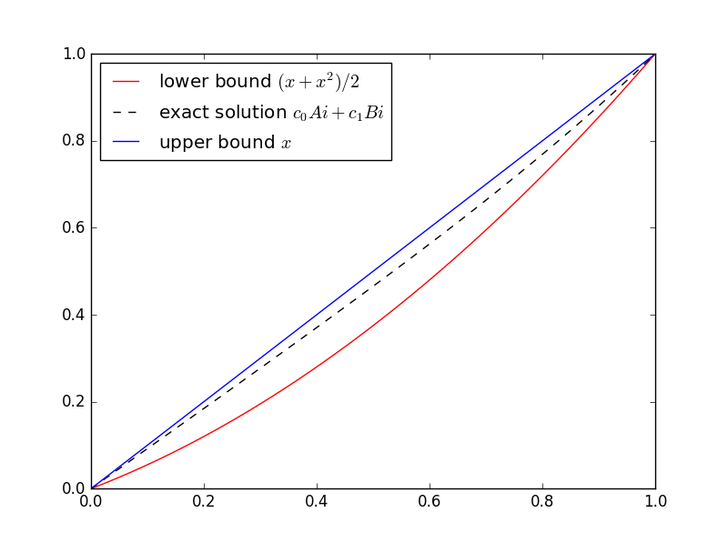
(xx2)/2 ≤ u(x) ≤ x

In general, you don’t know the function you’re trying to bound. That’s when bounds are most useful. But this is a sort of toy example because we do know the solution. The equation in this example is well known and is called Airy’s equation. The Airy functions Ai and Bi are independent solutions. Here’s a plot of the solution with its upper and lower bounds.

Here’s the Python code I used to solve for the coefficients of Ai and Bi and make the plot.

import numpy as np
from scipy.linalg import solve
from scipy.special import airy
import matplotlib.pyplot as plt

# airy(x) returns (Ai(x), Ai'(x), Bi(x), Bi'(x))
def Ai(x):
    return airy(x)[0]

def Bi(x):
    return airy(x)[2]

M = np.matrix([[Ai(0), Bi(0)], [Ai(1), Bi(1)]])
c = solve(M, [0, 1])

t = np.linspace(0, 1, 100)
plt.plot(t, (t + t**2)/2, 'r-', t, c[0]*Ai(t) + c[1]*Bi(t), 'k--', t, t, 'b-',)
plt.legend(["lower bound $(x + x^2)/2$", 
    "exact solution $c_0Ai + c_1Bi$", 
    "upper bound $x$"], loc="upper left")
plt.show()

SciPy’s function airy has an optimization that we waste here. The function computes Ai and Bi and their first derivatives all at the same time. We could take advantage of that to remove some redundant computations, but that would make the code harder to read. We chose instead to wait an extra nanosecond for the plot.

Help with differential equations

* * *

[1] Murray Protter and Hans Weinberger. Maximum Principles in Differential Equations.