Bessel function crossings

The previous post looked at the angles that graphs make when they cross. For example, sin(x) and cos(x) always cross with the same angle. The same holds for sin(kx) and cos(kx) since the k simply rescales the x-axis.

The post ended with wondering about functions analogous to sine and cosine, such as Bessel functions. This post will look at that question in more detail. Specifically we’ll look at the functions Jν and Yν.

Because these two Bessel functions satisfy the same second order linear homogeneous differential equation, the Strum separation theorem says that their zeros are interlaced: between each pair of consecutive zeros of Jν is exactly one zero of Yν, and between each pair of consecutive zeros of Yν there is exactly one zero of Jν.

Plotting Bessel functions J_3 and Y_3

In the following Python code, we find zeros of Jν, then look in between for places where Jν and Yν cross. Next we find the angle the two curves make at each intersection and plot the angles.

    from scipy.special import jn_zeros, jv, yv
    from scipy.optimize import bisect
    from numpy import empty, linspace, arccos
    import matplotlib.pyplot as plt
    
    n = 3 # bessel function order
    N = 100 # number of zeros
    
    z = jn_zeros(n, N) # Zeros of J_n
    crossings = empty(N-1)
    
    f = lambda x: jv(n,x) - yv(n,x)    
    for i in range(N-1):
        crossings[i] = bisect(f, z[i], z[i+1])
    
    def angle(n, x):
        # Derivatives of J_nu and Y_nu
        dj = 0.5*(jv(n-1,x) - jv(n+1,x))
        dy = 0.5*(yv(n-1,x) - yv(n+1,x))
        
        top = 1 + dj*dy
        bottom = ((1 + dj**2)*(1 + dy**2))**0.5
        return arccos(top/bottom)
        
    y = angle(n, crossings)
    plt.plot(y)
    plt.xlabel("Crossing number")
    plt.ylabel("Angle in radians")
    plt.show()

This shows that the angles steadily decrease, apparently quadratically.

Angles of crossing of J_3 and Y_3

This quadratic behavior is what we should expect from the asymptotics of Jν and Yν: For large arguments they act like shifted and rescaled versions of sin(x)/√x. So if we looked at √xJν and √xYν rather than Jν and Yν we’d expect the angles to reach some positive asymptote, and they do, as shown below.

Angles of crossing of √x J_3 and √xY_3

Related posts

Clearing up the confusion around Jacobi functions

The Jacobi elliptic functions sn and cn are analogous to the trigonometric functions sine and cosine. The come up in applications such as nonlinear oscillations and conformal mapping. Unfortunately there are multiple conventions for defining these functions. The purpose of this post is to clear up the confusion around these different conventions.

Plot of Jacobi sn

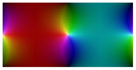
The image above is a plot of the function sn [1].

Modulus, parameter, and modular angle

Jacobi functions take two inputs. We typically think of a Jacobi function as being a function of its first input, the second input being fixed. This second input is a “dial” you can turn that changes their behavior.

There are several ways to specify this dial. I started with the word “dial” rather than “parameter” because in this context parameter takes on a technical meaning, one way of describing the dial. In addition to the “parameter,” you could describe a Jacobi function in terms of its modulus or modular angle. This post will be a Rosetta Stone of sorts, showing how each of these ways of describing a Jacobi elliptic function are related.

The parameter m is a real number in [0, 1]. The complementary parameter is m‘ = 1 – m. Abramowitz and Stegun, for example, write the Jacobi functions sn and cn as sn(um) and cn(um). They also use m1 = rather than m‘ to denote the complementary parameter.

The modulus k is the square root of m. It would be easier to remember if m stood for modulus, but that’s not conventional. Instead, m is for parameter and k is for modulus. The complementary modulus k‘ is the square root of the complementary parameter.

The modular angle α is defined by m = sin² α.

Note that as the parameter m goes to zero, so does the modulus k and the modular angle α. As any one of these three goes to zero, the Jacobi functions sn and cn converge to their counterparts sine and cosine. So whether your dial is the parameter, modulus, or modular angle, sn converges to sine and cn converges to cosine as you turn the dial toward zero.

As the parameter m goes to 1, so does the modulus k, but the modular angle α goes to π/2. So if your dial is the parameter or the modulus, it goes to 1. But if you think of your dial as modular angle, it goes to π/2. In either case, as you turn the dial to the right as far as it will go, sn converges to hyperbolic secant, and cn converges to the constant function 1.

Quarter periods

In addition to parameter, modulus, and modular angle, you’ll also see Jacobi function described in terms of K and K‘. These are called the quarter periods for good reason. The functions sn and cn have period 4K as you move along the real axis, or move horizontally anywhere in the complex plane. They also have period 4iK‘. That is, the functions repeat when you move a distance 4K‘ vertically [2].

The quarter periods are a function of the modulus. The quarter period K along the real axis is

K(m) = \int_0^{\pi/2} \frac{d\theta}{\sqrt{1-m\sin^2\theta}}

and the quarter period K‘ along the imaginary axis is given by K‘(m) = K(m‘) = K(1 – m).

The function K(m) is known as “the complete elliptic integral of the first kind.”

Amplitude

So far we’ve focused on the second input to the Jacobi functions, and three conventions for specifying it.

There are two conventions for specifying the first argument, written either as φ or as u. These are related by

u = \int_0^{\varphi} \frac{d\theta}{\sqrt{1-m\sin^2\theta}}

The angle φ is called the amplitude. (Yes, it’s an angle, but it’s called an amplitude.)

When we said above that the Jacobi functions had period 4K, this was in terms of the variable u. Note that when φ = π/2, uK.

Jacobi elliptic functions in Mathematica

Mathematica uses the u convention for the first argument and the parameter convention for the second argument.

The Mathematica function JacobiSN[u, m] computes the function sn with argument u and parameter m. In the notation of A&S, sn(um).

Similarly, JacobiCN[u, m] computes the function cn with argument u and parameter m. In the notation of A&S, cn(um).

We haven’t talked about the Jacobi function dn up to this point, but it is implemented in Mathematica as JacobiDN[u, m].

The function that solves for the amplitude φ as a function of u is JacobiAmplitude[um m].

The function that computes the quarter period K from the parameter m is EllipticK[m].

Jacobi elliptic functions in Python

The SciPy library has one Python function that computes four mathematical functions at once. The function scipy.special.ellipj takes two arguments, u and m, just like Mathematica, and returns sn(um), cn(um), dn(um), and the amplitude φ(um).

The function K(m) is implemented in Python as scipy.special.ellipk.

Related posts

[1] The plot was made using JacobiSN[0.5, z] and the function ComplexPlot described here.

[2] Strictly speaking, 4iK‘ is a period. It’s the smallest vertical period for cn, but 2iK‘ is the smallest vertical period for sn.

Physical constants in Python

You can find a large collection of physical constants in scipy.constants. The most frequently used constants are available directly, and hundreds more are in a dictionary physical_constants.

The fine structure constant α is defined as a function of other physical constants:

\alpha = \frac{e^2}{4 \pi \varepsilon_0 \hbar c}

The following code shows that the fine structure constant and the other constants that go into it are available in scipy.constants.

    import scipy.constants as sc

    a = sc.elementary_charge**2
    b = 4 * sc.pi * sc.epsilon_0 * sc.hbar * sc.c
    assert( abs(a/b - sc.fine_structure) < 1e-12 )

Eddington’s constant

In the 1930’s Arthur Eddington believed that the number of protons in the observable universe was exactly the Eddington number

N_{\mathrm{Edd}} = \frac{2^{256}}{\alpha}

Since at the time the fine structure constant was thought to be 1/136, this made the number of protons a nice even 136 × 2256.  Later he revised his number when it looked like the fine structure constant was 1/137. According to the Python code above, the current estimate is more like 1/137.036.

Eddington was a very accomplished scientist, though he had some ideas that seem odd today. His number is a not a bad estimate, though nobody believes it could be exact.

Related posts

The constants in scipy.constants have come up in a couple previous blog posts.

The post on Koide’s coincidence shows how to use the physical_constants dictionary, which includes not just the physical constant values but also their units and uncertainty.

The post on Benford’s law shows that the leading digits of the constants in scipy.constants follow the logarithmic distribution observed by Frank Benford (and earlier by Simon Newcomb).

Distribution of eigenvalues for symmetric Gaussian matrix

Symmetric Gaussian matrices

The previous post looked at the distribution of eigenvalues for very general random matrices. In this post we will look at the eigenvalues of matrices with more structure. Fill an n by n matrix A with values drawn from a standard normal distribution and let M be the average of A and its transpose, i.e. M = ½(A + AT).  The eigenvalues will all be real because M is symmetric.

This is called a “Gaussian Orthogonal Ensemble” or GOE. The term is standard but a little misleading because such matrices may not be orthogonal.

Eigenvalue distribution

The joint probability distribution for the eigenvalues of M has three terms: a constant term that we will ignore, an exponential term, and a product term. (Source)

p(x_1, x_2, \ldots, x_n) \propto \exp\left(-\frac{1}{2} \sum_{j=1}^nx_j^2 \right ) \prod_{j < k} |x_j - x_k|

The exponential term is the same as in a multivariate normal distribution. This says the probability density drops of quickly as you go away from the origin, i.e. it’s rare for eigenvalues to be too big. The product term multiplies the distances between each pair of eigenvalues. This says it’s also rare for eigenvalues to be very close together.

(The missing constant to turn the expression above from a proportionality to an equation is whatever it has to be for the right side to integrate to 1. When trying to qualitatively understand a probability density, it usually helps to ignore proportionality constants. They are determined by the rest of the density expression, and they’re often complicated.)

If eigenvalues are neither tightly clumped together, nor too far apart, we’d expect that the distance between them has a distribution with a hump away from zero, and a tail that decays quickly. We will demonstrate this with a simulation, then give an exact distribution.

Python simulation

The following Python code simulates 2 by 2 Gaussian matrices.

    import matplotlib.pyplot as plt
    import numpy as np
    
    n = 2
    reps = 1000
    
    diffs = np.zeros(reps)
    for r in range(reps):
        A = np.random.normal(scale=n**-0.5, size=(n,n)) 
        M = 0.5*(A + A.T)
        w = np.linalg.eigvalsh(M)
        diffs[r] = abs(w[1] - w[0])
    
    plt.hist(diffs, bins=int(reps**0.5))
    plt.show()

This produced the following histogram:

The exact probability distribution is p(s) = s exp(-s²/4)/2. This result is known as “Wigner’s surmise.”

Obesity index: Measuring the fatness of probability distribution tails

A probability distribution is called “fat tailed” if its probability density goes to zero slowly. Slowly relative to what? That is often implicit and left up to context, but generally speaking the exponential distribution is the dividing line. Probability densities that decay faster than the exponential distribution are called “thin” or “light,” and densities that decay slower are called “thick”, “heavy,” or “fat,” or more technically “subexponential.” The distinction is important because fat-tailed distributions tend to defy our intuition.

One surprising property of heavy-tailed (subexponential) distributions is the single big jump principle. Roughly speaking, most of the contribution to the sum of several heavy-tailed random variables comes from the largest of the samples. To be more specific, let “several” = 4 for reasons that’ll be apparent soon, though the result is true for any n. As x goes to infinity, the probability that

X1 + X2 + X3 + X4

is larger than a given x is asymptotically equal the probability that

max(X1, X2, X3, X4)

is larger than the same x.

The idea behind the obesity index [1] is to turn the theorem above around, making it an empirical measure of how thick a distribution’s tail is. If you draw four samples from a random variable and sort them, the obesity index is the probability that that the sum of the max and min, X1 + X4, is greater than the sum of the middle samples, X2 + X3.

The obesity index could be defined for any distribution, but it only measures what the name implies for right-tailed distributions. For any symmetric distribution, the obesity index is exactly 1/2. A Cauchy distribution is heavy-tailed, but it has two equally heavy tails, and so its obesity index is the same as the normal distribution, which has two light tails.

Note that location and scale parameters have no effect on the obesity index; shifting and scaling effect all the X values the same, so it doesn’t change the probability that X1 + X4 is greater than X2 + X3.

To get an idea of the obesity index in action, we’ll look at the normal, exponential, and Cauchy distributions, since these are the canonical examples of thin, medium, and thick tailed distributions. But for reasons explained above, we’ll actually look at the folded normal and folded Cauchy distributions, i.e. we’ll take their absolute values to create right-tailed distributions.

To calculate the obesity index exactly you’d need to do analytical calculations with order statistics. We’ll simulate the obesity index because that’s easier. It’s also more in the spirit of calculating the obesity index from data.

    from scipy.stats import norm, expon, cauchy

    def simulate_obesity(dist, N):
        data = abs(dist.rvs(size=(N,4)))
        count = 0
        for row in range(N):
            X = sorted(data[row])
            if X[0] + X[3] > X[1] + X[2]:
                count += 1
        return count/N

    for dist in [norm, expon, cauchy]:
        print( simulate_obesity(dist, 10000) )

When I ran the Python code above, I got

    0.6692
    0.7519
    0.8396

This ranks the three distributions in the anticipated order of tail thickness.

Note that the code above takes the absolute value of the random samples. This lets us pass in ordinary (unfolded) versions of the normal and Cauchy distributions, and its redundant for any distribution like the exponential that’s already positive-valued.

[I found out after writing this blog post that SciPy now has foldnorm and foldcauchy, but they don’t seem to work like I expect.]

Let’s try it on a few more distributions. Lognormal is between exponential and Cauchy in thickness. A Pareto distribution with parameter b goes to zero like x-1-b and so we expect a Pareto distribution to have a smaller obesity index than Cauchy when b is greater than 1, and a larger index when b is less than one. Once again the simulation results are what we’d expect.

The code

    for dist in [lognorm, pareto(2), pareto(0.5)]:
        print( simulate_obesity(dist, 10000) )

returns

    0.7766
    0.8242
    0.9249

By this measure, lognormal is just a little heavier than exponential. Pareto(2) comes in lighter than Cauchy, but not by much, and Pareto(0.5) comes in heavier.

Since the obesity index is a probability, it will always return a value between 0 and 1. Maybe it would be easier to interpret if we did something like take the logit transform of the index to spread the values out more. Then the distinctions between Pareto distributions of different orders, for example, might match intuition better.

[1] Roger M. Cooke et al. Fat-Tailed Distributions: Data, Diagnostics and Dependence. Wiley, 2014.

Curvature and automatic differentiation

Curvature is tedious to calculate by hand because it involves calculating first and second order derivatives. Of course other applications require derivatives too, but curvature is the example we’ll look at in this post.

Computing derivatives

It would be nice to write programs that only explicitly implement the original function and let software take care of finding the derivatives.

Numerical differentiation

Finite difference approximations for derivatives are nothing new. For example, Euler (1707–1783) used finite differences to numerically solve differential equations. But numerical differentiation can be inaccurate or unstable, especially for higher order derivatives.

Symbolic differentiation

Symbolic differentiation is another approach, having the computer manipulate expressions much as a person would do by hand. It works well for many problems, though it scales poorly for large problems. It also requires functions to be presented in traditional mathematical form, not in the form of source code.

Automatic differentiation

Automatic differentiation is a third way. Like numerical differentiation, it works with floating point numbers, not symbolic expressions. But unlike numerical differentiation, the result does not have approximation error.

As someone put it, automatic differentiation applies the chain rule to floating point numbers rather than to symbolic expressions.

Python implementation

I’ll use the Python library autograd to compute curvature and illustrate automatic differentiation. autograd is not the most powerful automatic differentiation library for Python, but it is the simplest I’ve seen.

We will compute the curvature of a logistic curve.

y = \frac{1}{1 + e^{-x}}

The curvature of the graph of a function is given by

\kappa(x) = \frac{|y''|}{(1 + y'^2)^{3/2}}

Here’s Python code using autograd to compute the curvature.

    import autograd.numpy as np
    from autograd import grad

    def f(x):
        return 1/(1 + np.exp(-x))

    f1 = grad(f)  # 1st derivative of f
    f2 = grad(f1) # 2nd derivative of f

    def curvature(x):
        return abs(f2(x))*(1 + f1(x)**2)**-1.5

Curvature plots

The graph is relatively flat in the middle and at the far ends. In between, the graph bends creating two regions of higher curvature.

    import matplotlib.pyplot as plt

    x = np.linspace(-5, 5, 300)
    plt.plot(x, f(x))
    plt.xlabel("$x$")
    plt.ylabel("$y$")
    plt.title("Logistic curve")
    plt.savefig("logistic_curve.svg")

Now let’s look at the curvature.

    y = [curvature(t) for t in x]
    plt.plot(x, y)
    plt.xlabel("$x$")
    plt.ylabel(r"$\kappa(x)$")
    plt.title("Curvature")
    plt.savefig("plot_logistic_curvature.svg")

curvature for logistic curve

As we should expect, the curvature is small at the ends and in the middle, with local maxima in between.

We can also look at the signed curvature, the same expression as curvature but without the absolute value.

k(x) = \frac{y''}{(1 + y'^2)^{3/2}}

We plot this with the following code.

    def signed_curvature(x):
        return f2(x)*(1 + f1(x)**2)**-1.5

    y = [signed_curvature(t) for t in x]
    plt.plot(x, y)
    plt.xlabel("$x$")
    plt.ylabel(r"$k(x)$")
    plt.title("Signed curvature")
    plt.savefig("graph_signed_curvature.svg")

The result looks more like a sine wave.

The positive values mean the curve is bending counterclockwise, and the negative values mean the curve is bending clockwise.

Related post: Squircles and curvature

Quantifying normal approximation accuracy

Probability is full of theorems that say that probability density approximates another as some parameter becomes large. All the dashed lines in the diagram below indicate a relationship like this.


You can find details of what everything in the diagram means here.

How can you quantify these approximations? One way is to use Kullback-Leibler divergence.  In this post I’ll illustrate this for the normal approximation to the beta and gamma distributions.

The Kullback-Leibler divergence between two random variables X and Y is defined as

KL(X || Y) = -\int f_X(x) \log \frac{f_Y(x)}{f_X(x)} \, dx

We will compute this integral numerically in the code below to create graphs of how K-L divergence varies with parameters.

Here are the imports we’ll need.

    from scipy.integrate import quad
    from scipy.stats import beta, gamma, norm
    from scipy import inf
    import matplotlib.pyplot as plt

Beta distribution

As the shape parameters of a beta distribution become large, the probability distribution becomes approximately normal (Gaussian).

Here is code that will take the two shape parameters of a beta distribution, construct a normal approximation by moment matching, and compute the quality of the approximation as measured by Kullback-Leibler divergence.

    def KL_beta_norm(a, b):
        b = beta(a, b)
        n = norm(b.mean(), b.std())
        f = lambda x: -b.pdf(x)*(n.logpdf(x) - b.logpdf(x))    
        integral, error = quad(f, 0, 1)
        return integral

And here we make our plot.

    x = [2**i for i in range(11)]
    y = [KL_beta_norm(t, 2*t) for t in x]
    plt.plot(x, y)
    plt.xscale("log")
    plt.yscale("log")
    plt.xlabel("a")
    plt.ylabel("KL divergence")
    plt.title("Comparing beta(a, 2a) and its normal approximation")
    plt.savefig("beta_KL.svg")
    plt.close()

The result is nearly linear on a log-log scale.

Kullback Leibler divergence from normal approximation to beta

I made the b parameter twice the a parameter to show that you don’t need symmetry. When you do have symmetry, i.e a = b, the approximation quality is better and the graph is even straighter.

Gamma distribution

As the shape parameter of a gamma distribution increases, the probability density becomes more and more like that of a normal distribution. We can quantify this with the following code.

    def KL_gamma_norm(shape):
        g = gamma(shape)
        n = norm(g.mean(), g.std())
        f = lambda x: -g.pdf(x)*(n.logpdf(x) - g.logpdf(x))
        mode = max(0, shape-1)
        integral1, error1 = quad(f, 0, mode)
        integral2, error2 = quad(f, mode, inf)    
        return integral1 + integral2

The integration code is a little more complicated this time. For small shape parameters, code analogous to that for the beta distribution will work just fine. But for larger parameters, the integration fails. The numerical integration routine needs a little help. The largest contribution to the integral is located near the mode of the gamma distribution. For large shape parameters, the integration routine misses this peak and grossly underestimates the integral. We break the integral into two pieces at the mode of the gamma distribution so the integration routine can’t miss it. This is a small example of why numerical integration cannot be completely automated. You have to know something about what you’re integrating.

(The quad() function has a parameter points to let you tell it about points of interest like this, but it doesn’t work when one of the limits of integration is infinite.)

The plotting code is essentially the same as that for the beta distribution. As before, the plot is linear on a log-log scale.

Kullback Leibler divergence for normal approximation to gamma

You could do a similar analysis on the other approximations in the distribution relationship diagram above.

More probability distribution approximation posts

Distribution of matches between two shuffled decks

Take two desks of cards and shuffle them. They can be standard 52-card decks, though the number of cards in the decks doesn’t matter as long as they’re the same and the decks are fairly large.

Now count the number of times the two desks match, i.e. how many times the same card is in the same position in both desks. The number of matches is random, and its distribution is approximately Poisson with mean 1. Let’s do a simulation and see how close the results come to the predicted outcome.

Here’s the Python code:

import numpy as np
from scipy.stats import poisson
import matplotlib.pyplot as plt

def count_zeros(x):
    return len(x[x==0])

num_reps = 10000
deck_size = 52

matches = np.zeros(deck_size+1, dtype=int)

# Simulation
for _ in range(num_reps):

    # Shuffle two decks
    a = np.random.permutation(deck_size)
    b = np.random.permutation(deck_size)

    # Count how often they match
    num_matches = count_zeros(a-b)
    matches[ num_matches ] += 1

# Cut off outputs too small to see
cutoff = 8

# Matches predicted by a Poisson distribution with mean 1.
predicted = [num_reps*poisson(1).pmf(i) for i in range(cutoff)]

# Plot results
x = np.arange(cutoff)
w = 0.3 # bar width
plt.bar(x, matches[0:cutoff], w)
plt.bar(x+w, predicted, w)
plt.legend(["actual", "predicted"])
plt.xlabel("matches")
plt.ylabel("frequency")
plt.savefig("shuffled_desk_matches.svg")
plt.show()

And here’s the output based on 10,000 simulations:

Plot showing good fit between predicted and actual

About 1/3 of the time, you get no matches, another 1/3 of the time you get one match, and the rest of the time you get more. More precisely, according to the Poisson model zero matches and one match are both have probability 1/e.

Average fraction round up

Pick a large number n. Divide n by each of the positive integers up to n and round the results up to the nearest integer. On average, how far do you round up?

Or in terms of probability, what is the expected distance between a fraction n/r, where n is large and fixed and r is chosen randomly between 1 and n, and the nearest larger integer?

In symbols, the question above is asking for the approximate value of

\frac{1}{n} \sum_{r = 1}^n \left( \left\lceil \frac{n}{r} \right\rceil - \frac{n}{r}\right )

for large n, i.e. in the limit as n goes to ∞. Here ⌈x⌉ denotes the ceiling of x, the smallest integer greater than or equal to x.

Let’s plot this as a function of n and see what it looks like. Here’s the Python code.

    import matplotlib.pyplot as plt
    from numpy import ceil, arange

    def f(n):
        return sum( ceil(n/r) - n/r for r in range(1, n) )/n

    x = arange(1, 100)
    y = [f(n) for n in x]
    plt.plot(x, y)
    plt.show()

And here’s the result.

It appears the graph may be converging to some value, and in fact it is. Charles de la Vallée Poussin proved in 1898 that the limiting value is the Euler–Mascheroni constant γ = 0.5772…. This constant is the limiting difference between the nth harmonic number and log n, i.e.

\gamma = \lim_{n\to\infty} \left(\sum_{r = 1}^n \frac{1}{r} - \log n \right)

We can add a horizontal line to our plot to see how well the graph seems to match γ. To do this we need to import the constant euler_gamma from numpy and add the

    plt.axhline(y=euler_gamma, linestyle=":")

after the plot command. When we do, this is what we see.

It looks like the plot is converging to a value slightly less than γ. Apparently the convergence is very slow. When we go out to 10,000 the plot is closer to being centered around γ but still maybe below γ more than above.

If we evaluate our function at n = 1,000,000, we get 0.577258… while γ = 0.577215….

At n = 10,000,000 we get 0.577218…. So taking 100 times as many terms in our sum gives us one extra correct decimal place, as we’d expect of a random processes since convergence usually goes like 1/√n.

Equation for the Eiffel Tower

Robert Banks’s book Towing Icebergs, Falling Dominoes, and Other Adventures in Applied Mathematics describes the Eiffel Tower’s shape as approximately the logarithmic curve

y = -y_* \log\left(\frac{x}{x_0} \right )

where y* and x0 are chosen to match the tower’s dimensions.

Here’s a plot of the curve:

Eiffel tower curve plot

And here’s the code that produced the plot:

from numpy import log, exp, linspace, vectorize
import matplotlib.pyplot as plt

# Taken from "Towing Icebergs, Falling Dominoes,
# and Other Adventures in Applied Mathematics"
# by Robert B. Banks

# Constants given in Banks in feet. Convert to meters.
feet_to_meter = 0.0254*12
ystar  = 201*feet_to_meter
x0     = 207*feet_to_meter
height = 984*feet_to_meter

# Solve for where to cut off curve to match height of the tower.
# - ystar log xmin/x0 = height
xmin = x0 * exp(-height/ystar)

def f(x):
    if -xmin < x < xmin:
        return height
    else:
        return -ystar*log(abs(x/x0))
curve = vectorize(f)
    
x = linspace(-x0, x0, 400)

plt.plot(x, curve(x))
plt.xlim(-2*x0, 2*x0)
plt.xlabel("Meters")
plt.ylabel("Meters")
plt.title("Eiffel Tower")

plt.axes().set_aspect(1)
plt.savefig("eiffel_tower.svg")

Related post: When length equals area
The St. Louis arch is approximately a catenary, i.e. a hyperbolic cosine.