Equation of a circle through three points

Three given points on a circle with unknown center

A few months ago I wrote about several equations that come up in geometric calculations that all have the form of a determinant equal to 0, where one column of the determinant is all 1s.

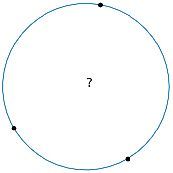
The equation of a circle through three points (x1, y1), (x2, y2), and (x3, y3) has this form:

\begin{vmatrix} x^2 + y^2 & x & y & 1 \\ x_1^2 + y_1^2 & x_1 & y_1 & 1 \\ x_2^2 + y_2^2 & x_2 & y_2 & 1 \\ x_3^2 + y_3^2 & x_3 & y_3 & 1 \\ \end{vmatrix} = 0

This is elegant equation, but it’s not in a form that’s ready to program. This post will start with the equation above and conclude with code.

Let Mij be the determinant of the minor of the (i, j) element of the matrix above. That is, Mij is the determinant of the 3 × 3 matrix obtained by deleting the ith row and jth column. Then we can expand the determinant above by minors of the last column to get

M_{11}(x^2 + y^2) - M_{12}x + M_{13}y - M_{14} = 0

which we can rewrite as

x^2 + y^2 -\frac{M_{12}}{M_{11}} x + \frac{M_{13}}{M_{11}} y - \frac{M_{14}}{M_{11}} = 0.

A circle with center (x0, y0) and radius r0 has equation

(x - x_0)^2 + (y - y_0)^2 - r_0^2 = 0.

By equating the coefficients x and y in the two previous equations we have

\begin{align*} x_0 &= \phantom{-}\frac{1}{2} \frac{M_{12}}{M_{11}} \\ y_0 &= -\frac{1}{2} \frac{M_{13}}{M_{11}} \\ \end{align*}

Next we expand the determinant minors in more explicit form.

\begin{align*} M_{11} &= \begin{vmatrix} x_1 & y_1 & 1 \\ x_2 & y_2 & 1 \\ x_3 & y_3 & 1 \\ \end{vmatrix} \\ &= (x_2y_3 - x_3y_2) - (x_1y_3 - x_3y_1) + (x_1y_2 - x_2y_1) \\ &= (x1y_2 + x_2y_3 + x_3y_1) - (x_2y_1 + x_3y_2 + x_1y_3) \end{align*}

Having gone to the effort of finding a nice expression for M11 we can reuse it to find M12 by the substitution

x_i \to s_i \equiv x_i^2 + y_i^2

as follows:

\begin{align*} M_{12} &= \begin{vmatrix} x_1^2 + y_1^2 & y_1 & 1 \\ x_2^2 + y_2^2 & y_2 & 1 \\ x_3^2 + y_3^2 & y_3 & 1 \\ \end{vmatrix} = \begin{vmatrix} s_1^2 & y_1 & 1 \\ s_2^2 & y_2 & 1 \\ s_3^2 & y_3 & 1 \\ \end{vmatrix} \\ &= (s_1y_2 + s_2y_3 + s_3y_1) - (s_2y_1 + s_3y_2 + s_1y_3) \end{align*}

And we can find M13 from M12 by reversing the role of the xs and ys.

\begin{align*} M_{13} &= \begin{vmatrix} x_1^2 + y_1^2 & x_1 & 1 \\ x_2^2 + y_2^2 & x_2 & 1 \\ x_3^2 + y_3^2 & x_3 & 1 \\ \end{vmatrix} = \begin{vmatrix} s_1^2 & x_1 & 1 \\ s_2^2 & x_2 & 1 \\ s_3^2 & x_3 & 1 \\ \end{vmatrix} \\ &= (s_1x_2 + s_2x_3 + s_3x_1) - (s_2x_1 + s_3x_2 + s_1x_3) \end{align*}

Now we have concrete expressions for M11, M12, and M13, and these give us concrete expressions for x0 and y0.

To find the radius of the circle we simply find the distance from the center (x0, y0) to any of the points on the circle, say (x1, y1).

The following Python code incorporates the derivation above.

    def circle_thru_pts(x1, y1, x2, y2, x3, y3):
        s1 = x1**2 + y1**2
        s2 = x2**2 + y2**2
        s3 = x3**2 + y3**2
        M11 = x1*y2 + x2*y3 + x3*y1 - (x2*y1 + x3*y2 + x1*y3)
        M12 = s1*y2 + s2*y3 + s3*y1 - (s2*y1 + s3*y2 + s1*y3)
        M13 = s1*x2 + s2*x3 + s3*x1 - (s2*x1 + s3*x2 + s1*x3)
        x0 =  0.5*M12/M11
        y0 = -0.5*M13/M11
        r0 = ((x1 - x0)**2 + (y1 - y0)**2)**0.5
        return (x0, y0, r0)

The code doesn’t use any loops or arrays, so it ought to be easy to port to any programming language.

For some inputs the value of M11 can be (nearly) zero, in which case the three points (nearly) lie on a line. In practice M11 can be nonzero and yet zero for practical purposes and so that’s something to watch out for when using the code.

The determinant at the top of the post is zero when the points are colinear. There’s a way to make rigorous the notion that in this case the points line on a circle centered at infinity.

Update: Equation of an ellipse or hyperbola through five points

A more convenient squircle equation

A few years ago I wrote several posts about “squircles”, starting with this post. These are shapes satisfying

|x|^p + |y|^p = 1

where typically p = 4 or 5. The advantage of a squircle over a square with rounded edges is that the curvature varies continuously around the figure rather than jumping from a constant positive value to zero.

Manuel Fernández-Guasti developed a slightly different shape also called a squircle but with a different equation

x^2 + y^2 = s^2 x^2 y^2 + 1

We need to give separate names to the two things called squircles, and so I’ll name them after their parameters: p-squircles and s-squircles.

As s varies from 0 to 1, s-squircles change continuously from a circle to a square, just as p-squircles varies do as p goes from 2 to ∞.

The two kinds of squircles are very similar. Here’s a plot of one on top of the other. I’ll go into detail later of how this plot was made.


Advantage of s-squircles

The equation for a p-squircle is polynomial if p is an even integer, but in general the equation is transcendental. The equation for an s-squircle is a polynomial of degree 4 for all values of s. It’s more mathematically convenient, and more computationally efficient, to have real numbers as coefficients than as exponents. The s-squircle is an algebraic variety, the level set of a polynomial, and so can be studied via algebraic geometry whereas p-squircles cannot (unless p is an even integer).

It’s remarkable that the two kinds of squircles are so different in the structure of their defining equation and yet so quantitatively close together.

Equal area comparison

I wanted to compare the two shapes, so I plotted p-squircles and s-squircles of the same area.

The area of a p-squircle is given here where n = 2. The area of an s-squircle is given here MathWorld where k = 1.

\begin{align*} A_1(p) &= 4\, \frac{\Gamma\left(1 + \frac{1}{p} \right )^2}{\Gamma\left(1 + \frac{2}{p} \right )} \\ A_2(s) &= 4\, \frac{E(\sin^{-1}s, s^{-1})}{s} \end{align*}

Here E is the “elliptic integral of the second kind.” This function has come up several times on the blog, for example here.

Both area function are increasing functions of their parameters. We have A1(2) = A2(0) and A1(∞) = A2(1). So we can pick a value of p and solve for the corresponding value of s that gives the same area, or vice versa.

The function A1 can be implemented in Mathematica as

    A1[p_] := 4 Gamma[1 + 1/p]^2/Gamma[1 + 2/p]

The function A2 is little trickier because Mathematica parameterizes the elliptic integral slightly differently than does the equation above.

    A2[s_] := 4 EllipticE[ArcSin[s], s^-2]/s

Now I can solve for the values of s that give the same area as p = 4 and p = 5.

    FindRoot[A2[s] == A1[4], {s, 0.9}]

returns 0.927713 and

    FindRoot[A2[s] == A1[5], {s, 0.9}]

returns 0.960333. (The 0.9 argument in the commands above is an initial guess at the root.)

The command

    ContourPlot[{x^2 + y^2 == 0.927713 ^2 x^2 y^2 + 1, 
        x^4 + y^4 == 1}, {x, -1, 1}, {y, -1, 1}]

produces the following plot. This is the same plot as at the top of the post, but enlarged to show detail.

The command

    ContourPlot[{x^2 + y^2 == 0.960333 ^2 x^2 y^2 + 1, 
        Abs[x]^5 + Abs[y]^5 == 1}, {x, -1, 1}, {y, -1, 1}]

produces this plot

In both cases the s-squircle is plotted in blue, and the p-squircle in gold. The gold virtually overwrites the blue. You have to look carefully to see a little bit of blue sticking out in the corners. The two squircles are essentially the same to within the thickness of the plotting lines.

History

The term “squircle” goes back to 1953, but was first used as it is used here around 1966. More on this here.

However, Fernández-Guasti was the first to use the term in scholarly literature in 2005. See the discussion in the MathWorld article.

Visualizing correlations with graphs

Yesterday I found a statistics textbook for geologists [1] for $1 at a library book sale. When I thumbed through the book an image similar to the one below caught my eye.

This image approximates Figure 15.2 in [1],

The nodes represent six factors of the thickness of rock formations and the edges are labeled with the correlations between factors. Only large correlations are shown. For example, in theory everything is correlated with “total” but carbonates are not significantly correlated with the total. Nonclastics divide into evaporates and carbonates; apparently nearly all the nonclastics in this data set were evaporites.

Notice that this example illustrates that correlation is not transitive. That is, if A is correlated with B and B is correlated with C, it does not follow that A is necessarily correlated with C.

Making the graph

I made the graph above with GraphViz using the following code.

    graph G {
    
    layout=neato
    
    T [label="Total"      , pos="2.50, 5.00!"]
    S [label="Sand"       , pos="4.66, 3.75!"]
    C [label="Carbonates" , pos="4.66, 1.25!"]
    E [label="Evaporites" , pos="2.50, 0.00!"]
    N [label="Nonclastics", pos="0.39, 1.25!"]
    H [label="Shale"      , pos="0.39, 3.75!"]
    
    T -- S [label=" 0.24 "]
    T -- H [label=" 0.89 "]
    T -- N [label=" 0.84 "]
    T -- E [label=" 0.82 "]
    H -- N [label=" 0.69 "]
    H -- E [label=" 0.70 "]
    S -- C [label=" 0.45 "]
    N -- E [label=" 0.99 "]

    }

I’ve mostly used GraphViz to make graphs when I didn’t care much about the layout. I’ve experimented with a few layout engines, but I hadn’t tried specifying the node positions before.

The nodes in the original graph were arranged in a circle, so I tried the circo layout engine. This did not position the nodes in a circle. I also tried specifying the positions without the bang on the end, giving the positions as layout hints. GraphViz did not appreciate my suggestions and was certain that it knew better how to layout the graph. But when I added the exclamation marks GraphViz acquiesced to my wishes.

GraphViz will create output in a variety of formats. I tried PNG and SVG. The SVG image above was 11 times smaller than the PNG output. One reason I starting using SVG images more often is that they often result in smaller files. They also look very nice at multiple resolutions, i.e. on a desktop and on a mobile device.

Related posts

[1] Krumbein and Graybill. An Introduction to Statistical Models in Geology. McGraw-Hill, 1965.

Associahedron

The previous post looked at ways of associating a product of four things. This post will look at associating more things, and visualizing the associations.

The number of ways to associate a product of n+1 things is the nth Catalan number, defined by

C+n = \frac{1}{n+1} {2n \choose n}

The previous post looked at products of 4 things, and there are 5 ways to do that because C3 = 5.

If we look at products of 5 things, there are 14 possibilities because C4 = 14.

In the 1950s Dov Tamari had the idea of visualizing the way associations are related. Jim Stasheff independently came up with the idea in the 1960s.

Imagine parenthesized products as vertices of a polyhedron, and connect two vertices with an edge if you can get from one to the other by one application of the associative law. The product of n terms corresponds to a polyhedron in n-2 dimensions. Such a polyhedron is called an associahedron.

If we were to do this with 4 items, we’d get a pentagon in the plane. This associahedron comes up as the commutative diagram describing the pentagon identity for monoidal categories.

If we do this with 5 items, we get a polygon in 3D. It has 14 vertices, because C4 = 14. It also has 21 edges and 9 faces.

(Quick check: VE + F = 14 – 21 + 9 = 2. Thanks, Euler.)

I recently learned about Excalidraw, and so I drew an associahedron with Excalidraw to try it out. Here’s what I got:

The dashed lines are edges you couldn’t see if the polyhedron were made of opaque material, but that you would see if it were transparent.

It’s not a regular solid because three faces have 4 sides and six faces have 5 sides.

Excalidraw is easy to use. It has more features than are apparent at first, which is good: you’re not immediately overwhelmed with options when you open it up, and yet when you need something you may be able to find it. For example, it’s obvious how to draw straight lines, which is probably what you want to do most of the time. But you can draw smooth curves if you need to.

Related posts

Aesthetic uses of Latin squares

We think they like randomness in design, but we don’t exactly. People like things that are sorta random, but not too random. When you literally scatter things randomly, they looked too clumped [1].

There are many ways around this problem, variations on randomness that people find more aesthetically pleasing. One of these ways is random Latin squares.

A Latin square of size n is an n × n grid filled with n different things—numbers, letters, colors, etc.— such that each kind of thing appears exactly once in each row and in each column. For example, 26 × 26 grid filled with the letters of the English alphabet is a Latin square if every row and every column contains the entire alphabet; no letters repeated and no letters missing.

A random Latin square is an arrangement that is random but subject to the constraint that it be a Latin square. Random Latin squares look nice because they’re somewhat random but they avoid certain kinds of repetition.

Suppose you have five different colors of tile and you need to lay down the tiles in a 10 × 20 grid. You want to lay down the tiles “randomly” but you don’t want too many of any one color to appear in a small area.

One way to do this would be to divide the 10 × 20 space into a grid of grids. Each subgrid is a 5 × 5 Latin square. Here’s an example.

The image above is a 2 × 4 grid of 5 × 5 grids, and each of the 5 × 5 grids is a Latin square chosen at random.

Here’s another example with five different colors and different random Latin squares.

If you look carefully, you’ll spot a few places where tiles of the same color touch on an edge. This cannot happen within a Latin square, but it can happen where two different Latin squares are next to each other. So the randomization scheme described here allows for a few tiles of the same color to touch but not many.

I expect randomized Latin squares are used this way fairly often. You’d never know, and that’s kinda the point. Someone would have to stare at a pattern like this a long time before they realized that horizontal or vertical segments of five do not repeat a color.

Related posts

[1] One way to detect fraud is to look for fake randomness. When people try to make something look random, they usually fail and leave statistically detectable fingerprints.

Unicode and Emoji, or The Giant Pawn Mystery

I generally despise emoji, but I reluctantly learned a few things about them this morning.

My latest couple blog posts involved chess, and I sent out a couple tweets using chess symbols. Along the way I ran into a mystery: sometimes the black pawn is much larger than other chess symbols. I first noticed this in Excel. Then I noticed that sometimes it happens in the Twitter app, and sometimes not, sometimes on the twitter website, and sometimes not.

For example, the following screen shot is from Safari on iOS.

screenshot of tweet with giant pawn

What’s going on? I explained in a footnote to this post, but I wanted to make this its own post to make it easier to find in the future.

In a nutshell, something in the software environment is deciding that 11 of the twelve chess characters are to be taken literally, but the character for the black pawn is to be interpreted as an emojus [1] representing chess. I’m not clear on whether this is happening in the font or in an app. Probably one, both, or neither depending on circumstances.

I erroneously thought that emoji were all outside Unicode’s BMP (Basic Multilingual Plane) so as not to be confused with ordinary characters. Alas, that is not true.

Here is a full list of Unicode characters interpreted (by …?) as emoji. There are 210 emoji characters in the BMP and 380 outside, i.e. 210 below FFFF and 380 above FFFF.

***

[1] I know that “emoji” is a Japanese word, not a Latin word, but to my ear the singular of “emoji” should be “emojus.”

How to make a chessboard in Excel

I needed to make an image of a chessboard for the next blog post, and I’m not very good at image editing, so I make one using Excel.

There are Unicode characters for chess pieces— white king is U+2654, etc.—and so you can make a chessboard out of (Unicode) text.

    ♔♕♖♗♘♙♚♛♜♝♞♟

I placed the character for each piece in an cell and changed the formatting for all the cells to be centered horizontally and vertically. The following is a screenshot of the Excel file.

Chessboard: screenshot from Excel file

The trickiest part is getting the cells to be square. By default Excel uses different units for height and width, with no apparent way to change the units. But if you switch the View to Page Layout, you can set row height and column width in inches or centimeters.

Another quirk is that you may have to experiment with the font to get all the pieces the same size. In some fonts, the black pawns were larger than everything else [1].

You can download my Excel file here. You could make any chessboard configuration with this file by copying and pasting characters where you want them.

When I tested the file in Libre Office, it worked, but I had to reset the row height to match the column width.

Related posts

[1] Thanks to a reply on twitter I now understand why black’s pawn is sometimes outsized. The black pawn is used as an emoji, a sort of synecdoche representing chess. That’s why some fonts treat U+265E, black knight, entirely differently than U+265F, black pawn. The latter is interpreted not as a peer of the other pieces, but as the chess emoji. See the chess pawn entry in Emojipedia.

More images from an oddball coordinate system

Three months ago I posted some images created by graphing equations in circular coordinates. Not polar coordinates as you might expect, but a strange coordinate system based on circles in another way. The most interesting thing about this coordinate system is that familiar functions product unfamiliar graphs.

This morning I played around with the code from that earlier post and made some new images.

The following image was based on exp(x+7)/10 + 10*tan(x/5).

This image was based on the same function over a different range.

And this hummingbird-line images was based on exp(x) – x.

Here are a few more blog posts that have interesting images.

Drawing commutative diagrams with Quiver

I recently discovered quiver, a tool for drawing commutative diagrams. It looks like a nice tool for drawing diagrams more generally, but it’s designed particularly to include the features you need when drawing the kinds of diagrams that are ubiquitous in category theory.

You can draw diagrams using the online app and export the result to LaTeX (tikz).

Here are some examples.

quiver diagrams

The app is mostly easy to figure out. The object and arrow labels are specified using LaTeX.

Quiver lets you position labels on either side of an arrow, or even inside the arrow as in the e in the first diagram above.

You can change the arrow and arrowhead styles, as in the second example.

It took me a little while to figure out how to have two arrows with the same destination and source, as in the third example. You use the “offset” setting to move arrows up or down do that they’re not on top of each other. And by default, the software helpfully assumes that if you want to move one arrow up a bit from center, you probably want to move the other one down from center by the same amount.

You can use the “curve” setting to draw arrows as in the final example. You can also draw arrows between arrows, as is common when working with 2-categories.

More category theory posts

Some mathematical art

This evening I ran across a paper on an unusual coordinate system that creates interesting graphs based from simple functions. It’s called “circular coordinates,” but this doesn’t mean polar coordinates; it’s more complicated than that. [1]

Here’s a plot reproduced from [1], with some color added (the default colors matplotlib uses for multiple plots).

The plot above was based on a the gamma function. Here are a few plots replacing the gamma function with another function.

Here’s x/sin(x):

Here’s x5:

And here’s tan(x):

Here’s how the plots were created. For a given function f, plot the parametric curves given by

\begin{align*} x(t) &= \frac{2t \left(f(t) \right )^2}{t^2 + \left(f(t) \right )^2} \\ y(t) &= \frac{2t^2 f(t)}{t^2 + \left(f(t) \right )^2} \\ \end{align*}

See [1] for what this has to do with circles and coordinates.

The plots based on a function g(x) are given by setting f(x) = g(x) + c where c = -10, -9, -8, …, 10.

Related posts

[1] Elliot Tanis and Lee Kuivinen, Circular Coordinates and Computer Drawn Designs. Mathematics Magazine. Vol 52 No 3. May, 1979.