Reading plots of a complex function

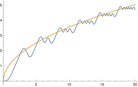
This post is about understanding the following plot. If you’d like to read more along these lines, see [1].

Hankel function phase plot

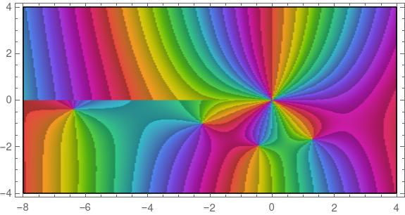
The plot was made with the following Mathematica command.

    ComplexPlot[HankelH1[3, z], {z, -8 - 4 I, 4 + 4 I}, 
        ColorFunction -> "CyclicArg", AspectRatio -> 1/2]

The plot uses color to represent the phase of the function values. If the output of the function is written in polar form as (r, θ), we’re seeing θ.

Here’s a plot of the identity function f(z) = z to show how the color rotation works.

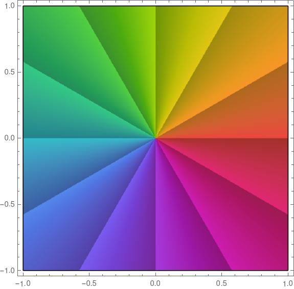
The color rotate from red to orange to green etc. (ROYGBIV) clockwise around a pole and counterclockwise around a zero.

You can see from the plot at the top that our function has a pole at 0. In fact, it’s a pole of order three because you go through the ROYGBIV cycle three times clockwise as you circle the origin.

You can also see four zeros, located near -6.4 – 0.4i, -2,2 – i, -0.4 -2i, and -1.3 – 1.7i. In each case we cycle through ROYGBIV one time counterclockwise, so these are simple zeros. If we had a double zero, we’d cycle through the colors twice. If we had a triple zero, we’d cycle through the colors three times, just as we did at the pole, except we’d go through the colors counterclockwise.

The colors in our plot vary continuously, except on the left side. There’s a discontinuity in our colors above and below the real axis. That’s because the function we’re plotting has a branch cut from -∞ to 0. The discontinuity isn’t noticeable near the origin, but it becomes more noticeable as you move away from the origin to the left.

Here’s a 3D plot to let us see the branch cut more clearly.

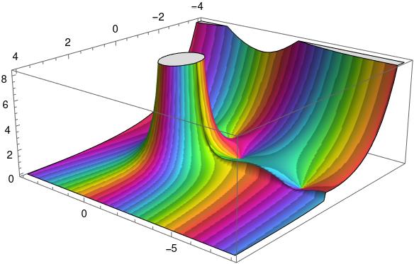
Here color represents phase as before, but now height represents absolute value, the r in our polar representation. The flat plateau on top is an artifact. The function becomes infinite at 0, so it had to be cut off.

You can see a seam in the graph. There’s a jump discontinuity along the negative real axis, with the function taking different values as you approach the real axis from the second quadrant or from the third quadrant.

This came up in a previous post, Architecture and math, but I didn’t say anything about it. Here’s a plot from that post.

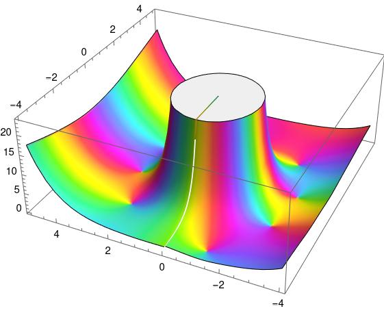
Why is there a little radial line on top where the graph was chopped off? And why is there a white streak below it? That’s evidence of a branch cut, though the discontinuity is small in this graph. You’ll notice color swirls around the base of the mesa. The colors swirl counterclockwise because they’re all at zeros. But you’ll notice the colors swirl clockwise as you go around the walls of the mesa. In fact they swirl around 5 times because there’s a pole of order 5 at the origin.

The book I mentioned in that post had something like this on the cover, plotting a generalization of the Hankel function. That’s why I chose the Hankel function as my example in this post.

Related posts

[1] Elias Wegert. Visual Complex Functions: An Introduction with Phase Portraits

Glasser’s function

I recently ran across an article on MathWorld about Glasser’s function. The function is defined by

G(x) = \int_0^x \sin(t \sin(t))\, dt.

Here’s a plot of G(x) along with its asymptotic value 2√(x/π).

This plot was made with the following Mathematica commands.

    G[x_] := NIntegrate[Sin[t Sin[t]], {t, 0, x}]
    Plot[{G[x], 2 Sqrt[x/Pi]}, {x, 0, 20}]

According to MathWorld,

The integral cannot be done in closed form, but has a number of remarkable properties, the foremost of which is that the first “hump” has a single subhump, the second hump has two subhumps, and so on.

To get a clearer view of these humps and “subhumps”, let’s subtract off the asymptotic value.

This was made using

    Plot[{G[x]/( 2 Sqrt[x/Pi])}, {x, 1, 20}, PlotPoints -> 100]

Ordinarily Mathematica chooses the number of plot points well, but the default led to an artificial flat spot on the graph so I manually increased the number of points.

What MathWorld is calling a “hump” is a record maximum as you view the plot from left to right. That is, each one is a global maximum over the interval [0, x + ε] where x is the location of the hump.

The humps seem to be evenly spaced. Is that the case?

By the fundamental theorem of calculus, the derivative of G(x) is the integrand of the integral defining G.

G'(x) = \sin(x \sin(x))

and G‘ is zero when x sin(x) is an integer multiple of π. To get an idea where the local extrema of G(x) are, we’ll plot x sin(x) and some integer multiples of π.

This was produced with the following code.

    Plot[{x Sin[x], Pi, -Pi, 2 Pi, -2 Pi, 3 Pi, -3 Pi, 
        4 Pi, -4 Pi, 5 Pi, -5 Pi}, {x, 0, 20}]

Note that between the first two zeros of sin(x), i.e. between x = 0 and x = π, there are no points where x sin(x) is an integer multiple of π. Between the next two zeros of sin(x), between π and 2π, the function x sin(x) takes on an integer multiple of π twice. The blue line plotting x sin(x) crosses the green line below the x axis twice. The function takes on integer multiples of π 4 times between x = 2π and 3π, 6 times between x = 3π and 4π etc.

Apparently between n π and (n + 1) π the function x sin(x) takes on integer multiples of π 2n times, which means G'(x) is zero 2n times, which means G has 2n local extrema.

If we number the locations where x sin(x) is an integer multiple of π, starting from 0, then x = 0 is the 0th solution, x = π is the 1st solution, x = 2π is the 4th solution, etc. In general, x = nπ is the location of solution number n².

The first “hump” is at solution 1 to x sin(x). The second hump is at solution 3. The third is at solution 7. The fourth is at solution 13 etc. Each time there is one more “subhump” between humps, two more extrema, between humps than before.

The nth hump is located at the (n² – n + 1)st place where x sin(x) is an integer multiple of π.

The locations of the humps between x = 0 and x = 20 are as follows:

    3.14159
    5.69936
    8.60636
   11.62042
   14.68050
   17.76473

The first differences of these values are

    2.55778 
    2.90700 
    3.01406 
    3.06008 
    3.08423

and so the distance between humps is roughly 3 and is increasing slowly. Perhaps it continues to increase, asymptotically approaching a constant distance.

Upper bound on wait time for general queues

The previous post presented an approximation for the steady-state wait time in queue with a general probability distribution for inter-arrival times and for service times, i.e. a G/G/s queue where s is the number of servers. This post will give an upper bound for the wait time.

Let σ²A be the variance on the inter-arrival time and let σ²S be the variance on the service time. Then for a single server (G/G/1) queue we have

W \leq \frac{\lambda(\sigma^2_A + \sigma^2_S)}{2(1-\rho)}

where as before λ is the mean number of arrivals per unit time and ρ is the ratio of lambda to the mean number of customers served. The inequality above is an equality for the Markov (M/M/1) model.

Now consider the case of s servers. The upper bound is very similar for the G/G/s case

W \leq \frac{\lambda(s\sigma^2_A + \sigma^2_S/s)}{2(1-\rho)}

and reduces to the G/G/1 case when s = 1.

More queueing theory posts

Source: Donald Gross and Carl Harris. Fundamentals of Queueing Theory. 3rd edition.

Multiserver queues with general probability distributions

Textbook presentations of queueing theory start by assuming that the time between customer arrivals and the time to serve a customer are both exponentially distributed.

Maybe these assumptions are realistic enough, but maybe not. For example, maybe there’s a cutoff on service time. If someone takes too long, you tell them there’s no more you can do and send them on their merry way. Or maybe the tails on times between arrivals are longer than those of an exponential distribution.

The default model makes other simplifying assumptions than just the arrival and service distributions. It also makes other simplifying assumptions. For example, it assumes no balking: customers are infinitely patient, willing to wait as long as necessary without giving up. Obviously this isn’t realistic in general, and yet it might be adequate when wait times are short enough, depending on the application. We will remove the exponential probability distribution assumption but keep the other assumptions.

Assuming exponential gaps between arrivals and exponential service times has a big advantage: it leads to closed-form expressions for wait times and other statistics. This model is known as a M/M/s model where the two Ms stand for “Markov” and the s stands for the number of servers. If you assume a general probability distribution on arrival gaps and service times, this is known as a G/G/s model, G for “general.”

The M/M/s model isn’t just a nice tractable model. It’s also the basis of an approximation for more general models.

Let A be a random variable modeling the time between arrivals and let S be a random variable modeling service times.

The coefficient of variation of a random variable X is its standard deviation divided by its mean. Let cA and cS be the coefficients of variation for A and S respectively. Then the expected wait time for the G/G/s model is approximately proportional to the expected wait time for the corresponding M/M/s model, and the proportionality constant is given in terms of the coefficients of variation [1].

W_{G/G/s} \approx \frac{c_A^2 + c_S^2}{2}\, W_{M/M/s}

Note that the coefficient of variation for an exponential random variable is 1 and so the approximation is exact for exponential distributions.

How good is the approximation? You could do a simulation to check.

But if you have to do a simulation, what good is the approximation? Well, for one thing, it could help you test and debug your simulation. You might first calculate outputs for the M/M/s model, then the G/G/s approximation, and see whether your simulation results are close to these numbers. If they are, that’s a good sign.

You might use the approximation above for pencil-and-paper calculations to get a ballpark idea of what your value of s needs to be before you refine it based on simulation results. (If you refine it at all. Maybe the departure of your queueing system from M/M/s is less important than other modeling considerations.)


[1] See Probability, Statistics, and Queueing Theory by Arnold O. Allen.


Queueing and Economies of Scale

If a single server is being pushed to the limit, adding a second server can drastically reduce wait times. This is true whether the server is a human serving food or a computer serving web pages. I first wrote about this here and I give more details here.

What if you add an extra server but you also add more customers? The second server still reduces the wait time, though clearly not by as much as if the work load didn’t increase.

If you increase the number of servers in proportion to the traffic, wait times will go down. In theory, wait times will approach zero as the traffic and number of servers go off to infinity together. So under ideal assumptions, you could lower wait times by scaling your number of customers and your number of servers. Alternatively, you could scale your number of servers but not as fast as your number of customers, and keep wait times constant while reducing payroll.

In theory, the ideal scale is as large as possible. Economies of scale are real, but so are dis-economies of scale. Eventually the latter overtakes the former. But that’s a matter for another post. For this post we’re only looking at an idealized model.

Examples

As before we assume the time between customer arrivals and the time required to serve each customer is random. (Technically, a M/M/s model.)

Assume first that the ratio of the rate at which customers arrive to the rate at which they can be served is 0.8. Here’s what happens when we increase the traffic and the number of servers proportionally.

Next assume that the ratio of the arrival and service rates is 0.9. Scaling the traffic and servers proportionally reduces the number of customers in line, but the wait time declines more slowly than it did when each server wasn’t so close to capacity.

Each new server helps, but each helps less than the one before. You hit diminishing return immediately.

Equations

Let ρ be the ratio of the total arrival rate to the rate at which a single server can take care of a customer and let s be the number of servers. In the examples above, ρ was 0.8s and 0.9s. The equations below don’t assume any particular relation between ρ and s except that ρ/s must be less than 1. (If ρ/s were greater than 1, the system would not approach an equilibrium; lines would grow without bound over time.)

Define p0 as follows. (NB: that’s a Roman p, not a Greek ρ. They’re visually similar, but it’s conventional notation in queueing theory.)

\frac{1}{p_0} = \frac{\rho^s}{s!(1 - \rho/s)} + \sum_{n=0}^{s-1} \frac{\rho^n}{n!}
Then the expected wait time is

\frac{p_0 \,\rho^{s+1}}{s\,s!\,(1 - \rho/s)^2}

By the way, we’ve assumed the time between arrivals and the time to serve a customer are both exponentially distributed. What if they’re not? That is the subject of my next post.

More queueing theory posts

Linear logic arithmetic

Linear logic has connectives not used in classical logic. The connectives ⊗and & are conjunctions, ⊕ and ⅋ are disjunctions, and ! and ? are analogous to the modal operators ◻ and ◇ (necessity and possibility).

\begin{table}[] \begin{tabular}{lccll} & \phantom{i}add\phantom{i} & mult & & \\ \cline{2-3} \multicolumn{1}{l|}{conjunction} & \multicolumn{1}{c|}{\&} & \multicolumn{1}{c|}{\otimes} & & \\ \cline{2-3} \multicolumn{1}{r|}{disjunction} & \multicolumn{1}{c|}{\oplus} & \multicolumn{1}{c|}{\parr} & & \\ \cline{2-3} & & & & \end{tabular} \end{table}

Another way to classify the connectives is to say ⊕ and & are called additive, ⊗ and ⅋ are multiplicative, and ! and ? are called exponential.And still another classification says that ⊕, ⊗, and ! have positive polarity, while &, ⅋, and ? have negative polarity.

\begin{table}[] \begin{tabular}{lcccl} & add & mult & exp & \\ \cline{2-4} \multicolumn{1}{r|}{positive} & \multicolumn{1}{c|}{\oplus} & \multicolumn{1}{c|}{\otimes} & \multicolumn{1}{c|}{!} & \\ \cline{2-4} \multicolumn{1}{r|}{negative} & \multicolumn{1}{c|}{\&} & \multicolumn{1}{c|}{\parr} & \multicolumn{1}{c|}{?} & \\ \cline{2-4} \end{tabular} \end{table}

This post will show that these arithmetical names are justified by analogy.

For one thing, multiplication-like connectives distribute over addition-like connectives.
2
\begin{align*} A \otimes (B \oplus C) &\equiv (A \otimes B) \oplus (A \otimes C) \\ A \parr (B \,\&\, C) &\equiv (A \parr B) \,\&\, (A \parr C) \\ (A \oplus B) \otimes C &\equiv (A \otimes C) \oplus (B \otimes C) \\ (A \,\&\, B) \parr C &\equiv (A \parr C) \,\&\, (B \parr C) \end{align*}

Also, the exponential-like operators behave analogously to the equation

e^(a+b) = e^a e^b.

with respect to the addition-like and multiplication-like connectives.

\begin{align*} !(A \& B) &\equiv (!A) \otimes (!B) \\ ?(A \oplus B) &\equiv (?A) \parr (?B) \end{align*}

In both equations, if you apply an exponential-like operator to the result of applying an addition-like operator, you get a multiplication-like operator applied to the exponential-like operator applied to two addition-like arguments separately.

The term “polarity” is justified by the fact that linear negation flips the polarity of connectives.

In the following analogs of De Morgan’s laws, negation turns conjunctions into disjunctions and vice versa, and it reverses the polarity of connectives.

\begin{align*} (A \otimes B)^\bot &\equiv A^\bot \parr B^\bot \\ (A \oplus B)^\bot &\equiv A^\bot \,\&\,\, B^\bot \\ (A \parr B)^\bot &\equiv A^\bot \otimes B^\bot \\ (A \,\&\, B)^\bot &\equiv A^\bot \oplus B^\bot \\ \end{align*}

Negating exponential connectives also flips polarity.

\begin{align*} (!A)^\bot &\equiv ?(A^\bot) \\ (?A)^\bot &\equiv !(A^\bot) \end{align*}

These rules are analogous to the rules for negating quantifiers in classical logic.

\begin{align*} \neg(\forall x, p) &\iff \exists x, \neg p \\ \neg(\exists x, p) &\iff \forall x, \neg p \end{align*}

More logic posts

Self-Orthogonal Latin Squares

The other day I wrote about orthogonal Latin squares. Two Latin squares are orthogonal if the list of pairs of corresponding elements in the two squares contains no repeats.

A self-orthogonal Latin square (SOLS) is a Latin square that is orthogonal to its transpose.

Here’s an example of a self-orthogonal Latin square:

    1 7 6 5 4 3 2
    3 2 1 7 6 5 4
    5 4 3 2 1 7 6
    7 6 5 4 3 2 1
    2 1 7 6 5 4 3
    4 3 2 1 7 6 5
    6 5 4 3 2 1 7

To see that this Latin square is orthogonal to itself, we’ll concatenate the square and its transpose.

    11 73 65 57 42 34 26 
    37 22 14 76 61 53 45 
    56 41 33 25 17 72 64 
    75 67 52 44 36 21 13 
    24 16 71 63 55 47 32 
    43 35 27 12 74 66 51 
    62 54 46 31 23 15 77

Each pair of digits is unique.

Magic squares

As we discussed in the earlier post, you can make a magic square out of a pair of orthogonal Latin squares. If we interpret the pairs of digits above as base 10 numbers, we have a magic square because each row, column, and diagonal has the digits 1 through 7 in the 1s place and the same set of digits in the 10s place.

Typically an n × n magic square is filled with the numbers 1 through n². We can make such a magic square with a few adjustments.

First, we subtract 1 from every element of our original square before we combine it with its transpose. This gives us the following.

    00 62 54 46 31 23 15 
    26 11 03 65 50 42 34 
    45 30 22 14 06 61 53 
    64 56 41 33 25 10 02 
    13 05 60 52 44 36 21 
    32 24 16 01 63 55 40 
    51 43 35 20 12 04 66 

If we interpret the elements above as base 7 numbers, then the entries are the numbers 0 through 66seven which equals 48ten. If we add 1 to every entry we get all the numbers from 1 through 100seven = 49ten. Written in base 10, this is the following.

     1 45 40 35 23 18 13 
    21  9  4 48 36 31 26 
    34 22 17 12  7 44 39 
    47 42 30 25 20  8  3 
    11  6 43 38 33 28 16 
    24 19 14  2 46 41 29 
    37 32 27 15 10  5 49 

Possible sizes

It’s surprising that orthogonal Latin squares exist as often as they do. Self-orthogonal Latin squares are more rare, and yet they exist for all sizes except n = 2, 3, or 6. (Source: The CRC Handbook of Combinatorial Designs.)

It’s hard to prove that self-orthogonal Latin squares exist, but it’s easy to verify the sizes where they don’t exist. There is no self-orthogonal Latin square of size 6 because there is no pair of orthogonal Latin squares of size 6. The latter is a hard theorem to prove, but given it, the former is trivial.

There are orthogonal Latin squares of size 3, but no self-orthogonal Latin squares of size 3. And it’s not hard to see why. Suppose there were such a square. Without loss of generality we can label the top row with 1, 2, and 3. Let x be the entry directly below 1.

    1 2 3
    x * *
    * * *

What could x be? Not 1, because elements in a column of a Latin square are unique. It can’t be 2 either, because otherwise when you join the square and its transpose would have two 22s. So x must be 3, and the element below x must be 2. But then when you join the square and its transpose you have two 32s. There’s not enough wiggle room for a 3 × 3 Latin square to be self-orthogonal.

Better parts, worse system

There’s a rule of systems thinking that improving part of a system can often make the system as a whole worse.

One example of this is Braess’ Paradox that adding roads can make traffic worse, and closing roads can improve traffic.

Another example is the paradox of enrichment: Increasing the food available to an ecosystem may lead to instability, and even to extinction.

Richard Hamming put it this way in what he called the first rule of systems engineering:

If you optimize the components, you’ll probably ruin the system performance.

For more variations on this principle, see this Twitter thread.

I’ve been thinking about this lately in regard to software tools. If you’re just starting out and ask around for the best way to do this and that, you might get individual bits of good advice that add up to bad advice.

“You’re still using X? You should be using Y. Y’s better.”

When someone says Y is “better” they probably mean that it has more features. It may also be objectively better by several other criteria. But that doesn’t mean it’s better for you, at this point in time, given your experience, your temperament, and your project.

The Dreyfus model of skill acquisition says that beginners want context-free rules: Y is better than X. That’s an understandable desire, and people are all too willing to give context-free advice. But context matters. A lot.

Yesterday I needed to do a little search-and-replace text munging, join two data sets, and compute some basic statistics. I thought about how I could go off on tangents for each task, using the best tool for each task individually, and take forever to get my job done. Instead, I cobbled something together quickly at a command line, with each step being far from the most general solution.

If you choose the best (i.e. biggest) tool for each task, you’ll get affirmation, or at least avoid criticism, for each choice. And you’ll likely end up with an unwieldy hodgepodge of tools, none of which you’re confident in using. If instead you think carefully about your abilities and your needs, you’ll gradually assemble a collection of tools that work together for you,  making you more confident and productive.

Queueing theory equations

A blog post about queueing theory that I wrote back in 2008 continues to be popular. The post shows that when a system is close to capacity, adding another server dramatically reduces the wait time. In that example, going from one teller to two tellers doesn’t make service twice as fast but 93 times as fast.

That post starts out at a very high level and then goes into some details. This post goes into much more detail.

For a quick introduction to queueing theory, see this page.

Queueing theory notation

In Kendall’s notation, we’re talking about M/M/1 and M/M/2 queues. The first letter denotes the assumed distribution on times between customer arrivals, the second denotes the distribution on service times, and the number at the end gives the number of servers.

The simplest and most common models in queueing theory are M/M models. The M‘s stand for “Markov” but they really mean exponential. (Sorry. I didn’t invent the notation.) The time between arrivals is exponentially distributed, which means the arrival is a Poisson process. The time it takes to serve each customer is also exponentially distributed.

Let λ be the number of who arrive per unit time, and let μ be the number of customers served per unit time, on average. For the system to approach a steady state we must have λ/μ < 1. Otherwise the number of customers in the queue grows over time without bound. In the example I mentioned above, λ = 5.8 customers per hour, and μ = 6 customers per hour. Customers are coming in nearly as fast as they can be served, and so a long line develops.

M/M/1 equations

For a M/M/1 queue, the expected wait time, once the system reaches steady state, is

W = \frac{\lambda}{\mu(\mu - \lambda)}

and the expected number of customers waiting at any time is

L = \frac{\lambda^2}{\mu(\mu - \lambda)}

M/M/2 equations

The equations for M/M/k systems in general are significantly more complicated, but they’re not bad when k = 2. For an M/M/2 system at steady state, the expected wait time is

W = \frac{\lambda^2}{\mu(4\mu^2 - \lambda^2)}

and the expected number of customers waiting is

L = \frac{\lambda^3}{\mu(4\mu^2 - \lambda^2)}

You may have noticed that for both M/M/1 and M/M/2 the expected number of customers waiting in line is λ times the expected wait time, i.e. L = λW. This is true in general and is known as Little’s law.

More queueing theory

Swanson’s rule of thumb

Swanson’s rule of thumb [1] says that the mean of a moderately skewed probability distribution can be approximated by the weighted average of the 10th, 50th, and 90th percentile, with weights 0.3, 0.4, and 0.3 respectively. Because it is based on percentiles, the rule is robust to outliers. Swanson’s rule is used in the oil and gas industry, but I don’t believe it’s widely known outside of that sector.

This post will apply Swanson’s rule to three distributions to see how well it does. I’ll plot the bias in Swanson’s rule and skewness for three distributions families as the shape parameters vary.

First, here’s a plot for the gamma distribution with shape parameter k varying from 0.5 to 10.

The skewness of a gamma distribution is 1/√k. So unless k is close to 0, the skewness of a gamma distribution is small and the error in Swanson’s rule is very small.

For the log normal I let the shape parameter σ vary from 0.01 to 1; I didn’t use larger parameters because skewness for the log normal increases very rapidly as a function of σ. Over the range I plotted the percentage relative error in Swanson’s rule is roughly equal to the skewness.

The skewness of a Pareto distribution is undefined unless the shape parameter is greater than 3. The plot below is based on shape parameters between 3.1 and 4. The skewness decreases as the shape parameter increases, asymptotically approaching 2.

Based on these examples, Swanson’s rule does indeed work pretty well when skewness is small. It works well for the gamma distribution in general because skewness is always small (unless the shape parameter k is tiny). But the log normal distribution shows that the assumption of small skewness is important.

For the Pareto distribution, Swanson’s rule works well when the shape parameter is large and the skewness is small. But this was kind of a stress test for Swanson’s rule because often the Pareto distribution is used when the skewness is large if not infinite.


[1] Swanson’s 30-40-30 rule. A. Hurst, G. C. Brown, R. I. Swanson. AAPG Bulletin, December 2000